7 min read
The resume won a design award in your group chat. The recruiter never typed your name into search because the upload preview showed skills where employers should be.
That's not taste policing. It's pipeline mechanics. Heavy layout changes read order before any human forms an opinion about your fonts. You won't get a callback for kerning if the title field is empty.
Most corporate reqs aren't judging your brand palette. They're trying to fill a role this week. Design that slows that scan reads as friction, not flair.
Check your resume for free after you flatten a designed template. You'll see whether keywords attach to jobs or decorative sections.
Generate a cover letter with plain paragraphs if your resume must stay visual for a portfolio role; keep the upload file boring even when the note explains creative work.
Quick Wins
- Upload preview before you assume humans saw the design.
- Move contact icons to typed text lines.
- Put current job title on line one in plain font, no banner behind it.
Timeline: where designed resumes drop out
Minute zero: You submit a PDF with columns, icons, and a timeline graphic. The portal runs parse.
Minute one: Parser reads sidebar Skills before Experience body. Keywords attach to the wrong block or none at all.
Same day: Recruiter filters req by title string you thought was obvious in a colored band. Search returns zero rows with your name because title field is blank.
If you survive search: Human opens PDF on a laptop. They hunt for current employer. Graphic headers slow skim. They pass to the next row with a boring header line.
Next week: Req closes with enough viable parsed rows. You never entered the debrief list because search never surfaced your name. Silence feels personal; often it's design blocking parse earlier in the same timeline.
How resume design affects parsing covers the technical side of minute one. This page is the recruiter path after that.
Internal referrals sometimes skip the harshest parse paths, but external applicants rarely get that bypass. If you're applying cold, assume the designed file must survive the same extractor as everyone else.
Mobile recruiting apps show truncated parse fields. Long decorative headers push job titles below the fold in those views. Recruiters scrolling between meetings won't expand your PDF if the first screen is artwork without a title string.
Sequence to salvage a designed file
- Export a plain duplicate; strip columns and icon rows first.
- Run upload preview; screenshot populated fields.
- Reinsert one accent color only after title and dates parse.
- Human test: can a friend find your current title in five seconds?
- Apply with the plain file; store the designed PDF for portfolio replies only.
Between steps two and three, compare preview side by side with a colleague's boring resume that passed search last week. You're calibrating field population, not aesthetics. If their title line appears and yours does not, copy their header structure before you touch color again.
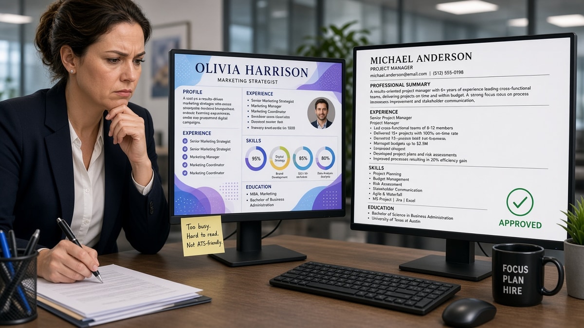
Before: Title sits inside a circular photo badge with no text duplicate.
After: Name on line one, current title on line two as plain text, photo removed from corporate upload.
Before: Skills shown as bar charts across page one.
After: Three tools moved into bullets under the latest job; Skills section is a short comma list below Experience.
Copy-paste plain header for corporate upload:
YOUR NAME
Target Title From Posting | City, ST | [email protected] | phone
EXPERIENCE
Employer | Job Title | Month Year – Present
I've rejected gorgeous files in under ten seconds because the job title was buried under a hero banner while the parsed row showed Unknown Title. The candidate never knew search failed first.
Why simple resumes perform better online matches this timeline once you ship the plain upload.
Executive candidates sometimes use brand-colored executive summaries spanning half a page. Parsing still wants Employer, Title, Dates in text lines. Put the executive story in bullet one under the current board or VP role instead of a banner paragraph with no header mapping.
Photo resumes common outside the US can trigger US corporate parsers to misread adjacent lines as contact strings. For US uploads, drop the photo and keep text contact lines even if your home market expects a headshot.
Design choices that read as risk
- Infographic replacing bullets: no quotable wins for hiring manager notes.
- Multiple fonts and weights on headers: skim friction on mobile screens.
- Dark mode resume PDFs: print and forward chains break contrast.
- QR codes without text backup: parsers ignore them; recruiters may not scan.
Teams hiring for brand roles still open PDFs on phones between meetings. If your title requires pinch-zoom through a collage, they'll defer the read. Plain title on line two survives that glance.
Vendor templates sold as ATS-friendly sometimes mean ATS-friendly icons, not structure. Trust upload preview from the employer you care about, not the template badge on a marketplace listing.
Verify before you blame the market
Run parse check on the designed file and on the plain duplicate. If only the plain file populates title, you have your answer about why silence followed apply.
Forward the plain PDF to a recruiter contact only when they ask for resume attachment by email. Many still upload your file into the same parser; plain keeps their manual step from garbling fields again.
Track which version you sent where in a simple spreadsheet: company, date, plain vs designed, preview screenshot yes or no. You'll stop wondering whether rejection was design or fit.
Run the ATS check on the file you actually upload. Match score on a broken import flatters you while recruiters see an empty row.
Let design live off the upload
Recruiters reject resumes that look too designed when structure hides searchable facts. Follow the timeline: fix parse, confirm sort, then earn human attention with bullets, not banners.
Keep a portfolio site for visual proof. Let the corporate upload be the boring map recruiters can search. You won't lose personality; you'll finally show up in the grid where personality gets read.
When a creative req explicitly asks for designed PDFs, still confirm parse on the portal they use. Some agencies run ATS even on designer hires. Read the fine print on the application page before you upload the award-winning layout.
If you're tired of silence, swap to plain for the next ten uploads and compare callback timing. You'll isolate design from fit faster than debating fonts in a group chat.
Read more
Frequently asked questions
Not always in creative hires when a portfolio link is the main artifact. For corporate ATS uploads, heavy design usually hurts because search runs on parsed text, not your color palette. Send plain text structure to the portal and save visual work for the portfolio URL.
Only if the portal accepts two files or a plain text field. Most corporate reqs take one PDF. Assume that file must parse. Keep a plain duplicate as your default upload.
Charts replace verbs. Recruiters cannot copy a skill bar into notes for the hiring manager. Infographics also break field mappers, so the human never sees you in the filtered list to begin with.
Sometimes yes on speed skim. If title and dates are hard to spot inside graphics, humans pass even when fields imported. Design must not hide the job header line recruiters look for first.