9 min read
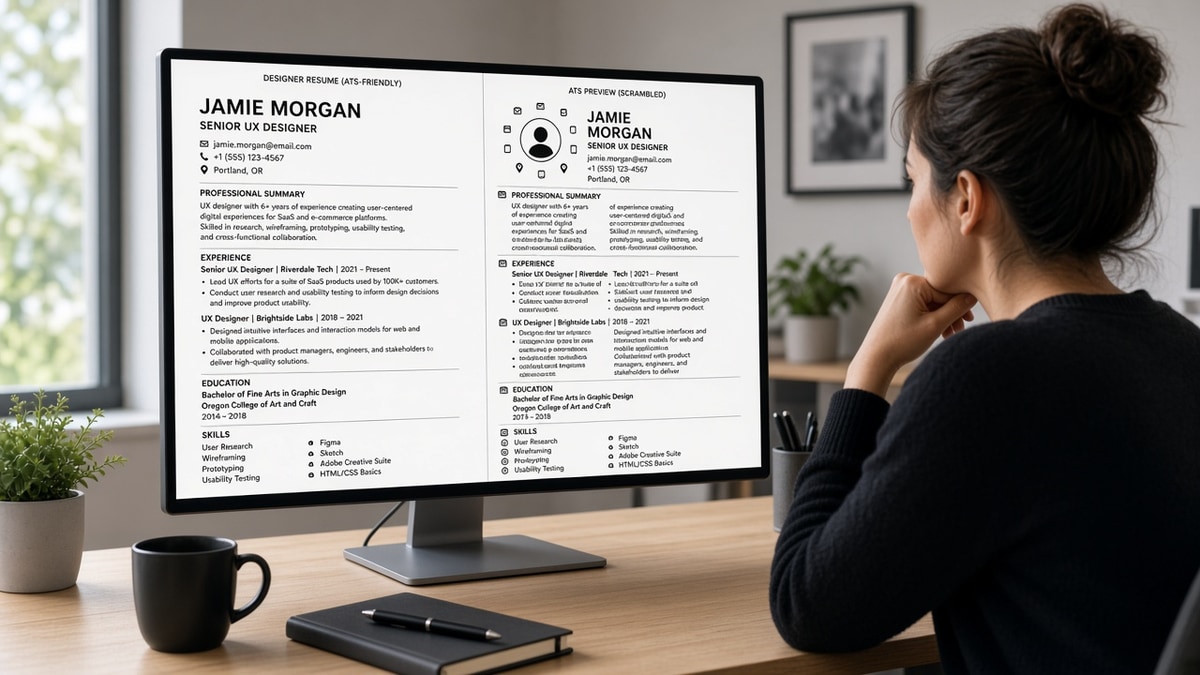
Your PDF looks perfect in Preview. The recruiter's screen shows your skills block above your current employer and your dates missing. That's not snobbery about fonts. It's order of extraction.
Design choices you made for human skim speed fight the parser's plain-text pass. Once fields are wrong, keyword match scores lie and search filters skip you even when you're qualified.
Start with check your resume for free against a saved posting after you rebuild layout. You'll see whether terms attach to employer lines or float orphaned.
If you're also sending a note, generate a cover letter that uses the same job title string you fixed in Experience so nothing contradicts parsed rows.
Quick Wins
- Collapse to one column for Experience and Education.
- Replace icon contact rows with typed email and phone lines.
- Open the employer upload preview and confirm title plus dates imported.
How resume design affects parsing behind the upload button
Parsing is not a human reading your layout. It's software stripping text and guessing which chunk is employer, title, date, or degree. Tables and columns change read order. A sidebar Skills list often imports after your oldest job, so matchers tie keywords to the wrong decade.
Headers and footers repeat on every page in some exports. Parsers sometimes treat repeated lines as one long string, duplicating contact info inside Experience. Text boxes float outside the normal flow, so job titles inside them vanish from field maps.
Visual hierarchy for humans (bold color bars, timeline graphics) rarely carries semantic meaning for software. The parser wants linear text with predictable headings. Fancy design without structure is the main reason two people with the same words get different match panels.
Font choice matters less than structure. Arial vs Calibri rarely breaks imports; nested tables inside Experience do. Bullets as custom Unicode dots sometimes paste as odd characters in preview. Use standard round bullets from the editor.
Page breaks can split a job block across pages. Keep each role's header and at least one bullet together. If a role header lands alone at the bottom of page one, some parsers attach its dates to the previous employer.
Light gray body text looks elegant but fails accessibility and sometimes drops contrast in OCR passes. Stick to solid black or near-black body copy for upload files.
Workday resume format habits apply across many US employers even when the portal skin differs. Single column and standard labels are the baseline.
Why simple resumes perform better online explains the recruiter side once your fields parse cleanly.
International candidates often maintain EU-style CV length while applying to US portals. Trimming research lists into links and keeping Experience in one column usually improves US parse more than translating headings alone.
Remote job headers should still include city and state when the posting asks for location compliance. Parsers map location tokens from the header line; hiding city inside a map graphic removes that field from search filters.
Procedure: rebuild for parse, then re-tailor
Set aside forty focused minutes. Longer marathons invite font tinkering that does not change parse. The goal is a second file, not a perfect redesign.
- Duplicate the file so you keep a pretty version for networking and a plain version for ATS uploads.
- Strip tables holding contact info or job headers. Put employer, title, city, and dates on one line each with pipe or comma separators parsers tolerate.
- Move Skills inline for must-have tools: one bullet under the job where you used them. Leave a short Skills section only for leftovers.
- Standardize headings to Experience, Education, Skills. Remove creative labels parsers won't map.
- Export PDF from Word or Google Docs with embedded fonts; avoid Canva-only PDFs if text selects as boxes.
- Upload to preview on the target portal or run a checker; fix until title and dates show in the right panel.
Between steps two and three, select all text and clear character spacing overrides. Resume templates from marketplaces often embed hidden spacing that looks fine visually but splits tokens in preview (Sales force instead of Salesforce).
Between steps five and six, print to PDF using the system dialog rather than print-to-image workflows. Confirm you can highlight a full job title with one drag in a PDF reader. If highlighting stops mid-word, parsers will struggle too.
Before: Contact row uses phone and email icons in a two-column table; Experience dates sit in the right column cells.
After: Plain lines Email: [email protected] and Phone: digits; each role uses Employer | Title | City on line one and Month Year to Month Year on line two above bullets.
Before: Skills sidebar lists Python, SQL, and Tableau with star ratings.
After: One bullet under the analyst job: Built weekly revenue tables in SQL and Tableau for ops review, feeding a Python script for anomaly flags.
Copy-paste experience header block:
ACME CORP | Senior Analyst | Austin, TX
March 2021 – Present
• Bullet one names the tool from the posting in the first eight words
I've watched qualified candidates get filtered out because a template put the job title inside a colored sidebar. Recruiters never saw the title in search; they assumed the person was junior or unrelated.
After layout is stable, re-run keyword pass once. Don't chase match score while fields are still blank. Order matters: structure first, tailoring second.
Step detail for Word users: turn on Show Paragraph Marks, delete section breaks inside Experience, and convert table rows to plain paragraphs with tabs only if the portal preview still garbles lines. Google Docs users should avoid floating text boxes for contact info; use left-aligned lines instead.
When you must keep a designed PDF for portfolio roles, store two filenames: LastName-Plain.pdf for ATS and LastName-Design.pdf for email to humans who asked for visual work samples. Never upload the design file to a Workday req by mistake.
Line length and margins change how parsers infer column breaks. Keep margins at least one inch and avoid squeezing content into a narrow center column with wide gutters. The parser may read gutters as column separators.
If preview shows your summary repeated inside every job, check for a header field in Word that repeats on each page. Move summary into the body once above Experience.
Date formats should match across roles: Month Year to Month Year or Year to Year, not mixed styles on the same file. Mixed styles confuse field end detection and truncate employment length calculations recruiters sort on.
Design choices that look fine until preview
- Multiple columns on page one: summary left, jobs right, scrambled import.
- Text in headers/footers: duplicated contact strings inside Experience blocks.
- Skill meters and charts: no readable text for matchers.
- Hyperlinked icons only: LinkedIn URL must appear as characters, not a glyph.
- Scanned PDFs: image pages with no selectable text fail entirely.
- Joint resume-plus-portfolio PDFs: extra pages push skills to page three where parsers stop reading consistently.
Designers and marketers feel pressure to show taste on the resume itself. Split portfolio links into the header URL line and keep the upload file text-first. Taste can live on your site; parsers won't load your CSS.
Legal and academic CVs often use long single-column text already. Corporate pivots from academia should trim publications to a link rather than multi-page lists inside the same PDF upload unless the req asks for full CV.
Test parse and match after every export tweak
Margins and font swaps can change line breaks parsers use as cues. Re-open preview when you touch spacing, even if content words stayed the same.
Run the ATS check on the plain file before batch applying. Pair with job match once fields populate so keywords score in context, not in a orphaned skills blob.
Save the preview screenshot when a company uses a finicky portal. You can compare the next apply without guessing whether the portal or your file changed.
Job match tools highlight missing terms after parse succeeds. Use them to pick which bullet to edit, not to justify keeping a broken template because the score looked high on a sidebar skills list.
Batch nights: rebuild once, then tailor bullets. Re-export after any margin tweak, even small ones. Parsers are picky about line wraps around employer names split across two lines.
Share the plain file name with anyone proofreading for you. Friends mean well when they suggest prettier templates; remind them corporate uploads reward parse over Pinterest layouts.
Accessibility check: screen readers traverse DOM order in HTML exports. If you build a web resume, test tab order matches visual order before you print to PDF for ATS.
Design for the parser first, polish for humans second
How resume design affects parsing comes down to read order. One column, standard headings, and typed contact lines get your titles into search. Everything else is decoration that can wait until the plain file imports cleanly.
Rebuild once, preview every apply night, and stop tweaking colors when the title field is empty. That's the whole habit.
When recruiters finally open your PDF, they'll appreciate clean typography. They just need to find you in search first. Design is a second pass reward, not the upload you bet your pipeline on.
Keep a change log in the file name: v3-plain after you strip tables, v4-plain after date fixes. You won't remember which export cleared preview unless you label it.
Read more
Frequently asked questions
Often yes. Icons replace text labels parsers expect, and skill bars are images with no readable string. Replace icons with plain words: phone, email, LinkedIn URL typed out. Keep one photo out of US corporate PDFs unless the employer asks.
Risky. Many parsers read left column first and dump the right column at the bottom, merging skills into the wrong employer block. Use one column for Experience and Education. If you love a template, export a plain duplicate for uploads.
Employers differ. Many US portals accept PDF and DOCX. PDF exported from Word with real text layers beats scanned images. If preview shows gibberish, try DOCX or rebuild in a single-column doc before you apply again.
Custom headers like My Journey instead of Experience confuse field mappers. Stick to standard labels recruiters search: Experience, Education, Skills. You can style font size, not the word itself.