9 min read
That template with color blocks looked sharp on your laptop. In iCIMS it might dump your email under Education while your latest job floats without dates.
You don't need a design degree to fix it. You need to delete the sidebar and put dates next to titles where parsers expect them.
If you've been applying with the same pretty file and getting zero screens, layout is a fair suspect before you rewrite every bullet.
We'll show teardowns you can copy tonight. You won't need a new font pack, just fewer boxes on the page.
Check your resume for free after you strip the layout down. If the preview jumbles sections, so will the recruiter grid view.
Below are before and after layout fixes you can apply tonight, plus a bare-bones skeleton to paste into Word.
This won't make you qualified for roles you are not. It stops a qualified file from dying because the parser read the columns backward.
Quick Wins
- Collapse to one column before you export.
- Rename creative headers to Experience, Education, Skills.
- Paste the export into Notepad to see true read order.
When the best resume template is the one ATS can read
Applicant tracking systems store fields: employer, title, dates, bullets. Templates that hide those fields inside tables or sidebars fight the importer.
Readable beats pretty on the first pass. Recruiters still want scannable bullets once your row loads. They cannot scan what never imported.
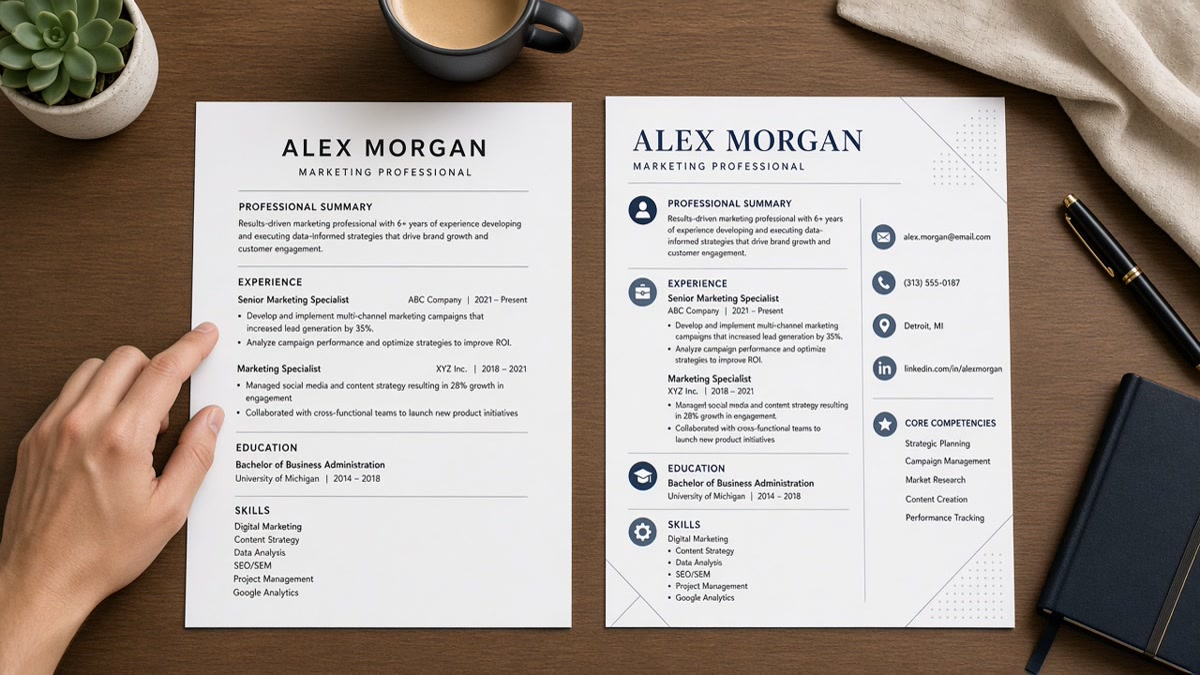
Before: Skills live in a left rail while jobs sit on the right.
After: Skills follow Experience in one stack so dates stay glued to titles.
For matching logic after parsing, see how ATS matches resumes to job descriptions . Format gets you into the match; keywords in bullets do the scoring.
Template before and after pairs
Each pair below is a layout fix, not a claim about hiring odds. Numbers inside sample bullets are illustrations only.
Two-column marketing layout
Before: Contact and skills in a navy sidebar; three jobs in a narrow main column with icons for each tool.
After: Name and email on line one, then Experience with Company, Title, Jan 2022 to Present, then bullets starting with campaign metrics such as lifted demo requests 14% in Q2.
Operations manager with a table grid
Before: Work history trapped in a Word table so the parser reads cells out of order.
After: Each role as plain lines: Regional ops manager, Company, Mar 2020 to Present, then dash bullets on cost and throughput.
Designer portfolio hybrid
Before: Header image, QR code, and skill bars across page one; jobs start on page two.
After: Text-only page one with Product designer title, recent employer, and two bullets on shipped UI work; portfolio link as a plain URL line under email.
Recent grad with creative section names
Before: Section titled My Journey and Impact Map with no dates.
After: Education with May 2025 graduation, Projects with month ranges, Internship under Experience with standard headers.
Senior finance leader with footer contact
Before: Phone and city only in the footer the portal strips.
After: Phone and city directly under the name block in the body so Workday captures them on import.
Copy-paste skeleton (plain text, drop into Word):
[Full Name]
[City, ST] · [phone] · [email] · [portfolio URL if needed]

EXPERIENCE
[Company] | [Job Title] | [Month Year] to [Month Year or Present]
- [Bullet with verb, scope, and outcome]
- [Bullet repeating a posting keyword with proof]

EDUCATION
[Degree], [School] | [Graduation Month Year]

SKILLS
[Tool], [Tool], [Tool] (plain comma list, no bars)
I've opened Greenhouse profiles where the template put certifications above the current job, so the grid preview looked like the candidate was still in school full time.
Before: You trust the marketplace preview thumbnail.
After: You upload once to a test req or run a checker and read the field order yourself.
Same template, two exports
Keep one Word master. Export DOCX for Greenhouse and Lever when the posting allows it. Export PDF only when the portal blocks Word uploads.
Before: You redesign in a browser tool and download PDF with layers the parser cannot read.
After: You adjust margins in Word, save DOCX, and print to PDF from Word if you must.
Scanned PDFs from a phone photo fail outright. If your template ever lived on paper, retype it. Do not upload a photo PDF as your application file.
Hyperlinks in headers are fine as plain URLs on their own line. Fancy buttons inside the template body often disappear on import.
Template choices that break imports
- Text boxes for summaries floating outside the main flow.
- Headers and footers holding the only copy of your phone number.
- Multiple font colors that vanish on plain-text export.
- Creative section titles parsers do not map to Experience.
Before: Template packs keywords into a hidden white-font paragraph.
After: Keywords sit in real bullets under dated roles recruiters can audit.
Compare file types in PDF vs Word resume for ATS what actually works before you lock a template for a Lever or Taleo req.
Test the template before every batch
Save a master plain layout, then duplicate per posting. Re-run preview when you change even one margin setting.
Build your resume when you want a starting file without sidebar markup baked in.
Run the ATS check on the export you plan to attach. Mismatched section order shows up before a recruiter does.
Generate a cover letter when the posting asks for one and you do not want layout bugs in a second attachment.
Plain templates still need human scan lines
Recruiters are not robots. Once your row opens, they skim the first eight words of bullet one. A boring template with sharp bullets beats a graphic header with vague duties.
Keep bold for section headers only. Let numbers inside bullets carry the emphasis so parsers and humans see the same text.
Before: Template squeezes ten jobs onto one page with 8-point type.
After: Two pages with 11-point body type and three strong bullets per recent role.
Contract roles belong in Experience with clear dates, not in a footer note. Parsers treat footers as optional; humans might miss them too.
Remote-only candidates should still list city and state if the posting asks for location metadata. Put it on line two under your name, not in a graphic pin icon.
More layout fixes by role type
Customer support lead
Before: Logo banner and photo header push ticket metrics to page two.
After: Company, Support team lead, dates, then bullets on CSAT and queue time with sample figures in the bullet text only.
Data analyst
Before: Skills matrix as a colored table spanning two pages.
After: Skills line lists SQL, Looker, and Python; bullets under the latest job show dashboard adoption and stakeholder count.
Project manager
Before: Timeline graphic for each program instead of dated roles.
After: Program manager title, program name in the company line, Month Year dates, bullets on budget and milestone delivery.
Registered nurse
Before: License number only in a footer icon row.
After: RN license and state on line two under the name; clinical roles in Experience with unit type and patient load in bullets.
Specialty headers like Clinical Journey still fail parsers. Use Experience even when the work was hospital rotations.
Warehouse and logistics supervisor
Before: Shift schedule chart embedded as an image next to job titles.
After: Supervisor title, facility name, dates, bullets on safety incidents and throughput with plain numbers in text.
Hourly roles still need readable dates. Month and year on each stint beats a graphic timeline every parser skips.
Five-minute export checklist
- Save as DOCX from Word, not from a browser design tab.
- Open the file on your phone and scroll: do dates sit under each title?
- Copy all text into Notepad: does Education appear after Experience?
- Search for stray text boxes: delete any floating summary box.
- Rename the file FirstLast_Role_Company.docx before upload.
Before: You upload the same Canva PDF to every portal.
After: You keep one Word master and export PDF only when the req insists.
Government and healthcare reqs on Taleo are especially picky about section order. When in doubt, mirror the order on the job description: experience first if they lead with duties.
Pick boring structure, strong bullets
The best resume template is the one ATS can read without reordering your career story. Strip columns, rename sections, and prove skills in Experience.
Keep a plain master file. Tailor bullets, not borders. Run one checker pass before you mass apply.
When the preview matches what you wrote, you have a template worth keeping for the next req.
Read more
Frequently asked questions
Often yes. Parsers read left to right, top to bottom. A sidebar with contact info and skills can import after your jobs, or merge sections. Single-column layouts keep employer names attached to the dates recruiters expect.
Follow the posting. When the employer does not specify, a clean DOCX exported from Word tends to parse more predictably than a designed PDF with text boxes. If they require PDF, export from Word instead of a design tool so hidden layers do not survive.
Treat them as decoration only. Parsers skip graphics, so a five-star skill bar becomes empty space. List tools as plain text in a Skills section and prove them again in Experience bullets.
11-point Calibri or Arial for body text is a safe default. Headers at 12 to 14 points are fine. Tiny type to squeeze a third page often breaks when the portal re-renders your file.
For US corporate applications, skip photos in the file. Images stall parsers and are not expected on most US reqs. Put energy into dated roles and bullets instead.