7 min read
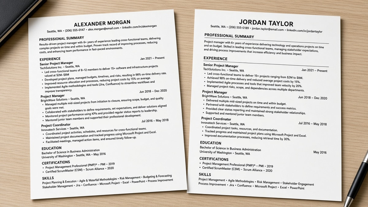
You don't need a graphic template to look put together. Most "designed" resumes I see in applicant portals are two-column files where the parser reads skills above the candidate's name. The plain version wins because it's readable to both machines and tired humans.
Job searching is slow enough without fighting your layout. If you've been told to "make it pop," that usually means add color. For online applications, pop isn't the right goal. Calm spacing reads confident.
Check your resume for free after you adjust spacing. If the parser sees a wall of text, a recruiter will too.
Tonight's job: upgrade a one-column draft with margin, header, and bullet fixes you can paste in Word or Google Docs. No new columns, no icons, no color blocks. You'll know it's working when the file still looks calm at 100% zoom and the plain-text paste keeps section order intact.
The teardowns below use the same content with different spacing. That's the point. You shouldn't rewrite achievements to look premium. You should present them so the first screen feels intentional.
Quick Wins
- Set margins to 0.75 inch and add 12 point space before each section header.
- Bold job titles and company names; keep dates right-aligned on one line.
- Cap each role at four bullets with a number in the first eight words.
What actually reads premium on a plain file
Premium is not decoration. It's the feeling that someone chose where your eye lands. On a single-column resume, that means name first, contact second, Experience third, with enough air between blocks that nothing fights for attention.
Spacing beats graphics every time. Recruiters skim in seconds. Wide margins and blank lines between sections signal care. A purple sidebar signals a template they have seen four hundred times this week.
Type hierarchy is the second lever. One font family, three sizes max: name, section labels, body. Bold marks job titles. Regular weight for company names. Dates in the same size as body text, aligned the same way on every role.
Bullet rhythm is the third. Four strong lines beat eight vague ones. Start with a verb, land a metric or scope in the first line, and keep each bullet to one or two lines. That pattern looks intentional even in Calibri on a white page.
For why columns and text boxes scramble import order, read why fancy layouts break parsing . The polish rules below assume you stay in one column.
How to make a simple resume look premium: before/after teardowns
Work through these three pairs on your current draft. Each change is formatting only. You are not rewriting your career story tonight.
Pair 1: Contact block and name line
Before: Name at 14 point, contact crammed on one line with pipe symbols, city buried at the end, no space before Experience.
After: Name at 17 point bold, contact on the next line at 10.5 point, blank line, then EXPERIENCE in 13 point bold caps with 6 point space after.
The header sets the tone. When the name is smaller than section labels, the file feels like a template export. Give the name one size bump and one blank line before the first section.
Pair 2: Role header and date alignment
Before: Job title and company on separate lines, dates floating under the city name, inconsistent Month-Year formats (Jan 2022 vs 01/2022).
After: Bold title, regular company, dates right-aligned on the same row: Operations Analyst, Northline Health · Jan 2022 to Present.
I've screened stacks of one-column files in Greenhouse, and the ones that feel expensive use the same date pattern on every role and never hide dates under the company line.
Pair 3: Bullet wall vs bullet rhythm
Before: Seven bullets per role, each starting with "Responsible for," no numbers, lines wrapping to three rows.
After: Four bullets, first line includes scope or metric: "Built weekly intake dashboards in Looker, cutting manual report time 6 hours per week across four clinics."
Shorter bullets with numbers read sharper than long duty lists. Cut the fifth bullet before you shrink font size.
Pair 4: Skills row clutter
Before: Skills section as a dense comma paragraph spanning four lines with every tool you touched once.
After: One line labeled Skills: SQL, Looker, Salesforce, with only tools repeated in your bullets or the posting.
A tight skills row finishes the page cleanly. A cloud of keywords looks like padding even when the parser accepts it.
Copy-paste block: polished one-column header and role
Paste this shape into Word or Google Docs
Jordan Ellis
[email protected] | 555-018-4420 | Denver, CO

EXPERIENCE

Operations Analyst, Northline Health                                    Jan 2022 to Present
• Built weekly intake dashboards in Looker, cutting manual report time 6 hours per week across four clinics
• Standardized handoff checklist with nursing leads, reducing missed fields on 120 weekly referrals
• Trained three new hires on Salesforce case routing during Q2 surge staffing

Skills: SQL, Looker, Salesforce, Excel
Match the spacing: blank line after your name block, blank line before EXPERIENCE, blank line between roles. That rhythm is what separates a draft from a finished file.
Spacing settings that hold on export
| Element | Target | Why it reads premium |
|---|---|---|
| Page margins | 0.75 to 1 inch all sides | Frames content; cramped edges look like a print squeeze |
| Space before section header | 10 to 12 point | Creates visual chapters without horizontal rules |
| Space between bullets | 3 to 6 point after each line | Stops a gray block of text on screen |
| Bullets per role | Three to four max | Forces priority; long lists look unfocused |
Export to PDF and copy all text into Notepad. Section order should match what you see on screen. If Skills jumps above Experience, fix layout before you tweak fonts.
Print one copy if you can. Margins that look fine on a laptop sometimes feel tight on paper. If the bottom third of the page is dense while the top half floats, move one older role to a single summary line before you touch font size.
Before: Section headers in all caps with underline decoration on every block.
After: EXPERIENCE in bold caps with 12 point space after, no underline. The label stands out from body text without adding parser-unfriendly lines.
Polish traps that break parsing
Some "premium" moves backfire in Taleo and Workday. Avoid them on the file you upload. A recruiter might never see the version you designed if the portal import garbles it first.
Profile photo boxes. Photos add no text for matching and some employers strip them on upload. Leave the headshot off application files.
Two-column "modern" templates. Skills and contact land in column one. The parser reads that column first, so your name may import below a keyword list. Stay single column for applications.
Icon contact rows. Phone and email glyphs often paste as blank squares in plain text. Write the words. No emoji, no wingdings.
Horizontal rules between every section. Thin lines export as table rows in some Word files. Use space before headers instead.
Justified body text. Justification creates rivers of white space and odd gaps that look cheap on screen. Left-align everything.
Before: 9-point body text to fit a sixth bullet on page one.
After: 11-point body with four bullets and one older role trimmed to a single line.
See 11 resume formatting mistakes that trip up ATS for upload-specific failures. Format polish does not help if the parser never reads the file cleanly.
Test the plain version before you upload
After spacing and hierarchy fixes, run the same file you plan to submit. A polished PDF that scrambles on import still loses in the portal.
Use the free ATS checker on your export. Fix section order and contact parsing before you rewrite bullets again.
If you are rebuilding from a cramped template, build your resume in a single-column layout with spacing baked in, then paste your bullets into the copy-paste block shape above.
When the posting also asks for a short note, generate a cover letter in the same plain formatting so both documents parse cleanly in one session.
Final spacing rule
If your resume looks crowded at full zoom, it is not premium yet. Widen margins, bold the section labels, align dates, and cut bullets before you add color or columns.
- One column, one font family, three sizes max.
- Blank lines between sections beat horizontal rules.
- Four metric-led bullets beat eight duty lines.
Plain files can look finished. Give the parser a boring layout and give the recruiter room to read.
Read more
Frequently asked questions
Yes. Wide margins, one font family, bold section labels, and consistent date alignment read expensive on screen. Color and icons do not survive every parser. Spacing and hierarchy do, and recruiters notice them in the first skim.
11-point Calibri or Arial for body text, 13 to 14 point bold for section headers, and 16 to 18 point for your name. Keep one family throughout. Drop to 10.5 point only if you truly cannot fit one page after cutting filler bullets.
Sometimes, but a airy one-page file beats a cramped two-page wall. Cut older roles to one line each, trim skills to one row, and shorten bullets before you shrink margins below 0.7 inch. White space signals intent, not wasted space.
Skip it for online applications. Header bars and sidebar blocks often export as tables the parser reads out of order. Use bold text and blank lines instead. Save a designed PDF for direct email when someone asks for a portfolio version.