11 min read
Your PDF looks clean on screen, but Workday still imports your phone number under Education and your 2024 role under the wrong employer. That's what these resume formatting mistakes look like in the wild: the parser reads a different story than the layout you designed.
Check your resume for free with the posting pasted in, then run the plain-text paste test on the same file. You'll likely see contact info, dates, or skills land out of order long before a recruiter opens the attachment. If you're not sure where the scramble starts, don't guess from the preview pane.
Below you'll walk through five repair steps that cover all eleven layout failures, two edge cases for design-heavy files, where fixes still go wrong, and a copy-paste block for role headers. Job searching's draining. This page is about changing the file on your desk, not pep talks.
Grab the last file you uploaded to a corporate portal. We're going to break it on purpose in plain text so you can rebuild it once, not ten times across separate applications.
Quick Wins
- Copy the final PDF into Notepad and read every line in order.
- Move contact info out of Word headers into body text under your name.
- Collapse two-column layouts into one continuous flow.
- Put each Month Year date on the same line as its job title.
Why the plain-text paste test catches resume formatting mistakes first
Most template advice tells you to pick a polished design and trust the export. US corporate hiring still runs through parsers in Workday, Greenhouse, Lever, Taleo, and iCIMS that read files as linear text. Columns, text boxes, tables, icons, header-only contact lines, unusual headings, detached dates, decorative fonts, scanned PDFs, and overdesigned pages all share one failure mode: the extracted order stops matching what you meant.
The bar your file is judged against: after paste, your name and contact info appear first, each employer block reads in reverse-chronological order, and every date sits beside the title it describes without needing page coordinates.
Workday often maps extracted content into structured profile fields, so mixed order can affect more than the resume preview. Greenhouse may preserve readable text but still index terms without useful context. Taleo implementations vary. None of that changes the repair: build one reading path, then test the attachment the employer receives.
The eleven failures recruiters mention most are columns, floating text boxes, unlabeled icons, header-only contact details, layout tables, photos and graphics, unusual headings, detached dates, decorative fonts, scanned PDFs, and pages so dense the story disappears. You do not need eleven separate templates to fix them. You need one paste test and five repair passes.
A composite operations analyst whose sidebar lists SQL and Tableau while jobs sit in a right column can look qualified on screen and incoherent after import. The skills block may land between two unrelated employers. A graduation year may attach to the wrong job. Recruiters ctrl-f for proof and find scrambled chronology instead.
Read how to beat an ATS system for the wider screening picture. This page stays on layout repairs you can run in one sitting before you upload again.
Five steps to fix resume formatting mistakes before you upload
Work through one exported file at a time. The eleven failures below fold into five moves. If a step fails the paste test, do not upload until that layer is fixed.
Step 1: Run the plain-text paste test on the final export
Open the PDF or DOCX you'll actually attach. Select all, copy, paste into a plain editor. Read top to bottom. If contact info is missing, dates float alone, or skills interrupt a job block, you've found the real problem. A scan or flattened design export can look perfect while selecting as one image. Select a middle bullet in the PDF. If nothing copies as words, re-export from Word or Google Docs instead of printing to a virtual printer.
Before: PDF looks sharp; paste shows skills between two employers and no email line.
After: Paste reads name, phone, email, summary, skills, then each employer block in order.
Step 2: Collapse columns, text boxes, and layout tables into one flow
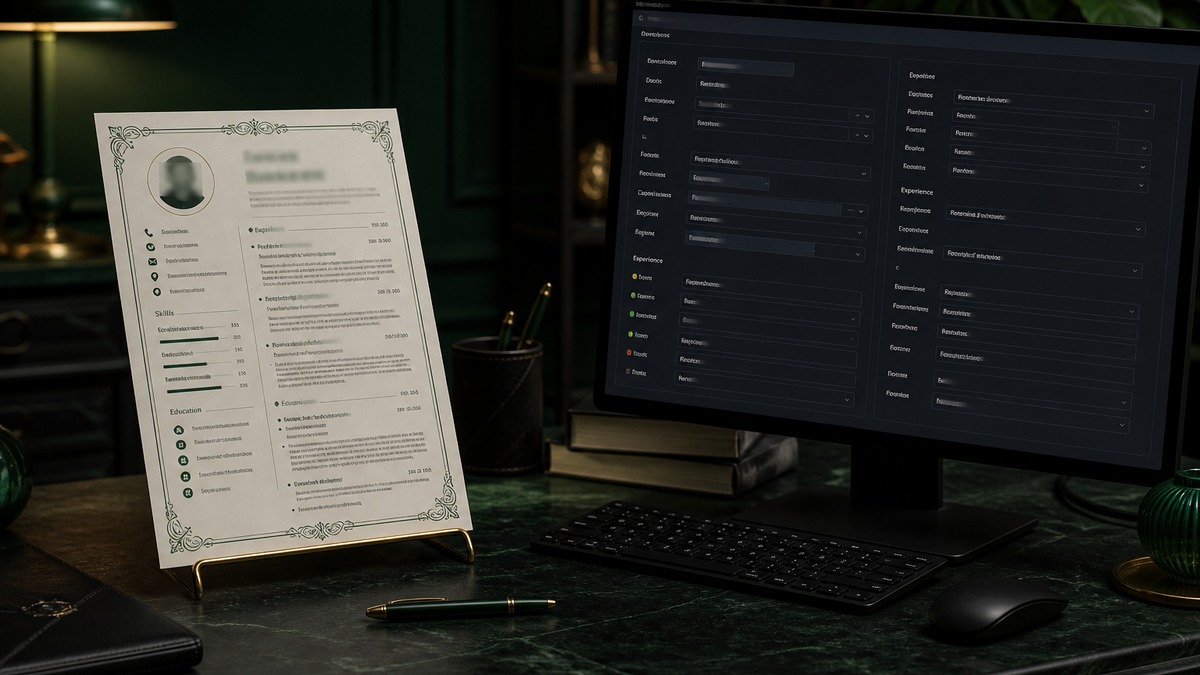
Columns save space visually but introduce competing reading paths. Text boxes are drawing objects even when they look like paragraphs. Tables can align dates in a left rail while titles sit in a right column. Turn on Word gridlines and open the Selection Pane. Move names, phone numbers, employers, dates, and skills into ordinary paragraphs. Replace layout tables with labeled lines: "Data: SQL, Tableau, Excel Power Query."
Before: two-column page with skills stacked left and jobs on the right inside invisible table cells.
After: one column with contact, summary, skills, then reverse-chronological experience in consecutive blocks.
Step 3: Replace icons, photos, and graphics with written labels
A phone handset does not become the word Phone. Five dots beside Python may extract as five unrelated characters. Photos and logos provide pixels, not searchable qualifications. Write Phone, Email, LinkedIn, Portfolio, and every skill in plain text. Remove headshots for US private-sector applications unless a legitimate local instruction requires one. Replace timeline graphics with explicit Month Year ranges in body text.
Before: envelope and handset icons with unlabeled contact details in a header box.
After: Email and Phone labels appear under the name in body text with a plain hyperlink for LinkedIn.
Step 4: Standardize headings, headers, and date blocks
Keep essential contact details in the body, not the Word Header feature. Use Experience, Skills, Education, Certifications, or Projects instead of creative labels like My Journey or Toolbox. Put each date range on the title line or immediately below it in Month Year format, such as March 2023 to August 2026. Do not rely on vertical timelines, connector lines, or far-right alignment boxes.
I've screened stacks of these in Workday and Greenhouse, and the file that wins is boring and specific: standard headings, body contact, dates glued to titles.
Before: left-rail date column and right-rail employer column with contact only in the footer.
After: Operations Analyst, Acme Logistics, Dallas, TX, March 2023 to Present as one consecutive block under Experience.
Step 5: Fix fonts, density, and export selectable text
Use a common readable font at 10 to 12 points with standard round bullets. Decorative faces and tiny type invite substitution during PDF export. Dense skill clouds, six bullet levels, and crushed margins can parse yet still fail human review. If shrinking type is the only way to keep a third page of weak duties, cut content instead. Embed fonts when the export supports it, then paste again.
Before: 8-point all-cap section headers, symbol bullets, and a scanned phone photo of a printed resume.
After: 11-point Calibri or Arial, hyphen bullets, and a DOCX or text-based PDF generated from the source application.
Copy-paste role header block
Copy-paste this skeleton for each employer line, then fill with your facts: "[Job Title] | [Employer Name] | [City, ST] | [Month Year] to [Month Year or Present]" followed by three bullets where bullet one names a tool or outcome from the posting in the first eight words.
Example fill: "Operations Analyst | Acme Logistics | Dallas, TX | March 2023 to Present" then "Built weekly SLA dashboards in Looker, cutting reactive tickets 11% in Q3" as bullet one.
Edge case: creative or marketing roles with a portfolio
You can link to visual work without building the resume as an infographic. Keep the upload file single-column and text-first. Put the portfolio URL in body contact text and one Projects bullet. Let the portfolio carry layout creativity. The ATS file should remain a readable index of dated roles.
Before: Canva two-column resume with icon skill meters and a buried portfolio link in a footer.
After: plain Word export with Portfolio: yoursite.com in the contact block and one dated Projects line naming the campaign you led.
Edge case: template you're attached to from a vendor
Rebuild inside the template instead of fighting it forever. Duplicate the file, strip text boxes and tables, paste content into body paragraphs, and retest. If the vendor layout still scrambles order after two exports, switch to a plain single-column base. Qualifications do not survive a parser that never reads your sidebar.
See how to write resume bullets that show outcomes, not duties after the layout is clean so your evidence lands in the right fields.
Where layout repairs still go wrong
Testing the editable Word file but uploading a different PDF. Export behavior matters as much as the source. Run the paste test on the attachment, not only the working document.
Keeping a two-column shell because it parsed once. Employer updates and conversion paths change. One clean upload last month does not guarantee the next req.
Leaving icons because they look professional. If Phone and Email are not written as text, assume the parser skipped them.
Renaming Experience as Superpowers. Creative headings force software and tired recruiters to infer meaning. Standard labels are faster for everyone.
Stuffing margins instead of cutting bullets. Overdesigned density can parse and still lose human screens when evidence hides in a wall of 8-point type.
Assuming PDF always beats DOCX. Follow the employer instruction. A text-based DOCX often outperforms a flattened design PDF.
Skipping the second paste after a small edit. One new text box or icon row can reorder the export. Paste again any time you touch layout, not only on the first rebuild.
Score the repaired export against the posting
After the paste test passes, run the same file against the req on your screen. You are checking whether titles, tools, and credentials appear inside dated Experience text, not only in a sidebar or Skills footer.
Run a free ATS check with the description pasted, then score your job match once contact info and chronology read cleanly in plain text.
Export a boring file, then apply
The eleven layout failures share one test: plain-text order. When contact info and dates land where they belong, parsers in Workday, Greenhouse, and Taleo get a fair shot at your evidence. Pretty PDFs that fail the paste test still die quietly in import.
Open your last export tonight. Paste it. Collapse columns and text boxes. Write labels instead of icons. Standardize headings and date blocks. Save selectable text and run one more check before you upload. When the portal wants a letter, generate a cover letter that repeats the same Month Year role line from your repaired header block.
This won't fix applying to roles you're not qualified for. It stops a qualified file from dying because resume formatting mistakes scrambled the chronology recruiters needed to see.
Read more
Frequently asked questions
A single-column document with ordinary headings, body text, simple bullets, and dates next to each role is a dependable baseline. Follow the employer file-type instruction and test the final export with a plain-text paste before you upload.
Not automatically. Some two-column files parse, while others merge or reorder content. Workday and Greenhouse behavior also depends on file construction and employer configuration. A clean paste test reduces uncertainty more than guessing from the on-screen layout.
A simple table may parse, but nested cells and work histories split across columns carry avoidable risk. Use ordinary paragraphs for essential contact, experience, skills, education, and credentials unless you have tested that exact table in a plain-text export.
Keep essential contact details in the main body. Some extraction paths skip or separate headers and footers. A visual header area can be created with body spacing without using the Header feature.
Copy the final file into plain text, inspect Word gridlines and objects, search core terms, and run a job-specific check. Verify the exported attachment rather than only the editable source.