11 min read
You've downloaded three "ATS-friendly" designs this week. Two columns, icon headers, skill bars. None of them fixed the silence after upload. That's because most template shops sell decoration parsers skip. The US ATS resume template that actually wins isn't a Canva theme. It's four blocks in fixed order: contact, experience strips with Month Year dates, education, skills echo at the bottom.
Check your resume for free with the posting pasted in. You'll often see Skills flagged green while Experience imports out of order. The layout scrambled your strips. Bullet one never reached the recruiter queue in reading sequence.
Below: the four-block bar your file is judged against, six before/after layout pairs across different roles, what weak templates share, and a copy-paste skeleton you can drop into Word or Google Docs tonight. Job searching's draining. You don't need another design subscription. You need a plain column parsers and humans read the same way.
Pull up your current PDF before you scroll. We're tearing down layout choices side by side, not debating font psychology.
Quick wins
- Stack contact, Experience strips, Education, then skills echo in one column.
- Put Month Year dates on the same line as title and employer.
- Paste your PDF into Notepad before you tweak fonts.
- Drop sidebars, skill bars, and icon rows that reorder the import stream.
The US ATS resume template every parser expects
Forget the thumbnail preview. Workday, Greenhouse, Lever, Taleo, and iCIMS import a text stream top to bottom. When your layout fights that stream, contact lands after Skills and your current job reads like a footnote. The winning layout is boring on purpose.
Block 1: Contact. Name, phone, email, city and state if you want location signal. No photo. No QR code. No social icon row that pushes text into columns. One left-aligned block above everything else.
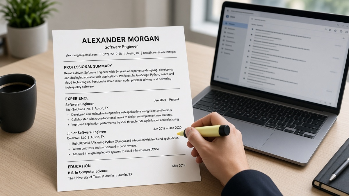
Block 2: Experience strips. Each role gets one horizontal strip: Job Title | Employer | Month Year to Month Year or Present. Bullets sit directly under that strip. Three to five bullets on current role, fewer on older jobs. Reverse chronological. No tables splitting title from dates.
Block 3: Education. Degree, school, graduation year or expected year. Certifications that parsers search can sit here or as a short sub-block. Keep it text. No diploma graphics.
Block 4: Skills echo. Eight to twelve terms you already proved in bullets. Not a word cloud. Not a sidebar. A single line or short list at the bottom for ctrl-f and parser keyword pass.
What parsers treat as decoration: summary paragraphs above Experience, skill bars with fill percentages, testimonial quotes, hobbies, references available upon request, and second columns that reorder the stream. You can keep some of that for human readers who print the PDF. You can't rely on it surviving import.
I've screened imports where Skills landed between employers and bullet one never paired with the title strip. Same candidate on a single-column four-block layout gets a clean Experience field recruiters actually open.
Read formatting mistakes that kill your resume when your paste test still scrambles after you fix section order. This page is the layout teardown those fixes assume.
Before/after layout pairs across roles
Each pair below is layout only. Swap employer names and tools for honest ones from your file. Content can stay rough while you fix structure first.
Pair 1: Digital marketing manager
Before: Two-column Canva layout. Contact and Skills in left rail. Experience in narrow right column. Dates in floating boxes. Summary with keyword paragraph above jobs.
After: Single column. Contact block. Digital Marketing Manager | Northwind Health | Mar 2022 to Present strip with four bullets under it. Education. Skills line: HubSpot, Google Analytics, Meta Ads, SQL (terms from bullets only).
Pair 2: Software engineer
Before: Skills grid with progress bars at top. Projects section before Experience. GitHub link in header footer parsers drop.
After: Contact with email and phone in body, not footer. Software Engineer | Beta Systems | Jan 2023 to Present strip. Bullets lead with Python, AWS, and CI/CD proof. Education with B.S. Computer Science. Skills echo: Python, AWS, Terraform, PostgreSQL.
Pair 3: Registered nurse, med-surg
Before: Photo headshot, colored section bands, "Clinical Competencies" table before Employment History.
After: No photo. Registered Nurse, Med-Surg | Riverside Medical Center | Mar 2021 to Present strip. Three bullets under strip. BSN and RN license line in Education. Skills echo: Epic, ACLS, BLS, patient ratios (only what bullets name).
Pair 4: Warehouse shift lead
Before: Icon bullets, centered name with decorative line, "Core Strengths" word cloud above jobs, dates show 2020 with no month.
After: Left-aligned contact. Warehouse Shift Lead | Apex Distribution | Aug 2020 to Present strip with Month Year dates inline. Two bullets with scope and metric. High school or associate degree in Education. Skills echo: WMS, forklift certification, OSHA 10.
Pair 5: Administrative assistant
Before: Three-column table for each job: title left, company center, dates right. Parser reads cells out of order.
After: Administrative Assistant | Summit Legal Group | Jun 2021 to Present on one strip line. Bullets under strip. Education with certificate if relevant. Skills echo: Outlook, calendaring, DocuSign, data entry (from bullets).
Pair 6: Career changer, project coordinator target
Before: Full-page "Professional Profile" and "Transferable Skills" sections before any dated employer. Parsers score keywords with no job anchor.
After: Honest title on strip: Project Coordinator | Community Arts Nonprofit | Sep 2022 to Present. Bullet one carries Jira and budget proof. Optional two-line summary removed or moved below current strip only after bullets match. Education and skills echo last.
Edge case: two contract roles in one year
Short gigs need separate strips, not one merged paragraph. Layout rule is the same: title, employer, Month Year on one line per client, bullets under each.
Before: Consulting 2024 to 2025 block listing three clients in prose.
After: Analyst | Client Alpha | Jan 2024 to May 2024 with two bullets; Analyst | Client Beta | Jun 2024 to Present with its own strip and bullet one tailored to the new req.
Edge case: federal or academic CV length
Long files still obey the stream. Contact, then Experience strips newest first, then Education, then Skills echo. Extra sections like publications go after Skills, not before Experience. Parsers still read top down. Don't bury your current strip on page two behind a three-paragraph summary.
Before: Publications and grants fill page one; current role starts page two.
After: Current role strip on page one under contact; publications moved to end block after skills echo.
Run the paste test after each pair: export PDF, paste into Notepad. Contact, strips, education, and skills should appear in that order with no sidebar text between employers. See the 10-second resume scan checklist once strips parse clean and you need skim order on title and bullet one.
What broken templates share
Candidates blame the ATS when the layout never gave it a fair import. These four patterns show up on almost every scrambled file in a full recruiter queue. Fix the pattern once on a master file, then fork bullet one per req.
Pattern 1: Sidebar Skills import between jobs
Left-rail Skills look modern on screen. Parsers inject that rail between employer blocks. Your second job's bullets detach from its strip. Single column removes the rail entirely.
Pattern 2: Dates in a separate column
Right-aligned date columns parse as orphan strings. Month Year belongs on the same line as title and company. Gaps become visible on the strip instead of hidden in layout tricks.
Pattern 3: Summary before proof
Keyword summaries above Experience score on keyword tools and fail on field import. Recruiters ctrl-f into Experience anyway. If summary and bullet one disagree, the strip wins in their head.
Pattern 4: Headers, footers, and text boxes
Phone in a footer or name in a Word text box often drops on upload. Contact in the main body only. Same rule for page numbers and decorative banners.
Before: Redesigned template three times; Skills still in sidebar; dates still floating; summary still three paragraphs.
After: One plain DOCX master with four blocks; paste test passes; bullet one swapped per posting; PDF export for upload when the portal allows it.
Copy-paste four-block layout skeleton
Drop this into a blank document. Use 11-point Calibri or Arial. No tables. No columns. Replace bracketed lines with your data.
[YOUR NAME]
[City, ST] · [phone] · [email]
PROFESSIONAL EXPERIENCE
[Job Title] | [Employer Name] | [Mon YYYY] to Present
• [Bullet one: posting must-have in first eight words; scope and outcome]
• [Bullet two: second proof point]
• [Bullet three: older duty or metric]
[Job Title] | [Employer Name] | [Mon YYYY] to [Mon YYYY]
• [Bullet one]
• [Bullet two]
EDUCATION
[Degree], [School] · [Year]
[Certification if req searches it]
SKILLS
[Tool], [Tool], [Tool]: echo terms from bullets above only
Font and file rules: single column, standard bullets (not icons), save DOCX when the portal accepts Word, otherwise export text-based PDF from Word or Google Docs. Avoid design-tool PDFs until the paste test passes.
Tailoring rule: keep layout fixed. Swap bullet one and the skills echo per posting. Don't rebuild columns or move Skills to the top for "keyword density." Density without strip order is still decoration.
Rebuild and verify before upload
Starting from a scrambled Canva file? Build a plain single-column resume once, paste the four-block skeleton in, then stop redesigning. Layout should be stable across applications.
After the paste test passes, Score your job match on the open posting. It flags missing duty terms in Experience when Skills looks full. It won't fix sidebar import. It shows where bullet one still gaps against the req.
When the req asks for a letter, keep layout talk out of it. Generate a cover letter from the posting after the four-block paste test passes.
Keep the layout boring, swap bullet one
The US ATS resume template that wins is not the prettiest download. It's contact, experience strips with Month Year dates, education, and skills echo at the bottom on one column. Everything else is optional at best and parser poison at worst.
Build one master file with the copy-paste skeleton. Run the paste test before every upload. Tailor bullet one and the skills echo per req. You'll still see silence when teams pause hiring. You won't lose as often to layout you could fix in twenty minutes.
Run a free resume check on the next posting after your four blocks parse clean. Fix structure on your side. Let queue timing explain the rest.
Read more
Frequently asked questions
Contact with phone and email, Professional Experience with title-employer-Month Year strips and bullets, Education, and a Skills echo at the bottom. Summaries, photos, icon rows, and reference lines are optional decoration most parsers read out of order or skip entirely. Keep the four blocks in that sequence on a single column.
No for most US corporate uploads. Two-column Canva and Word templates often push Skills or contact into a sidebar parsers import between job blocks. Single column keeps contact at top, experience strips in reading order, then education and skills. Paste your PDF into Notepad to confirm nothing jumps between employers.
At the bottom as an echo of tools already named in dated Experience bullets. Skills rails beside the body or clouds above Experience look full on screen and empty in Workday field import. Put proof in bullet one under each strip, then repeat three to eight terms in Skills for ctrl-f.
Month Year beside each role on the same line as title and employer: Jun 2022 to Present, not 06/22 or 2022 alone. Parsers in Greenhouse, Lever, Taleo, and iCIMS map start and end fields from that strip. Gaps over three months need one honest line on the strip or in a short contract note.
Only if the same proof also sits under a dated employer line. Many recruiters jump from contact straight to Experience. A keyword summary without matching bullets under a title strip reads like SEO padding. If you keep one, cap it at two lines and mirror those terms in bullet one.