6 min read
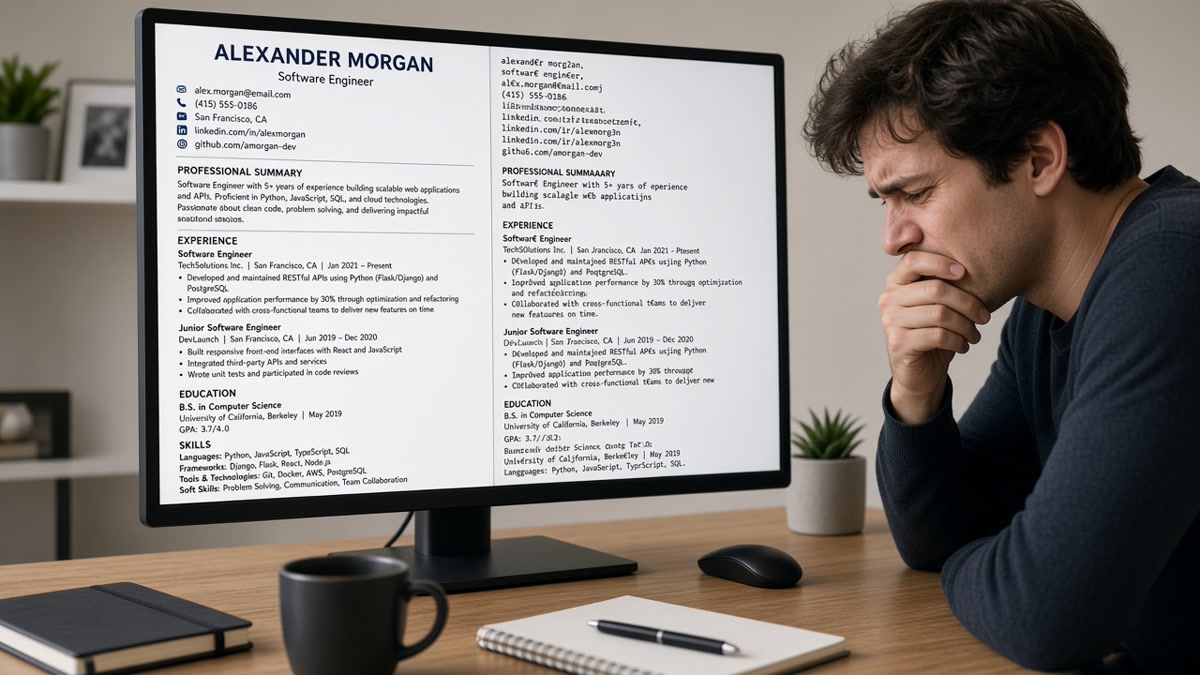
Your resume looks perfect in the PDF viewer. Then you upload it and the recruiter's screen shows your skills block above your name. That's not a glitch. That's parsing.
Design tools sell visual hierarchy. Applicant tracking systems sell searchable fields. When those two models collide, the parser wins and your layout loses. You won't always get an error toast. You'll just stop hearing back.
If you're rebuilding tonight, don't start with a new font or color palette. Start by copying your file into Notepad and reading the wreckage. That's the version Workday sees before a human opens your profile.
Check your resume for free after you run the plain-text test below. If the copy-paste version is unreadable, no amount of color blocks will save the upload.
This page compares fancy layouts vs plain single-column files on the criteria parsers actually use: field order, text extraction, and recruiter skim speed.
Quick Wins
- Copy all text from your PDF into Notepad. Read what the parser sees.
- Move contact info and dates out of headers, footers, and sidebars.
- Rebuild in one column before your next Workday upload.
How parsers read your file
An ATS does not admire your margins. It pulls plain text from the file and maps chunks into fields: name, email, phone, employer, title, dates, description. The mapping works when text appears in a predictable top-to-bottom order with recognizable section labels.
Fancy layouts break parsing when visual design fights that order. A right-sidebar skills column often stores all sidebar text before the main body in the file. Icons and charts carry zero extractable text. Headers and footers sometimes drop entirely on import.
Humans compensate with layout cues. Parsers do not. If your most recent job title lands halfway down the extracted text, keyword matching and recruiter skim both suffer.
Parsers do not understand "see column two for experience." They read the byte stream. A left sidebar stored before the main body means your skill cloud becomes the opening paragraph in Greenhouse. Recruiters then scroll past it looking for a name that should have been line one.
Use four criteria to judge any resume file before upload:
- Field order: Does name and contact appear first in plain text?
- Date integrity: Do employment dates stay attached to the right employer?
- Section labels: Are Experience and Education plain words, not icons?
- Skim path: Can a tired recruiter read top to bottom without jumping columns?
For what happens after upload in a major ATS, read why your resume looks different after upload .
Fancy layout vs single-column
Same candidate, same bullets, two files. One uses a Canva-style two-column template with a color sidebar. One uses a plain Word single-column layout. The human view looks similar. The parser view does not.
| Criterion | Fancy two-column layout | Plain single-column |
|---|---|---|
| Contact block | Often trapped in a text box or sidebar; may parse last | Top of page, first lines extracted |
| Skills placement | Sidebar skills can appear before name in plain text | Skills follow experience in logical order |
| Job dates | Table cells split dates from employer lines | Dates sit on the same line as title and company |
| Graphics | Skill bars and icons ignored; gaps in text | No graphics; keywords stay in bullets |
| Recruiter skim | Pretty in PDF; scrambled in ATS viewer | Matches PDF and ATS preview |
Before (fancy): Plain-text paste starts with "Python SQL Tableau" then jumps to "Jordan Lee" ten lines later, with 2022 dates orphaned under the wrong heading.
After (single-column): Paste reads "Jordan Lee, email, phone, Experience, Company A, Analyst, Jan 2022 to Present, bullet…" in order.
Copy-paste block: plain-text extraction test
Run this before every upload
1. Open your resume PDF in any viewer
2. Select all text (Ctrl+A / Cmd+A) and copy
3. Paste into Notepad or a blank TextEdit doc
4. Check:
   [ ] Your name is in the first three lines
   [ ] Phone and email are complete, not split
   [ ] Each job title sits next to its company and dates
   [ ] Skills are not floating above your name
   [ ] No blank chunks where icons used to be
5. If any box fails, rebuild single-column before applying
When a fancy file still makes sense
Handing a designed PDF to a hiring manager at a career fair is different from uploading to iCIMS. Keep two exports if you need to: plain for portals, polished for human-only moments. If you only maintain one file, maintain the plain one.
Creative portfolios live on the web for a reason. The resume file's job in an ATS is to populate fields, not to win a design award. Put the visual story on a site you control and link it in the application when the form allows a URL field.
Some design-heavy PDFs export fine because they're still single-column under the hood. Run the test anyway. A template that worked for a colleague might store text differently in your version of Word or Canva.
Before: One Canva PDF for every channel.
After: Single-column DOCX or PDF for ATS; optional designed PDF only when someone requests it by email.
I've opened thousands of uploads in Workday where the template looked sharp but the extracted profile had skills listed as the candidate's first name. The fix was never more color. It was one column and standard headings.
Design traps that scramble text
Multi-column templates. The most common reason fancy layouts break parsing. Sidebar-first extraction is the default failure mode.
Tables used as layout grids. Nested tables split employer names from dates. Some parsers read row by row in ways that do not match your visual grid.
Text boxes for contact info. Visually centered and clean. Often skipped or dumped at the end of the file on import.
Skill rating graphics. Five-dot skill meters carry no text. The keywords never reach the ATS index.
Headers and footers. Page numbers and repeated contact lines in the footer may duplicate or vanish depending on the parser.
Canva and design-tool exports. Pretty templates often flatten text into shapes the parser skips. Export to PDF, then run the copy-paste test. If half the resume disappears, rebuild in Word with a blank single-column doc.
Columns inside one section only. Even a two-column experience block (dates left, bullets right) can split dates from job titles. Put dates on the same line as the company name every time.
Before: Contact email only in a footer text box on page two.
After: Email and phone in the body under your name on line two.
For a deeper list of formatting failures, see 11 resume formatting mistakes that trip up ATS .
Test before you upload
After you flatten to one column, run the plain-text test again. Then pass the same file through HireFlow's checker to catch layout issues the eye misses.
Use the free ATS checker on the exact PDF you'll submit. Rebuilding layout is faster than re-applying after a garbled upload.
If the posting also wants a cover letter, generate a cover letter in the same plain formatting. Matching structure across documents keeps both files readable in the same portal.
When to pick plain
Default to single-column for any application that runs through an ATS. That's most corporate hiring in the US. Fancy layouts break parsing quietly. You often won't get an error message. You'll get silence.
- Run the copy-paste test on every new template.
- Keep dates on the same line as employer and title.
- Save design flair for portfolios, not parser food.
Your bullets did the hard work. Don't let a sidebar reorder them before a human ever sees your name.
Read more
Frequently asked questions
Not always with an automatic reject flag, but parsers still scramble text from columns, tables, and text boxes. Workday, Greenhouse, Lever, and Taleo extract plain text in file order, not visual order. A scrambled profile is harder to match and easier to skip during a quick screen.
Use a plain single-column file for online applications and keep a designed PDF for direct email or portfolio links when someone asks. Most corporate hiring still runs through an ATS first. If you only have one version, make it the one that parses.
A simple single-column Word export often survives extraction better than a PDF saved from a design tool. Many employers accept PDF. Test your export with a plain-text copy-paste before you assume either format is safe.
Plain does not mean empty. One column with bold section headers, consistent dates, and white space reads professional on screen. Recruiters spend seconds on the first skim. Clarity beats decoration when the parser is the first reader.