6 min read
You're not wrong to want a resume that looks like your work. You're applying through a portal that treats every PDF like a spreadsheet import. That's the split this page names.
Check your resume for free on the plain export you plan to upload first. You're checking whether employers and dates survive paste-to-plain-text, not whether the layout wins a design award.
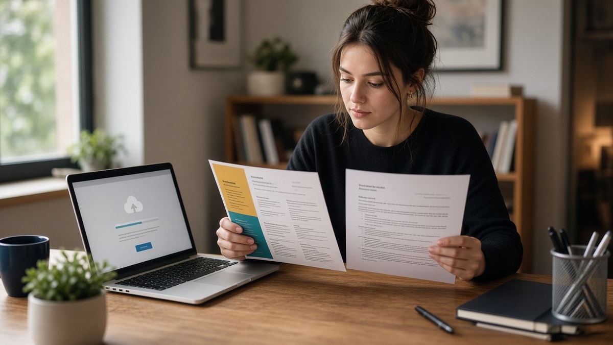
When a creative resume is still okay comes down to who reads the file first. Parser first means boring wins. Human first means your layout can carry part of the story if the text stays readable, and it won't rescue a file that scrambled in plain text.
Job searching's draining when every template blog says "be creative" and every portal silently trashes columns. You don't need a new identity. You'll need two files and a rule for which one goes where.
Quick wins
- Upload the single-column DOCX on career sites; save the designed PDF for direct sends.
- Paste each file into plain text and confirm job order before you apply.
- Put portfolio proof on a link in the header, not inside icon rows on the upload file.
When a creative resume is still okay (and when it is not)
Creative means layout risk, not talent risk. Color blocks, sidebars, and icon skill rows signal taste to a designer. To an importer they signal scrambled employer lines. The question is never "Am I allowed to be creative?" It is "Who opens this attachment tonight?"
Portal applications almost always hit an ATS first. Email from a referrer, a recruiter you met at an event, or a small shop that said "send me your PDF" usually hits a screen first. That's where a designed file still earns its keep if the words stay scannable in five seconds.
Before: You upload the Canva two-column PDF to a Greenhouse link because it matches your portfolio site.
After: You upload a flattened Word export to the portal and attach the Canva PDF only when the hiring manager replies asking for samples.
Before: You hand a printed tri-fold resume to a creative director at a portfolio review.
After: You still hand the print piece, but you follow up with a plain PDF for HR because payroll needs parseable dates.
This won't fix applying to roles you're not qualified for. It stops a qualified creative from losing on upload while the designed version never gets opened.
For format traps that hit designers as hard as engineers, read resume formatting errors that break ATS parsing next to this rule set.
Three paths where design can lead
Use this as a gate before you attach the pretty file. If none of these match, the portal-safe version leads.
Path 1: Direct email or DM with a named reader
Someone asked you to send work. They will scroll on a laptop, not run an importer first. A restrained layout with standard fonts can show hierarchy without hiding dates in graphics.
Path 2: Portfolio or work-sample field
Some postings split "resume" and "portfolio." Put the plain resume in the resume slot. Put case studies or a PDF lookbook in the portfolio slot. Never merge both into one upload when the form gives you two boxes.
Path 3: In-person or live review
Print or tablet reviews are human-first. You can show layout craft if type size stays readable and job titles are obvious. Still carry a plain PDF on your phone for "Can you forward this to HR?"
Copy-paste decision block:
{`Application type: portal / email / in-person
Reader first: parser / human
Plain file ready: yes / no
Designed PDF: attach / skip
Plain-text job order: pass / fail
Tonight's upload: [filename]`}
I've screened brand-design stacks in Lever where the visual PDF was gorgeous and the Workday profile showed one job because icons replaced employer names. The candidate wasn't weak; the wrong file went through the portal.
Canva users should read is Canva resume ATS friendly before treating a template thumbnail as proof the export parses.
Design habits that fail the portal upload
- Skill bars or star ratings instead of typed tool names in the body.
- Contact details trapped in a header the importer reads as body text.
- Two-column timelines that reorder employers in plain text.
- Image-only PDF exports with no selectable text.
- One designed file for every application because it "matches your brand."
Before: You skip the plain version because the creative shop "values design."
After: You send the plain file to the portal and the designed PDF when the creative lead asks for a walkthrough.
PDF versus Word still matters on the plain file. Compare PDF vs Word resume for ATS on the export you actually submit, not the brochure you email later.
Prove the plain file before you decorate
Run the portal version through the checker after you flatten columns. You want employers, titles, and dates to survive before you spend an hour on accent color.
Build your resume as the parse-safe base, then duplicate the content into your design tool for the direct-send PDF. Same bullets, different skin.
What to send tonight
When a creative resume is still okay is a routing rule, not a personality test. Portal path gets the boring file that passes plain text. Human path gets the layout you are proud of, with the same dates and titles underneath.
Run the free ATS check on the upload version before you attach the designed one to email. You keep both identities without sacrificing the application that actually counts. If the posting asks for a short note, generate a cover letter that names one portfolio piece, not a second designed PDF.
Read more
Frequently asked questions
Not as your only upload. Career portals in Workday, Greenhouse, and iCIMS run importers on the file first. Use a single-column DOCX or text-based PDF there. Send the designed PDF only when a human asked for it by email or when the posting lists a portfolio field separate from the resume upload.
Yes. Your portfolio proves taste. The plain file proves titles, dates, and tools survive parsing. Hiring managers in creative shops still forward the boring version to HR for the official req. Lead with the file that imports cleanly, then share the visual PDF when someone is already looking.
Only after you paste the export into plain text and employers read in order. Canva templates often hide contact lines in graphics or split experience across columns. If plain text scrambles, the portal version is not okay yet. See our Canva-specific notes before you treat pretty as parse-safe.
Two is enough for most searches: a portal-safe single column and a designed PDF for direct sends. Name them with dates so you do not re-upload the wrong one. Same employers and dates on both; only layout and accent styling change.