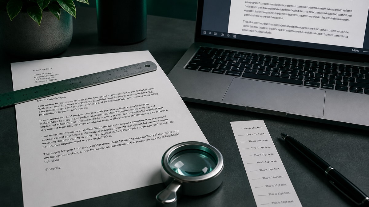
For most US job applications in 2026, set cover letter body text to 11 or 12 point in a standard business font — Calibri, Arial, Helvetica, or Times New Roman — with one-inch margins. Match the resume font family and body size so the packet looks like one document. Never drop below 11 point to squeeze an extra paragraph onto the page.
Point size is a readability and parsing decision, not a design flex. Applicants asking what font size should a cover letter be usually already know to match the resume — the failure mode is shrinking type to cheat page length. The same letter can pass on a PDF upload and fail in a paste box if you shrink type instead of trimming copy. This page is a diagnostic: run the font size × channel readability rubric, fix the three failure modes we see most often, and upload with confidence. For overall layout, see US cover letter format that does not get ignored . For page length, see should a cover letter be one page .
Key Takeaways
- Default body size: 11 or 12 point in a standard business font
- Match resume font family and body point size on every upload
- Fail band: below 11 point body, margins under 0.75 inches, or contact info only in headers
- Paste boxes on Workday and Greenhouse strip formatting — trim words, not type size
- Headers and name lines can be 12–14 point; paragraphs stay at body size
- Export PDF and copy-test every paragraph before you apply
Font size × channel readability rubric: pass and fail bands
Before you change fonts, score the draft against channel and point size together. A 12-point PDF attachment can still fail if the same text was drafted at 9 point and stretched to fit. The rubric below is the fastest diagnostic we use: each row names a channel, the body size band that passes, and what fails readability or parsing.
Yale's Office of Career Strategy cover-letter guidance tells applicants to use a readable font at standard business size — the same advice Purdue OWL's letter formatting notes repeat for US applications. The rubric turns that general advice into a pass-or-fail check per channel.
| Channel | Body size (pass) | Fail band | Readability call |
|---|---|---|---|
| PDF upload (Workday / Greenhouse) | 11–12 pt body; 12–14 pt name | <11 pt body; <0.75 in margins; text boxes | Pass — screener-readable on laptop |
| Paste box only | Draft at 11–12 pt; paste plain text | Shrinking source to 9–10 pt before paste | Pass — portal applies its own styles |
| PDF + paste (same application) | Same 11–12 pt on both versions | Different sizes or fonts between fields | Caution — match content and sizing logic |
| Email to recruiter | 11–12 pt in body; PDF attachment matches | 10 pt email body with 12 pt PDF | Pass — one visual standard |
| Mobile recruiter preview | 11–12 pt; single column | <11 pt; two-column letterhead | Fail — unreadable without zoom |
| Parser extraction test | Contact in body at 11–12 pt | Phone/email only in header/footer | Fail — blank fields in ATS view |
| Accessibility / large print | 14 pt body if needed; 1 in margins | 14 pt letter + 10 pt resume mismatch | Pass — consistent across packet |
How to read the rubric: start with your channel row. If any fail-band condition is true, fix it before you argue about serif vs sans-serif. Shrinking type to solve a length problem belongs on the one-page trim list , not in the font menu.
Key Takeaway: 11–12 point body type passes every corporate channel; anything smaller fails readability before a human reads a single sentence.
What US career offices publish about cover letter type size
US university career centers do not treat font size as a style choice. They treat it as part of the same business-letter standard as margins, date block, and single-page length. The guidance is consistent even when the office names a different default font.
UC Berkeley's cover-letter guide describes a readable font at 10 to 12 point for business correspondence. Most applicants should aim at 11 or 12 for the letter body because 10 point is already the floor on many resumes — stacking 10-point letter text under a 10-point resume leaves no visual hierarchy. Yale Law's cover-letter advice stresses readability for busy readers; that implies standard margins and type large enough to scan on paper or PDF.
None of these offices tell you to shrink type to fit an extra anecdote. When the letter runs long, they tell you to cut. That is the same order of operations HireFlow recommends: trim content, then check length, then export — never the reverse.
Key Takeaway: career-office guidance supports 11–12 point body type; use 10 point only if your resume already uses 10 and you need a matched pair.
Body text, name line, and date: what to size where
A cover letter is not a flyer. You need at most three size levels: name, body, and nothing else. Applicants get into trouble when they design a letterhead with five sizes and a colored rule — parsers and screeners both prefer plain structure.
- Name: 12–14 point, same font family as the resume header. Bold is optional; all-caps is unnecessary.
- Contact block and date: 11–12 point, single-spaced, left-aligned with the body. Put phone and email here — not in a Word header.
- Employer address: 11–12 point. Spell out the hiring manager only when the posting names them.
- Paragraphs: 11–12 point, left-aligned, no justification. Use standard line spacing (about 1.0 to 1.15).
- Close and signature: same body size. A typed name line matches the paragraph above it.
For the full block order — date, inside address, salutation — follow the field guide in US cover letter format . Font size should never be the variable you change between applications; content tailoring should be.
Common Mistake: 14-point name, 9-point paragraphs, 8-point footer with the only copy of your email. That layout fails the parser row in the rubric above.
Key Takeaway: two sizes — name plus body — are enough for every US corporate letter.
What happens when cover letter type is too small or too large
Too small (below 11 point body): screeners on 13-inch laptops and phones must zoom. Many will not. Small type also clusters with other shortcuts — tight margins, text boxes, multi-column letterheads — that break copy-paste extraction. The letter may store in Workday or Greenhouse but arrive blank in the recruiter panel. For how portals treat attachments, read how ATS handles cover letters .
Too large (14+ point body): wastes vertical space, pushes a tight draft to a second page, and reads as unprofessional in corporate contexts. Accessibility is the main valid reason to go larger — and then both resume and letter should move together.
Mismatched with resume: 12-point letter beside 10-point resume looks like two people applied. Match family and body size even if the resume uses a slightly smaller header. Consistency signals attention to detail; mismatch signals a template merge.
Mid-check: if the resume fails a parse test, fixing letter font size will not repair it. Run a free ATS check on HireFlow on the resume first, then return to letter formatting.
Key Takeaway: sub-11-point body type fails human and machine readability; oversized body type wastes the one page you have.
Three formatting fixes that pass the readability rubric
These examples are illustrative. Copy the sizing logic, not the job title.
| Before (fail band) | After (pass band) |
|---|---|
| Entire letter set to 9.5-point Calibri with 0.5-inch margins to fit five paragraphs. Phone number sits in the Word footer at 8 point. | Body reset to 11-point Calibri, one-inch margins, two proof paragraphs plus close. Phone and email moved into the contact block at 11 point. Overflow sentences cut — not shrunk. |
| Decorative letterhead: 18-point name, 10-point body, 9-point employer block in a two-column text box with a colored border. | 13-point name, 12-point body, single column. Employer address left-aligned above the salutation. Same font as the resume PDF. |
| 12-point PDF attached to Greenhouse; applicant pasted the same letter from a 10-point Google Doc source. Paste preview shows half the paragraphs — applicant reduced font further to 9 point and repasted. | Draft at 12 point throughout. PDF uploaded; paste version trimmed to three paragraphs and a close (about 250 words). No font change for the paste field — shorter copy instead. |
Key Takeaway: every fix moves type into the 11–12 point pass band and pulls contact lines into the body — never the other way around.
Font size audit checklist before you upload
Run this numbered checklist in order. Stop when every item passes — do not upload with a known fail-band row still open.
- Set body to 11 or 12 point in the same font family as your resume. Decision: if resume body is 10 point, letter may be 10 point; otherwise stay at 11+.
- Check margins at one inch (minimum 0.75). Decision: if text still overflows, trim a paragraph — do not narrow margins and shrink font in the same edit.
- Move phone, email, and LinkedIn out of headers and footers into the contact block at body size.
- Limit size levels to two: name line and body. Remove text boxes and decorative banners.
- Export PDF and select-all copy test. Decision: if a block will not copy, rebuild it as plain paragraphs.
- Score the rubric row for your channel (PDF, paste, or both). Decision: if PDF + paste, prepare a shorter paste version at the same draft size.
- Preview on phone at 100% zoom. Decision: if you squint, increase to 12 point or cut text — never drop below 11.
Key Takeaway: the checklist takes five minutes and prevents the most common font-size failures on Workday and Greenhouse uploads.
Workday and Greenhouse: PDF font size vs paste-box behavior
Workday and Greenhouse both accept a cover-letter PDF attachment on many requisitions. The PDF keeps your 11–12 point formatting when a recruiter opens the file. A separate paste field on the same form strips fonts, sizes, and colors — the portal renders plain text in its own stylesheet.
That split confuses applicants. They shrink type in the source document so the pasted preview "looks shorter," then attach a normal PDF. The recruiter sees a readable attachment and a cramped paste preview that may truncate around two thousand characters. The fix is not smaller type — it is a shorter paste version drafted at the same 11–12 point size, then copied without formatting.
Failure mode we see weekly: 10-point paste text with a 12-point PDF. The screener wonders which version is authoritative. Pick one story, one body size, two delivery lengths if both fields are required. Attach the full PDF; paste opener, two proofs, and close only.
Neither platform scores you on font choice. Both store what you send. Readability matters when a human opens the PDF on a phone between meetings — which is why the pass band starts at 11 point, not 9. For storage and search behavior, see how ATS handles cover letters .
Key Takeaway: PDF keeps your sizing; paste boxes ignore it — trim words for paste, never point size.
Font family and point size: what actually pairs well
Serif vs sans-serif matters less than size and consistency. Times New Roman at 12 point and Calibri at 12 point both pass. Times runs denser — you may fit fewer words per page, which can help you notice overflow earlier. Calibri and Arial read slightly larger at the same point size, which helps screeners on low-resolution displays.
Rules that hold across families:
- One family per packet — resume and letter match.
- No decorative or script fonts for body text.
- Do not embed fonts that are not standard if the PDF warns on export.
- Bold for name or salutation only; not for whole paragraphs.
If you are deciding between 11 and 12 point, pick 12 when the letter is your only attachment and 11 when you need one more line without touching margins — never go to 10. When the letter and resume are ready, run HireFlow's ATS checker on the resume, then upload both files together.
Key Takeaway: choose Calibri, Arial, Helvetica, or Times at 11–12 point — then stop redesigning and tailor the sentences instead.
Frequently asked questions
Both pass for US corporate applications. Twelve-point type is the default most career offices cite; 11-point is acceptable when you need one more line without shrinking margins below 0.75 inches. Match the body size on your resume so the packet reads as one document. Do not mix 11-point on the letter and 10-point on the resume.
No. Ten-point body type fails the readability rubric for PDF uploads and paste boxes alike. Screeners read on laptops and phones; small type signals you hid weak content behind design tricks. Cut sentences instead. For length rules, see our one-page cover letter guide.
Yes — same font family and body point size. Headers on the letter can be one step larger (for example 12-point body with 14-point name), but the paragraph text should match the resume. Mixed fonts make the packet look pasted together and can confuse parsers that compare field order across files.
Paste boxes strip formatting. Size only matters while you draft in Word or Google Docs. Write at 11 or 12 point, then paste plain text. The portal will apply its own styles. If the pasted preview looks cramped, shorten the copy — you cannot fix paste-box display with smaller type in your source file.
Indirectly. Parsers read embedded text from PDFs; they do not score you on point size. Very small type or text in headers and footers can fail extraction, which leaves the letter blank in the recruiter view. Keep contact lines in the body at standard size. For how portals store letters, see our ATS cover letter guide.
Either is fine at 11 or 12 point. Times New Roman runs slightly denser — you may fit fewer words per page. Calibri and Arial read a bit larger at the same point size. Pick one family, use it on both documents, and export PDF. Do not switch fonts to cheat page length.
Name: 12 to 14 point, bold or regular depending on your resume header. Date and contact block: same as body (11 or 12 point). Employer address block: same as body. Section labels inside the letter are rare; if you use one, bold the body size rather than jumping to 16 point.
Almost never for body text. Fourteen-point paragraphs look like a children's worksheet, not a business letter. The only common exception is accessibility requests — if you need 14-point for vision reasons, use it consistently on resume and letter and keep margins at one inch. Otherwise stay at 11 or 12.