12 min read
Pick Calibri or Arial, stay near 11 pt, and stop there unless preview proves otherwise. Decorative scripts and thin light weights look sharp on screen and often shred in Workday text view. You don't need a typography degree. You need a file recruiters can select text from.
Font won't save a weak Experience section. It keeps a strong one readable after upload. Check your resume for free after export so you're fixing parser order, not guessing from the Word doc. If preview can't highlight bullet two, keywords won't matter yet.
You're not failing because you lack taste. Portals strip styling. The list below shows which type choices survive that strip without turning phone numbers into symbols. It's boring on purpose.
Below: why parsers care about font at all, the short list that usually works, exceptions for design roles, mistakes that scramble uploads, and a copy-paste settings block for Word and Docs. You can finish the font pass in twenty minutes if you don't reopen design templates.
Quick Wins
- Set body to Calibri or Arial 11 pt before you write bullets.
- Remove icon bullets and text boxes from the contact row.
- Export PDF and open portal preview on the same file.
- Keep one font family; bold headings instead of switching typefaces.
Why US ATS care about font more than you expect
Parsers read text layers, not design intent. When PDF export embeds odd subsets or substitutes fonts, characters drop or reorder. You lose digits in phone numbers, slashes in dates, or whole bullet lines. Recruiters then see a file that looks empty where your best proof lived.
iCIMS, Taleo, and Greenhouse previews vary, but the pattern repeats: standard system fonts survive; decorative fonts fail. Naming an ATS is not claiming a secret score. It's naming where you'll spot the damage first.
Human readers want legibility too. Light gray body text at 9 pt fails on phones. Bold section labels at 14 pt with 11 pt bullets give structure without a second typeface. Recruiters often open files on phones between interviews, so contrast matters as much as parser rules.
If you wear reading glasses, preview the PDF on your phone at arm's length. When you squint, bump body to 11.5 pt before you add a second page of fluff.
Edge case: creative portfolios legitimately use display type. Keep the upload resume plain. Link the portfolio. Don't merge both into one PDF with mixed fonts unless the req explicitly asks for design samples inline.
Edge case: macOS Pages or Canva exports sometimes rasterize text. Workday then sees an image, not searchable lines. Rebuild in Word or Docs with Arial when preview shows no selectable text.
Read why your resume looks different after Workday upload when font looks fine locally but preview shifts spacing.
Resume font choices that parse best in US ATS
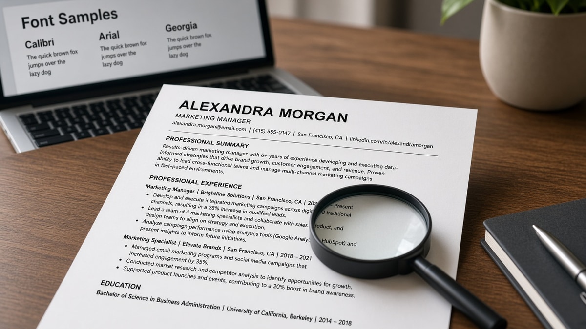
Start with one of these families for the full body. Adjust size before you swap typefaces again.
Calibri 11 pt for default corporate uploads
Word's default for a reason. Rounded sans letters export cleanly to PDF on Windows-heavy HR stacks. Use bold Calibri for Experience and Education headings, regular for bullets.
Before: Mixed Calibri body with a script name header; preview drops the header entirely.
After: Name in bold Calibri 14 pt, body 11 pt, plain hyphen bullets; contact line parses on one row.
Arial 10.5 to 11 pt when you need dense one-page files
Arial packs slightly tighter than Calibri without going below readable size. Good for early-career one-pagers with six bullets per role. Avoid Arial Narrow. It saves space and costs legibility in preview.
Georgia 11 pt when you prefer a serif
Georgia renders clearly on screen and in PDF text layers. Skip Times New Roman if your template applies automatic small caps to headings; small caps sometimes map to odd Unicode in older parsers.
I've opened thousands of Greenhouse previews where the only issue was a light custom font on the contact line; switching to Arial fixed parse order before we ever touched keywords.
Helvetica and Roboto on Google Docs exports
Docs users often pick Roboto or Helvetica. Both usually survive PDF download when you avoid weight 300 for body text. Use 400 regular for bullets, 700 for headings. Download PDF, don't share the link, before you upload.
Before: Resume built in Canva with Montserrat Light; Workday preview shows blank Experience.
After: Same content rebuilt in Docs with Arial 11 pt; Experience lines appear in correct order.
Size and spacing rules that matter as much as family
Body 10.5 to 12 pt. Section headings 12 to 14 pt bold. Line spacing 1.0 to 1.15. Margins 0.7 to 1 inch. Tab stops for dates beat text boxes aligned by hand. Text boxes often export out of reading order.
Copy-paste block: Word and Docs font settings
{`Microsoft Word
- Font: Calibri 11 pt (body), Calibri Bold 13 pt (section headings)
- Paragraph: Line spacing 1.08, space after 4 pt on bullets
- Bullets: standard round bullet, not Wingdings
- Contact: one line, pipe separators, no icons
- Export: File > Save As > PDF, "Best for electronic distribution"

Google Docs
- Font: Arial 11 pt body, Arial Bold 13 pt headings
- File > Download > PDF Document (.pdf)
- Avoid Add-ons that inject custom fonts before export

After export
- Upload to portal preview or ATS check
- Select all text in preview; if selection skips sections, fix layout`}
Edge case: federal or academic templates mandate Times New Roman 12 pt. Use the mandate for body, still skip text boxes. Scan anyway because older portals strip footers.
Edge case: you need a monospaced font for technical roles. Use Consolas only for inline tool names inside bullets, not the whole resume. One-line code snippets parse; full-page monospace does not always.
Lever and Greenhouse mobile previews shrink fonts further. If you're debating 10.5 versus 11 pt, choose 11 pt for mobile recruiters reviewing between meetings.
Bold entire sentences for emphasis and parsers still read them, but humans skim them as shouting. Bold one metric per bullet, not the whole line.
All caps section headings parse but read like alerts. Title case with bold Calibri scans calmer in iCIMS list view.
Read resume rejected by ATS when font fixes alone do not restore missing sections. Layout and file type may still be the blocker.
Type and layout combos that break parsers
Icon fonts for email and phone are the fastest way to lose contact info. Replace with words and digits. Parentheses around area codes are fine. Unicode phone glyphs are not.
Script or handwriting fonts for your name look memorable and often OCR as noise. Bold sans name line only.
Justified paragraphs add odd spaces parsers read as extra tokens. Left align everything.
White or light gray body text fails contrast in preview and sometimes drops in extraction. Stick to black or near-black.
Tables for layout, even invisible borders, reorder cells in Taleo. Use tab stops for dates instead.
Before: Two-column Canva resume with icon bullets; Skills column merges into contact block in preview.
After: Single-column Arial file; Skills follows Summary in correct order.
This won't fix missing keywords. It stops qualified files from looking blank because the parser never read bullet two.
Embedding fonts you downloaded from a marketplace can bloat PDFs and fail subsetting. System fonts keep file size sane for mobile recruiters too.
Don't fight font rules until layout is single column. Fancy type on a two-column grid still scrambles order.
Hyperlinks styled as buttons sometimes strip link text. Show the URL in plain Arial if the role expects GitHub or portfolio links in line.
Underlining whole lines for section breaks looks like links in PDF readers. Use bold headings instead of underline decorations.
Color-coded skills by category is pretty in Word and often flattens to one gray block in text view. Keep category labels as plain text headings, not colored shapes.
Saving as JPEG or PNG makes font choice irrelevant. Parsers cannot read image resumes. PDF or DOCX only unless the portal explicitly blocks PDF.
Headers and footers with page numbers sometimes duplicate contact lines in preview. Move contact info to the body margin once and delete the footer field before export.
Track changes and comments left on in Word can inject hidden characters. Accept edits and turn off markup before PDF save so parsers don't read reviewer names as part of your summary.
When you print to PDF from a browser instead of exporting from Word, fonts substitute more often. Use the app's PDF export path every time.
Test the export before you tune keywords
Upload the PDF to HireFlow's free ATS resume checker and confirm Experience lines appear in order. Fix font and layout first when sections shuffle.
Rebuilding from a broken Canva file? Build your resume in a single-column template with default sans type so you are not re-fighting export settings on every edit.
Do this now: Set Arial or Calibri 11 pt, remove icons, export PDF, scan once, then edit bullets knowing the parser can see them.
Set font once, then forget it
Pick Calibri or Arial at 11 pt, single column, standard bullets. Export PDF, scan preview, then spend your energy on bullets that prove fit. Font swaps are a one-time fix, not a weekly hobby. Once preview shows clean text, lock the template and stop tweaking type for every application.
Store the locked template as Resume-Master-Calibre11.pdf and duplicate for tailoring. That habit stops accidental font drift when you paste bullets from old versions that still carry Montserrat or Cambria from college career center templates.
- Apply the copy-paste settings block in Word or Docs tonight.
- Remove icons and text boxes from contact and skills areas.
- Export PDF and upload to portal preview once.
- Only then rewrite bullets for the next posting.
- Lock the template so font settings do not drift between versions.
When preview looks clean, run a free ATS check on the same file before your next application batch.
And if you're comparing portals, generate a cover letter in plain text styling too so the package matches the resume parser expectations.
Keep a screenshot of clean portal preview in your job search folder. When a new template tempts you, compare the screenshot first. If the old plain file parsed, you already won the font decision.
Read more
Frequently asked questions
Yes for most corporate portals when you export a clean PDF from Word or Google Docs. Serifs parse fine if you skip fancy ligatures and keep one font family for body text. Pair 11 pt Times with plain section headings, not Word art styles. If preview scrambles headings, switch to Calibri or Arial before you rewrite content.
Use one font for body and the same family bolded for headings, or one serif body with a matching sans heading only if both are standard system fonts. Mixing a display font for your name with a different body font often breaks PDF text layers. Recruiters forgive boring. Parsers forgive boring faster than they forgive cute.
10.5 to 12 pt for body, 12 to 14 pt bold for section labels. Below 10 pt, mobile preview shrinks and older recruiters squint. Above 12 pt body, one-page files spill to two without adding proof. Keep margins near one inch so lines do not wrap into odd breaks after upload.
Common choices like Arial, Calibri, and Georgia usually export cleanly from both when you download PDF. Exotic Google fonts may substitute on export and drop characters in Workday preview. Stick to fonts both apps list near the top of the menu. Scan after every export, not after every synonym edit.
Yes. Phone and email icons, social glyphs, and dingbat bullets often become empty boxes or shuffle contact lines to the footer in Greenhouse. Spell Email and Phone as words with plain punctuation. Save design flair for the portfolio site, not the upload file.