8 min read
You didn't miss keywords. Your layout sent them to the wrong job block. That's the gap most candidates never see because the portal preview still looks fine on their screen. You can't fix that with a font swap if the sidebar already scrambled read order.
Template shops sell visual hierarchy. Workday and Greenhouse import plain text and guess where sections start. When the guess is wrong, accuracy drops: wrong dates, missing skills, bullets attached to the wrong employer. That's how resume design reduces accuracy before anyone reads your verbs. You'll know it's layout when metrics from your current role land under an old internship in the paste test.
Before you swap fonts again, check your resume for free on the exact export you'll upload. If bullet one under your current title survives the paste test, you're fighting wording problems. If metrics jumped to an old role, you're fighting design.
Below you'll compare designed versus plain across the criteria parsers care about, see what each option does after upload, and get a simple rule for which file to send where. You don't need a second template tonight if the paste test already failed once.
Job searching is already draining. You don't need a pretty file that invents a weaker version of your career on import.
What parser accuracy actually measures
Accuracy isn't a vibe score. It's whether the system attached each fact to the right field: employer, title, start date, end date, bullet text, degree, skill list. When design scrambles read order, those fields fill wrong even though your PDF looks perfect.
Four criteria decide whether your file imports clean. Layout order (single column vs columns). Text containers (normal paragraphs vs text boxes and tables). Character set (standard bullets vs icons and wingdings). Header/footer behavior (contact repeated or dropped).
A designed resume often fails two or three at once. A plain resume passes all four with boring fonts and no graphics. That's why the same candidate can look overqualified in email and underqualified in the ATS profile.
For how file type changes the same layout, read how resume file type impacts screening . Design and format stack. Fix layout first, then pick DOCX or PDF.
Designed resume: visual wins, parser losses
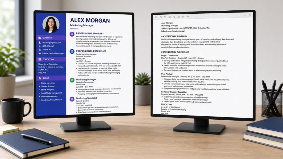
Designed templates optimize for the screenshot: colored sidebar, skill bars, logo strip, two-column timeline. Humans skim left rail for contact and skills. Parsers scan one stream and stitch columns left to right, row by row.
Two-column layout. Left rail holds Skills and certifications. Right rail holds Experience. On import, Skills may appear above your name. Your strongest metric bullet can sit under a college internship because the parser finished the left column before it reached your current title.
Tables and text boxes. A skills matrix looks tidy. Many parsers treat each cell as disconnected text. Tools you listed once import three times or vanish. Summary boxes float after Education instead of under Contact.
Icon bullets and graphics. Star ratings and chart bars carry zero text. Wingding bullets sometimes become blank lines. A QR code or headshot can push the first real bullet off page one in the imported view.
Headers, footers, and repeated name bands. Page-two footers with your name often import as body text. Recruiters then see your name mid-document where a bullet should be. Dates in colored pills at the margin drop entirely on some Greenhouse imports.
I've opened Workday profiles where the designed PDF on disk showed a director title and the parsed timeline still listed analyst from 2019 because the sidebar dates never mapped to the right employer block.
Designed files aren't dishonest. They're just read by a machine that doesn't understand your color scheme. Accuracy falls when decoration carries information the parser can't see.
Plain resume: boring layout, attached facts
Plain doesn't mean empty. It means one column, standard section headers, and bullets that stay under the job title you wrote. Contact at top. Experience next. Education and Skills after proof.
Single column read order. Name, phone, email, city on three lines. Summary as normal paragraphs. Each role: Job Title, Company, Month Year to Month Year on one or two lines, then bullets. Parsers and recruiters read the same story top to bottom.
Standard typography. Arial, Calibri, or Georgia at 10 to 12 point body. Bold for section headers and job titles. Round or hyphen bullets, not icons. Accent color optional if the file still reads clean in grayscale and plain text.
Lists instead of tables. Skills as comma-separated lines or simple bullets. No star ratings. If you used Salesforce in a bullet upstairs, list Salesforce once in Skills. Duplication beats a chart the parser ignores.
Example bullet that stays attached: "Built weekly churn dashboards in Looker, cutting reactive tickets 11% in Q3." That line belongs under the correct employer because nothing in the layout pulled it sideways.
Plain files still need strong writing. They don't fix applying to roles you're not qualified for. They stop a qualified file from dying because the parser invented a weaker timeline.
How resume design reduces accuracy: designed vs plain
Use this table when you're choosing tonight's upload. If the designed column wins on looks but loses on import behavior, send plain through the portal.
| Criterion | Designed resume | Plain resume |
|---|---|---|
| Column structure | Sidebars, split contact and Skills | One column, top to bottom |
| Job title + dates | Dates in margin boxes, often dropped | Title and Month Year on same block |
| Metric bullets | May attach to wrong role after column merge | Stay under the employer you intended |
| Skills section | Charts, bars, crowded tags | Plain list after Experience |
| Paste test result | Scrambled order, missing lines | Contact → summary → current role → bullets |
Import snippets: designed vs plain
Before: Skills: Python, SQL, Tableau. Phone: 555-0142. Intern, Data Analyst, 2019. Cut reporting time 40%. Senior Data Analyst, Northline Health, 2022 to present. (Metric from the senior role now sits under the internship.)
After: Maya Chen. Senior Data Analyst, Northline Health, March 2022 to present. Built self-serve Looker dashboards used by 14 clinic managers, cutting ad hoc report requests 40%. Data Analyst Intern, City General, June 2019 to August 2019. (Order and attachment match intent.)
Before: Two-column sidebar with Skills above Experience on paste test.
After: Single column with contact, current title, dates, then bullets in that order.
When the import snapshot tells the wrong story
The designed file didn't delete your senior role. It misfiled the proof. Recruiters filtering on recent scope see an internship bullet with a director-level metric and move on. You never get a human conversation to fix the mismatch.
Compare with why your resume looks different after upload in Workday when you need portal-specific symptoms. The fix is still flatten layout before you debate keywords.
Copy-paste accuracy check
Paste test (run on your upload file):
1. Upload or open the file in Word, then Select All → Copy → paste into Notepad.
2. Confirm contact lines appear before Experience.
3. Confirm your current job title appears before older roles.
4. Confirm bullet one under the current role still reads first for that job.
5. If Skills jumped above Experience or metrics moved, switch to plain layout.
Decision rule: which file to send where
Portal upload → plain single-column DOCX or Word-export PDF. Any application through Workday, Greenhouse, Lever, Taleo, or iCIMS gets the file that passes the paste test. No sidebar. No skill bars. No text boxes.
Email to a hiring manager who asked → designed optional. If they requested a PDF by reply and you know a human opens it first, a restrained design may be fine. Still keep one plain version ready when they forward you to HR.
Networking PDF → designed if readable, plain backup required. Hand someone a designed card at a meetup if you want. Save the plain export for the link they'll paste into their ATS later.
When in doubt, plain wins. You can always polish wording after layout survives import. You can't undo a scrambled profile after you click submit.
If you're trimming a designed template tonight, collapse columns first, convert tables to bullets second, strip icons third. Then rerun the paste test. Font personality is last.
For roles where minimal structure already performs well, see why minimal resumes perform better . Accuracy and minimalism overlap, but accuracy is the non-negotiable bar for portals.
Design traps that scramble imports
- Two-column sidebars. Skills and contact in a left rail reorder before Experience on import.
- Tables and text boxes. Each cell exports as disconnected text with no job attachment.
- Icon bullets and skill bars. Star ratings carry zero parseable text for keyword search.
- Headers and footers with your name. Page-two footers import as body text mid-document.
Test the export before you apply
Run the checker on the same file the portal will eat. If sections arrive out of order, design is the problem, not your verbs.
Run a free ATS check on your plain export. When bullet one stays under your current title and dates map cleanly, you can tailor keywords with confidence.
Draft a cover letter for email referrals while your plain file goes through the portal. Humans may read the letter first. The ATS still needs the parse-safe export.
Build a plain single-column resume if two paste tests fail on your template. Starting from a parser-safe base beats fighting a designed file for an hour.
Pick the file the parser can read
Designed resumes trade import accuracy for thumbnail appeal. Plain resumes trade flair for attached facts. Corporate hiring runs on imports first. Send plain through portals, keep designed copies for humans who skip the parser, and run a paste test before every batch apply.
Your metrics only help when they stay under the job that earned them. Layout is what keeps them there.
This won't fix applying to roles you're not qualified for. It stops a strong background from getting misread because a sidebar shuffled your timeline.
Read more
Frequently asked questions
Not always, but designed files fail more often because sidebars, tables, and icon bullets change read order. A light accent color on headers may survive. A two-column layout with metrics in the right rail often attaches those numbers to the wrong employer. Run a paste test on the export you plan to upload before you trust the template.
Plain does not mean ugly. Single-column Calibri with bold job titles and tight bullets scans fast for humans too. Recruiters spend seconds on the first screen. They want proof in Experience, not a sidebar chart. Design that hides weak bullets behind graphics hurts you with humans and parsers.
DOCX from Word or Google Docs usually preserves text order better than PDFs exported from design tools. If the posting allows either, test both with a paste check. If the posting requires PDF, export from Word rather than Canva so tables and columns flatten more predictably.
Yes, keep two files. Use the plain upload for corporate portals in Workday, Greenhouse, Lever, Taleo, and iCIMS. Save a designed PDF for email introductions when a human asked for your resume directly. Never send the designed file through a portal that parses before a recruiter opens it.