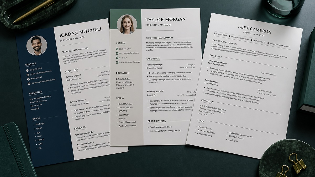
The best ATS resume template in 2026 is single-column, reverse-chronological, and built with standard headings, plain text contact details, consistent dates, and ordinary bullets. Choose visual hierarchy through typography and spacing, not sidebars, charts, icons, or text boxes. Export selectable text, test its reading order, and follow the employer's requested file type.
A template cannot guarantee an interview, and there is no defensible product ranking that predicts every employer's configuration. The useful comparison is feature by feature: which structure preserves meaning during extraction, which design helps a recruiter skim, and which elements create risk without adding evidence.
This commercial comparison gives you criteria for choosing a format, not invented pass rates. If you want to build while applying those criteria, start with the free ATS resume builder. For a deeper explanation of matching, read what a good ATS score actually means.
Key Takeaways
- Rank template features, not unsupported brand claims.
- Choose one column and a predictable top-to-bottom reading order.
- Use standard headings and keep dates beside each role.
- Let spacing and typography create polish.
- Test the populated export, not the attractive blank preview.
- Tailor content after the template passes the structure check.
What “passes ATS” means for a resume template
“ATS friendly” is often used as if software makes one pass-or-fail decision based on graphic design. In practice, an applicant tracking system supports an employer's recruiting workflow. It can store the original document, extract text, populate candidate fields, support searches, present application answers, and connect with other tools. The employer decides how those functions fit its process.
A template succeeds at its job when essential content survives extraction in a sensible order. Your contact details remain identifiable. Titles stay connected to employers and dates. Bullets remain under the correct role. Skills are words rather than pictures. Education and certifications appear as distinct facts. The visible file also remains comfortable for a person to review.
Workday, Greenhouse, Lever, and Taleo are not one shared parser, and employers configure them differently. No template maker can truthfully promise identical results in every environment. A safe structure reduces common sources of failure. When an application shows parsed fields, inspect those fields and correct errors before submission if editing is available.
Passing does not mean matching the job. A flawless file can lack required experience. A strong match can still lose because of a knockout response, location restriction, work authorization issue, or stronger applicant pool. Separate the structure test from the qualification and keyword test. The template carries your evidence; it does not create that evidence.
Hiring decisions should use job-related criteria and comply with applicable law. The U.S. Equal Employment Opportunity Commission offers applicant information, and the Society for Human Resource Management provides HR practice resources. A public scanner cannot audit the full fairness or legality of a hiring process.
Key Takeaway: A template passes its practical test when it preserves readable, correctly ordered evidence. It does not earn a universal software approval badge.
ATS template feature comparison: safer choices versus risks
Evaluate a template with realistic content. A blank sample with two short jobs may look clean, but the true test comes when you add a long employer name, a remote location, overlapping consulting work, eight bullets, certifications, and a portfolio URL. Good templates expand without breaking their relationships.
| Feature | Recommended | Why alternatives fail |
|---|---|---|
| Columns | One continuous column | Parallel blocks can interleave during extraction |
| Headings | Experience, Skills, Education | Creative labels weaken recognition and skim speed |
| Contact | Plain text in body | Header, footer, and icons may be skipped |
| Dates | Consistent month and year beside role | Timelines detach dates from employers |
| Skills | Plain text grouped by category | Bars and logos do not state searchable proficiency |
| Design | Readable font, spacing, light accent | Shapes and text boxes complicate reading order |
| File output | Selectable PDF or ordinary DOCX | Scans and flattened images contain no reliable text |
A modest accent color is usually harmless because meaning still exists in the words. Color becomes a problem when it reduces contrast or becomes the only way to distinguish categories. Likewise, a horizontal rule can separate sections without affecting extraction. A progress ring showing “80% leadership” communicates neither a recognized skill nor verifiable evidence.
Templates should support ordinary editing. If adding one bullet causes dates to jump, text to overlap, or a second column to drift, the design is too fragile for repeated tailoring. Your resume will change for different roles. The format should make accurate customization easier, not punish it.
Key Takeaway: Choose the template whose structure survives real content. Decorative restraint is useful when it protects order, contrast, and editing speed.
Which resume template type fits your career stage
Most candidates should begin with a reverse-chronological template. Recent, relevant work appears first, and the repeated title-employer-date pattern is familiar to recruiters and parsers. This format suits steady career progression, lateral moves, promotions, and many career changes when transferable evidence is selected carefully.
Students and recent graduates can still use reverse chronology. Place Education near the top, followed by Skills, Projects, internships, campus roles, and employment according to relevance. A project is not paid experience, so label it honestly. Give it dates, tools, purpose, individual contribution, and output just as you would any evidence block.
Career changers may benefit from a short summary and compact Skills section before Experience. Avoid a purely functional template that removes dates and employers from achievements. Recruiters often need chronology, and applications may request it separately. Use a hybrid only in the limited sense of adding a relevant summary and skills layer above complete work history.
Senior leaders need space for scope: functions led, team size where relevant, operating scale, decision authority, transformation work, and business outcomes. Two pages are often more readable than compressing twenty years into tiny type. Earlier roles can receive fewer bullets, while recent and target-relevant work carries detail.
Technical candidates need a template that handles Projects, Publications, Patents, Open Source, or Technical Skills without turning them into a logo wall. Designers can include a written portfolio URL and describe product outcomes in text. The resume remains an evidence index; the portfolio demonstrates the visual work.
Whatever the career stage, do not select a template because its sample candidate resembles your occupation. Select it because the sections fit your evidence. A “developer template” with skill bars is weaker than a general professional template that cleanly supports languages, frameworks, infrastructure, projects, and impact.
Candidates with contract, freelance, or portfolio careers need the same chronological clarity. Group projects under a consulting business only when that is the truthful work arrangement, then identify representative clients or engagements without breaching confidentiality. Give the overall practice a date range and give selected projects enough context to show role, output, and technology. Do not scatter dates into a visual timeline that separates them from the engagements.
Applicants returning after caregiving, health, education, military service, or another career break do not need a graphic format to hide time. Use complete dates for employment and add a brief Career Break entry when it improves understanding. Focus that entry on relevant study, volunteer work, projects, or plainly stated caregiving only when you choose to share it. The template should make chronology understandable without demanding personal detail.
Academic and research candidates may need publications, presentations, grants, laboratory methods, or teaching. A resume for an industry role should select the evidence most relevant to that employer rather than reproducing a full curriculum vitae. Use standard section labels and consistent citation formatting. Keep publication titles as text, not screenshots, and provide a researcher profile link when it helps the reviewer reach the complete record.
Federal, government, and some regulated applications can request information that differs from a private-sector resume. Follow the agency or employer instructions even when the resulting document is longer. The correct template is the one that supports required content while preserving clear relationships. Generic advice about page count or section order never overrides explicit application directions.
Key Takeaway: Career stage changes section emphasis, not parsing fundamentals. Keep complete chronology and move the most relevant proof where recruiters can find it quickly.
Before-and-after template choices that improve parsing
These examples compare structure, not candidate quality. The “after” version does not invent experience; it makes existing facts easier to extract and evaluate.
Before: Name and contact information appear in a graphic header with phone and email icons.
After: Jordan Lee | Austin, TX | 512-555-0100 | [email protected] | linkedin.com/in/jordanlee appears as selectable text in the body.
Before: A left sidebar lists dates while the right column lists employers, titles, and bullets.
After: Product Analyst — Meridian Software | Austin, TX | Jan 2023–Aug 2026 appears as one connected heading above its bullets.
Before: Skill logos and five-dot ratings represent Excel, SQL, Tableau, and Salesforce.
After: Data: SQL, Excel, Tableau | CRM: Salesforce appears in plain text, with priority tools repeated in evidence-bearing bullets.
Before: “My Journey” contains work history, education, volunteering, and certificates on one illustrated timeline.
After: Experience, Education, Volunteer Experience, and Certifications use separate standard headings and reverse chronology.
Content quality still determines value. Once the format is clean, change generic duties into evidence. “Responsible for reports” should become a truthful statement naming the report, tools, cadence, audience, and outcome where known. Do not add sample metrics. Use records you can verify and explain.
Candidates considering visual builders should compare both Canva discussions: whether Canva resumes are ATS friendly and how Canva exports perform in ATS checks. The product name alone does not decide safety; the selected layout and export do.
Key Takeaway: Move meaning out of position, imagery, and decoration and into selectable words that remain connected after extraction.
Seven-step checklist for choosing and testing a template
- Reject layouts with sidebars, floating text boxes, overlapping shapes, decorative timelines, or essential information in headers and footers.
- Confirm the template uses standard headings and supports the sections your career stage needs without renaming them.
- Fill the template with realistic long titles, employers, dates, bullets, education, skills, certifications, and links.
- Check readability at normal zoom: body type, contrast, margins, line length, bullet spacing, and page breaks should feel comfortable.
- Export the exact file type requested by the employer and confirm that all important text can be selected and copied.
- Paste the entire document into a plain-text editor and inspect reading order, missing content, merged lines, and detached dates.
- Tailor the resume to one posting, run an ATS check, and complete a final human review before submitting.
Build from a parser-safe foundation
Create a clear resume, tailor its content, and export a professional file without risky layout elements.
Build your ATS-ready resume freeRepeat the extraction test after major changes. A template may work on page one and break when a new role pushes a heading to page two. Also confirm that links remain clickable and written destinations remain understandable. An icon-only portfolio link becomes useless when the icon disappears.
Save a clean master copy, then duplicate it for each target role. Tailoring should change summary emphasis, selected skills, bullet order, and relevant detail without changing factual history. Keep submitted versions so your interview examples match the employer's copy.
Key Takeaway: Judge a template only after filling and exporting it. The finished candidate file is the real product, not the marketplace preview.
Resume template mistakes to avoid in 2026
Do not buy a template because a seller claims a perfect ATS score without naming a transparent method. There is no single public test that reproduces every employer's Workday, Greenhouse, Lever, or Taleo setup. Ask whether the file uses safe structure and whether you can test the actual export yourself.
Avoid templates that force a photo. In the United States, a headshot is generally unnecessary for most roles and consumes valuable space. It can also add bias concerns that do not help your application. Use a professional profile URL when the role benefits from an online presence.
Avoid rating systems. “Four out of five” for Python, negotiation, or leadership has no shared definition. State the skill and prove scope through work. Certifications can include the issuer and status. Language proficiency can use established labels such as native, professional working proficiency, or another accurate framework.
Do not hide gaps by deleting dates or grouping unrelated roles under a broad heading. Employers may request complete chronology in the application anyway. Use month and year, label contract work accurately, and explain a career break briefly when it helps understanding. Clear history is easier to trust.
Avoid shrinking margins and type until the page becomes exhausting. Page count is not the only design criterion. A readable two-page resume can outperform a cramped one-page file in human review. Remove stale tools, repeated duties, generic objectives, and irrelevant early detail first.
Finally, never treat a template as finished content. The structure can pass extraction while generic language fails to distinguish you. Use role-specific ATS keyword guidance to tailor accurate terminology after the format is stable.
Key Takeaway: Ignore absolute marketing promises. A trustworthy template exposes its structure, remains editable, and lets you verify the exported reading order.
Choose structure first, then make the resume yours
A strong template is a reliable frame: one column, clear hierarchy, familiar labels, connected chronology, and flexible sections. Your facts make it persuasive. Select role-relevant evidence, use language the target employer recognizes, and preserve enough context for a recruiter to evaluate every claim.
Create your version with the HireFlow free resume builder, then verify the result using the ATS resume checker. Test structure before match, and never replace accurate content with a template seller's sample language.
Key Takeaway: A template should disappear behind your evidence. Build on a safe frame, tailor honestly, test the export, and submit a document made for human review.
Frequently asked questions
A single-column reverse-chronological template with standard headings, normal fonts, plain text contact details, and simple bullets is the most dependable choice. It preserves reading order and keeps each title, employer, date range, and achievement together.
No. A resume can use restrained color, clear typography, spacing, and a visible hierarchy without adding parsing risk. The safest design choices improve navigation rather than storing meaning in icons, charts, text boxes, sidebars, or decorative timelines.
Some systems may extract them successfully, but columns add reading-order risk with little hiring benefit. Skills or dates can merge into unrelated experience. When clean parsing matters, choose one column instead of testing whether a particular employer configuration handles the design.
Use the file type requested by the employer. A selectable PDF exported from a simple source file often preserves appearance well. A clean DOCX also works when it uses ordinary paragraphs and bullets. Avoid scanned PDFs, floating text boxes, and image-based content.
A simple Canva design with selectable text may parse, but many layouts rely on columns, icons, shapes, or positioned text blocks. Those choices increase risk. Review the exact export in plain text before using it, and move to a conventional template if reading order breaks.
One page often suits students and early-career applicants; two pages can suit experienced candidates with relevant evidence. ATS software does not create a universal one-page rule. Prioritize readable proof and remove low-value material before shrinking fonts or margins.
They do not require a branded template. Workday, Greenhouse, Lever, and Taleo can be configured differently, yet all benefit from clear text and predictable sections. Test parsed fields when available and follow the application instructions for file type and required information.
Fill it with realistic content, export the final file, and paste all text into a plain-text editor. Check contact details, section order, titles, companies, dates, bullets, education, and keywords. Then upload it to a resume checker and inspect any parsing or match gaps.