10 min read
Your PDF looks sharp on your laptop, but Workday imports the same file with half the letters missing from your job title. That's usually font choice, not keyword density. The parser doesn't care how the PDF looked in Preview. When the typeface is decorative, condensed, or mixed with icons, characters drop before a recruiter ever sorts the list.
Check your resume for free with the posting on your screen. You'll see whether employer names and titles landed as readable strings or whether a pretty header font stripped them on export.
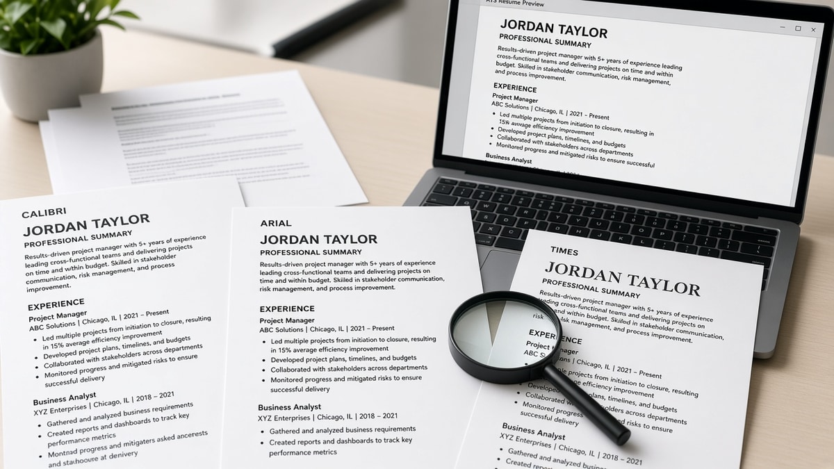
Below you'll see how we judge the best fonts for ATS resumes against plain-text imports, side-by-side Calibri, Arial, Georgia, and Times notes, before/after pairs across five roles, decorative fonts to skip, and a copy-paste settings block. Job searching's already draining. This page is about fixing type on the file you've got tonight.
If you've been told any font works in a PDF, that's only half true. Text-selectable PDFs from Word behave differently than Canva exports with outlined type. We're treating the Notepad paste as the truth test, not the thumbnail preview.
Quick Wins
- Pick one standard font for the entire file: Calibri, Arial, Georgia, or Times New Roman.
- Set body text to 11 point and headers to 12 or 13 point in the same family.
- Paste the exported PDF into Notepad before you upload to any portal.
- Delete script, display, and icon fonts even if the template looked premium.
Calibri, Arial, Georgia, and Times: best fonts for ATS resumes compared
We judge fonts on one question: after export, does every character in your contact block and first job title appear in plain text in the right order? Fancy layout does not count. If the Notepad paste is clean, the font is a safe default for Workday, Greenhouse, Lever, Taleo, and iCIMS imports.
Calibri (sans-serif, Word default): Soft, modern, and familiar on US corporate files. Use 11 point body. It survives DOCX uploads well. Risk shows up when you mix Calibri body with a display header font from a purchased template. Keep headers in Calibri Bold instead.
Arial (sans-serif, universal): The cross-platform workhorse. Slightly wider than Calibri, which helps when you export from Google Docs or share between Mac and Windows without substitution warnings. Good for operations, sales, and tech roles where sans-serif is the norm.
Georgia (serif, screen-friendly): Clear serifs that still parse as plain text. Works when you want a traditional feel without going full Times. Policy, education, and editorial roles still show serif files in hiring packets. Stay at 11 point minimum.
Times New Roman (serif, formal): Narrower than Georgia. Fine for one-page files when you need to fit ten years of scope. Some candidates push to 10.5 point to save lines. That is where parsers start dropping punctuation. Prefer 11 point and trim bullet text instead.
Edge case: the posting asks for a PDF and you only have Word. Export a text-selectable PDF from Word with fonts embedded. If the portal also accepts DOCX, upload DOCX when the preview screen shows field mapping. Read PDF vs Word resume for ATS when the employer specifies a format.
Edge case: you need a monospace line for GitHub or repo URLs. One inline code line in Consolas or Courier New inside an otherwise Arial file usually parses. Do not set the whole resume in monospace. Parsers treat wide code blocks as tables on some older Taleo builds.
Edge case: Mac Pages or design tools default to Helvetica variants. Export to PDF, paste into Notepad, and confirm dotless i characters and accented letters in your name survived. Substitutions often show up as blank squares in the import preview, not in your preview pane.
The bar is boring type that survives paste. You are not picking a font to express personality at the parser stage. You are picking one that keeps your title searchable after import.
Before/after font fixes across five roles
Each pair shows the plain-text read a portal likely stored, not how the PDF looked in Preview. Weak versions use decorative or mixed fonts. Strong versions use one standard family at consistent sizes. Swap the role that matches your file.
Marketing coordinator (Canva script header)
A mid-level marketer had a two-column Canva export with a script name line and sans body. The parser merged columns and dropped vowels from the title row.
Before: plain-text paste after export
J b T tle: M r k t ng C rd n t r
Cmp ny: N rthw nd M dia
Sk ll : M t , G ogle nalyt cs, Hoot uite
After: single-column Calibri 11 pt in Word, same content
Job Title: Marketing Coordinator
Company: Northwind Media
Skills: Meta Ads, Google Analytics, Hootsuite
Registered nurse (condensed display font)
A clinical candidate used a condensed display font at 9.5 point to fit three travel contracts on one page. Human readers squinted. The import skipped the license line entirely.
Before: plain-text paste
RN  BSN
Lic nse:
Experience St Mary s Hospital
After: Arial 11 pt, license on its own line
{`RN, BSN
License: State of Illinois Active
St. Mary's Hospital, Med-Surg, 2022 to Present`}
Data analyst (mixed serif header, sans body)
Mixing Georgia headers with Arial bullets looks fine in Word. Some PDF engines outline the header font while leaving body text selectable. Search then misses SQL and Tableau in the experience block.
Before: search preview in a checker showed SQL only in Skills footer
After: Georgia 11 pt throughout; SQL and Tableau appear in the first bullet under the current role
Before: Built dashboards for leadership team.
After: Built Looker dashboards in SQL and Tableau for finance ops, cutting weekly reporting time from 6 hours to 90 minutes across four business units.
Administrative assistant (symbol bullets and Papyrus-style font)
Icon bullets and novelty serif fonts turn into question marks or empty boxes during import. Assistants often list software in tight lines that break first.
Before: plain-text paste
?? Managed calendars for VP team
?? Advanced Micr soft Off ce
After: Times New Roman 11 pt with hyphen bullets
- Managed calendars for three VP direct reports
- Advanced Microsoft Office, Zoom, and Concur
Career changer (template display font for name)
A teacher moving into instructional design used a large display font for the name and a thin light weight for body text. The name imported as separate letters. Email and phone merged onto one line.
Before: contact block paste
A L I C E J O H N S O N alice.johnson email.com 312 555 0192
After: Arial 14 pt name, 11 pt body, one line per contact field
Alice Johnson
[email protected] | 312-555-0192 | Chicago, IL
Copy-paste font settings block
Paste this checklist into a comment in Word or Docs before you export tonight. Swap the font name once and apply to the whole file.
FONT CHECKLIST (pick one family for all text)

[ ] Font: Calibri OR Arial OR Georgia OR Times New Roman
[ ] Name line: 14 pt Bold, same family
[ ] Section headers: 12 pt Bold, same family
[ ] Body and bullets: 11 pt Regular, same family
[ ] Bullets: standard hyphen or dot, not icons
[ ] Export: DOCX or text-selectable PDF from Word
[ ] Test: paste full file into Notepad; read first job block
[ ] Upload preview: employer and title on separate lines
Read how to handle special characters that break ATS when your name or employer includes accents, apostrophes, or ampersands that still drop after a font fix.
I've opened enough Workday imports to know a decorative name line is the first thing I stop searching when titles come through as single letters.
Decorative fonts and formatting pairs to skip
Script and handwriting fonts. Brush Script, Lucida Handwriting, Lobster, and similar faces break letter spacing on export. They are the fastest way to lose vowels in job titles.
Novelty display fonts. Comic Sans, Papyrus, Impact as body text, and rounded "friendly" template fonts read unprofessional and parse poorly. Recruiters forgive boring. They do not forgive unread imports.
Ultra-light or ultra-condensed weights. Thin Helvetica Light at 9 point looks elegant until PDF rasterization drops strokes. Condensed faces squeeze letters together so parsers read one word as two.
Custom downloaded fonts not embedded on export. A free "resume font pack" from a marketplace often substitutes to Arial on the recruiter machine but outlines on upload. Embed fonts in Word or stick to system defaults.
Icon fonts and dingbats for bullets. Phone glyphs, envelope icons, and checkmarks in icon fonts become empty boxes. Type the words Phone and Email or use plain punctuation.
Two-column templates with different fonts per column. Sidebars in sans serif and history in serif scramble read order in Lever and iCIMS. Move to single column before you change fonts. Read the best resume template ATS can read when layout and font fail together.
All-caps display headers with letter-spacing tricks. Increased spacing between caps looks premium in InDesign. Parsers store M A R K E T I N G as separate tokens that do not match Marketing in the req.
Edge case: creative roles that expect portfolio layout. Keep the creative PDF for humans and maintain a plain single-font DOCX for portals. Do not upload the layout-heavy file because it "matches the brand."
Edge case: federal or academic CVs that require Times at 12 point. Length is expected. Still avoid watermarks and mixed footers. Times at 12 is fine when the whole file uses it consistently.
Verify font and text before the portal eats the file
Upload your exported file to HireFlow's free ATS checker with the posting text pasted in. Confirm job titles, employers, and skills appear as words, not blanks or single letters. That catches font swaps faster than staring at the PDF thumbnail.
When a portal asks for a plain-text cover note, use the cover letter generator and paste into the box without bringing over header fonts from the resume. Plain Arial or Calibri in the letter matches the boring file that parsers prefer.
Save the checker result beside the version number in your filename, such as Johnson_Resume_Arial_v2.pdf. If import still fails, paste into Notepad again before you burn another application slot on the same broken export.
Pick one boring font tonight
The best fonts for ATS resumes are the ones that survive a Notepad paste after export: Calibri, Arial, Georgia, or Times New Roman at consistent sizes. Decorative type wins a glance on your screen and loses your title in the import row recruiters search.
Open your file, select all, apply one family at 11 point, replace icon bullets with hyphens, and export again. Paste into Notepad before you upload. If the first job block reads clean, you are done with fonts for this version.
You do not need a new template pack. You need one readable typeface and a test paste. That is what keeps qualified files from dying before keyword matching even starts.
- One font family for name, headers, and bullets.
- 11 point body, 12 to 14 point headers, standard bullets only.
- Notepad paste plus a free checker run before every portal upload.
Read more
Frequently asked questions
Both pass parsers when you keep one font at 10.5 to 11.5 point body size in a single-column DOCX or text-selectable PDF. Calibri is the default in newer Word files and reads slightly softer on screen. Arial is the safer pick when you export from Google Docs or share files across Mac and Windows. Pick one and use it for the whole file.
Yes. Georgia and Times New Roman are standard serif fonts that parsers treat as plain text. They work well for legal, academic, and policy roles where serif tradition still shows up in hiring packets. Keep body text at 11 or 12 point and avoid mixing serif body with sans-serif headers unless you test the export in Notepad first.
They stand out in the wrong queue. Script, display, and icon fonts break title extraction in Workday and Taleo, so your experience section can import blank while the PDF looks fine on your screen. Recruiters notice clarity in the first eight words of a bullet, not a cursive name line they cannot search.
Use 10.5 to 11.5 point body text and 12 to 14 point section headers in the same font family. Smaller condensed type saves space but drops characters during PDF export. Larger display type pushes contact lines onto a second page where footers sometimes get skipped.
Save the file, paste the full text into Notepad or TextEdit, and read the first job block. If letters are missing or job titles merged with company names, change the font before you upload. Then run the same file through a free checker with the posting pasted in so you catch gaps before the portal import screen.