6 min read
That designer template isn't cheating the system. It's just written for eyes, not import order.
You don't need a blank document. You need a file where the portal preview matches what you typed.
If you've been tweaking keywords while preview still shows skills above your current role, layout's the leak. Fix structure first, then tune language. You'll save time once import order stops fighting you.
Check your resume for free after you flatten columns so section headers still land in order.
Quick Wins
- Switch to one column before you change bullet wording.
- Paste the file into Notepad once; jumbled order means the ATS sees jumbled order.
- Open employer preview and read top to bottom aloud before submit.
What changes when plain formatting hits an online portal
Upload isn't email. The system strips styles, walks the document in file order, and maps text into fields. Anything that isn't linear text becomes noise or empty rows.
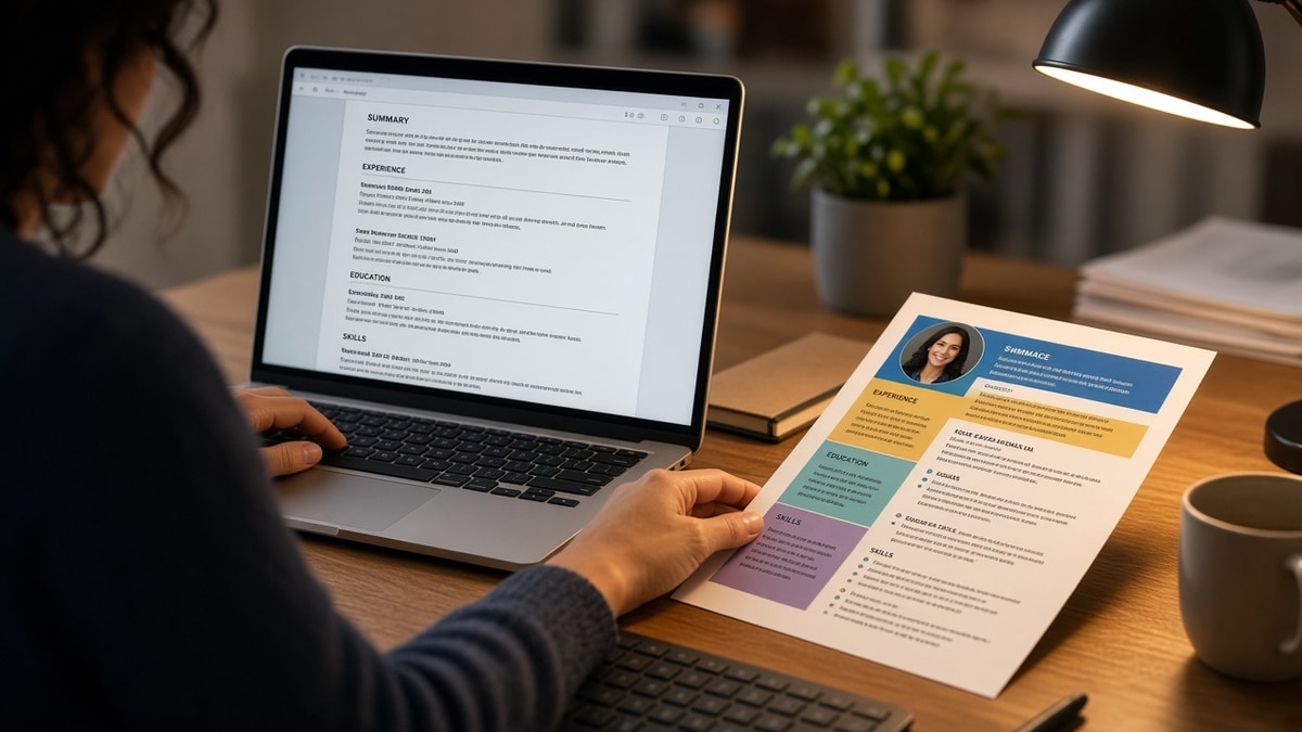
Columns split your timeline. A left rail of skills can import before your latest employer, so matchers attach tools to the wrong dates.
Tables look tidy on screen but parsers often read cell by cell, not row by row. Job title in column one and bullets in column two may never reunite in the database view recruiters search.
Headers and footers are risky storage. Contact lines parked in a footer sometimes vanish from preview while the body looks fine in Acrobat.
Plain doesn't mean ugly. It means Calibri or Arial at 11 points, bold section labels, and bullets that stay under the employer line they belong to.
Pair this with resume formatting errors that break ATS parsing when you need a trap-by-trap list beyond layout.
Plain layout checklist for upload night
| Element | Plain default | Why it matters online |
|---|---|---|
| Layout | Single column | Preserves top-to-bottom job order |
| Fonts | Arial, Calibri, Helvetica | Embeds cleanly in DOCX and simple PDF |
| Emphasis | Bold headers and titles | Readable without color or icons |
| Lists | Standard bullets | Each achievement stays a separate line |
| Dates | Month Year to Month Year | Less garbling than slashes alone |
Before: Two-column template with skills rail; portal preview lists Python and SQL before your employer name.
After: Skills section after experience; tools still appear inside bullets under dated jobs.
Before: Blue section headers and divider lines; preview shows blank gaps where color blocks were.
After: Bold black headers, same words, no shading; preview text matches your PDF.
Copy-paste barebones header block:
YOUR NAME
City, ST | phone | email | linkedin.com/in/handle

TARGET TITLE (matches posting)

SUMMARY
Two lines max. Role family plus scope.

PROFESSIONAL EXPERIENCE
Company Name | Job Title | Month Year to Month Year
- Bullet with tool and outcome
- Bullet with metric from your real work

SKILLS
Short list, comma or bullets

EDUCATION
School | Degree | Year
I've passed on strong candidates in iCIMS when preview showed their MBA above a decade of engineering roles because the template parked education in a top banner. The PDF looked senior; the parsed record read like a new grad.
Hyperlinks can stay as typed URLs. Fancy link styling often strips on import, so spell the full path instead of hiding it behind button graphics.
Keep each job block contiguous. Don't force a page break between employer name and its bullets. Parsers sometimes treat the split as two unrelated entries.
When you must save PDF, export from Word or Google Docs with standard fonts. Design-tool PDFs are where custom encoding surprises show up in preview.
Decorations that survive PDF but not import
- Skill meters, star ratings, and progress bars (empty cells after parse).
- Text inside shapes or callout boxes (often imports last or never).
- Multiple font families in one section (parser thinks sections changed).
- Creative section names recruiters won't search (rename to Experience and Skills).
- Logos and headshots (treated as images, not searchable text).
A polished PDF on your screen isn't proof. Portal preview is proof.
See the best resume template is the one ATS can read when you're choosing between pretty marketplace files.
White text on colored bands is a common Canva trick. Parsers may read the letters and lose contrast metadata, but humans in preview mode see missing lines.
Test like the portal reads it
Upload to a sandbox profile or use the employer's preview pane. If you can't find your email after import, it was never in the body text.
Run the ATS check on the flattened file so headers and employer lines still pair with bullets.
Generate a cover letter when you need to carry scope that won't fit on a tight one-page layout.
Make the preview your source of truth
The gap you care about is design view versus ATS record. When those two views match, keyword edits finally attach to the right jobs.
Strip layout risk tonight, re-upload once, and save that preview screenshot beside the file name. You'll know which version actually went out the door.
This won't rescue a role you're underqualified for. It stops a qualified file from dying because the parser never saw your current title on page one.
If you're choosing between prettier margins and a clean import, pick the import every time until callbacks pick up.
Save the plain version as your master file, then branch copies for tailoring so you never reintroduce columns by accident.
Read more
Frequently asked questions
You can, but many portals read down one column first. Skills in a sidebar often import before your current job. For online uploads, a single column is the safer default.
Treat them as decoration. Parsers usually skip graphics and may leave blank rows where bars sat. List tools as plain text bullets or a short comma line instead.
Standard bold on headers and job titles is fine. Avoid text inside shapes, tables, or headers and footers. If preview drops a section, move it into the body as plain bold lines.
Follow the posting. When the portal accepts both, a clean DOCX with simple styles often survives import better than a design PDF. Always open preview before you submit.
Recruiters expect scannable structure, not poster art. Tight bullets, consistent dates, and clear section labels read as professional on screen and on paper.