11 min read
Your infographic resume looks sharp on screen. The upload preview in Workday or Greenhouse often doesn't. Skill bars, icon rows, and magazine-style columns are built for human eyes. Parsers read one text stream and map what they find to employer, title, dates, and skills. When those fields scramble, you're not underqualified. Your file's unreadable to the software that screens first.
You don't need to abandon design taste. You need a plain, single-column upload with real text labels, then a portfolio link for the visual story. Check your resume for free on the export you'll actually submit. A clean parse won't fix a weak match to the posting, but a garbled parse can bury a strong candidate before a recruiter opens the PDF.
Job searching's already draining. This walkthrough takes about thirty minutes on a master file you'll reuse. Run one text test, strip the graphics that replaced words, rebuild in a boring layout, link your portfolio, then preview the upload. No lecture on design theory. Just hands on the keyboard.
Quick Wins
- Paste your export into Notepad today. If contact info vanishes or columns merge mid-sentence, stop applying until you rebuild.
- Replace every skill bar with a plain word list: Figma (advanced), Sketch (working knowledge).
- Move your designed portfolio to a header link. Upload the boring text file to the ATS.
- After you rebuild, run the export through HireFlow before the next application batch. One preview beats guessing which template lied.
What an infographic resume is (and why ATS cannot read it)
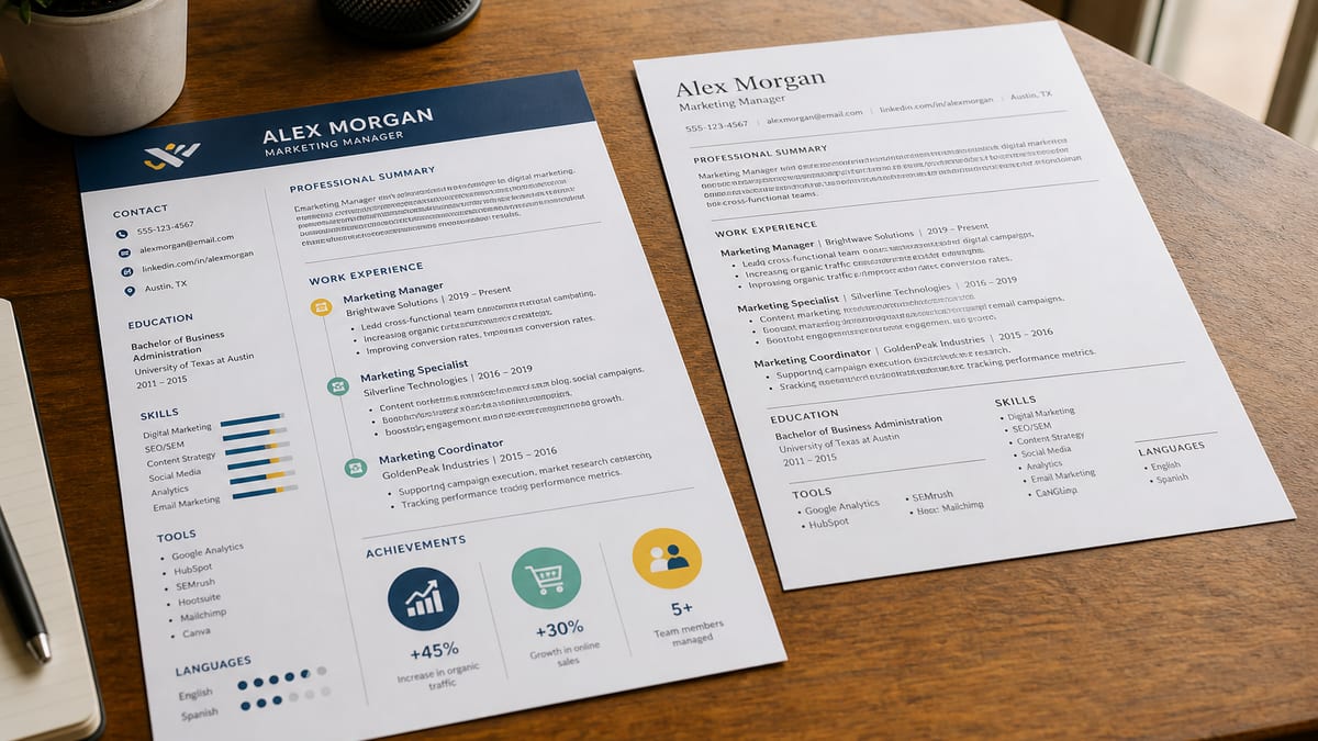
These layouts swap standard written sections for visual shortcuts. Icon rows instead of a skills list. A circular timeline instead of Month Year dates. Star or percentage bars instead of proficiency in words. A two-column magazine grid with contact details trapped in a sidebar. The PDF still looks intentional to you. The parser often sees missing fields, merged lines, or random word order.
Parsers do not score design. They score extractable text. Workday, Greenhouse, Lever, Taleo, and iCIMS all start by pulling characters out of your file and hunting patterns: job titles near dates, employer names above bullets, skill tokens in a list. Graphics with no underlying text string contribute nothing. Multi-column layouts read left to right across the page width, which stitches unrelated content into one line.
Text boxes in Word or Canva exports are a separate trap. Content inside a floating box sometimes never leaves the box on export. The human PDF keeps the layout. The plain-text paste drops entire jobs. That is why a file that wins a design award can still lose in screening.
The contrast most candidates miss: the thing that kills the file is not missing keywords alone. It is layout that puts keywords in places the parser never reads. A mid-level marketing analyst whose top bullet still reads Responsible for weekly reports has a writing problem. A designer whose Figma skill sits inside a five-star icon has a format problem. Different fixes.
If your export settings are part of the issue, read DOCX export settings that improve US ATS parsing before you blame the template marketplace. Sometimes the layout is fine in the editor and breaks only on save.
How to replace a visual resume with a plain ATS-safe format
Step 1: Run the Notepad test and save what the parser sees
Open the exact PDF or DOCX you plan to upload. Select all, copy, paste into Notepad or TextEdit in plain-text mode. Do not paste into Word first. You want the raw character stream, not a cleaned-up version.
Read top to bottom like a recruiter skimming a parsed preview. Does your name appear first? Do phone and email show as words, not blank lines? Do job titles sit above their bullets, or does a skills sidebar inject words mid-paragraph? Screenshot the paste if it looks wrong. That screenshot is your rebuild brief.
Before: Paste shows Photoshop 80% merged with March 2022 Senior Designer Acme contact block empty.
After: Name, email, phone on line one. Senior Designer, Acme Co., Mar 2022 to Present on its own line. Skills list reads Figma, Photoshop, Illustrator as plain words.
Step 2: Strip every graphic that replaced a word
Work section by section. Contact row first. Replace phone, email, and LinkedIn icons with spelled-out labels on one line each. Skills next. Delete bars, stars, and donut charts. Rewrite tools as a comma list or short bullets with proficiency in words, not shapes.
Experience and education last. Kill timeline graphics. Put Month Year dates beside titles in one column. If a promotion graphic showed two roles inside one circle, split them into two lines under one employer header.
Graphic designer example:
Before: Five-star icon row beside Figma, Sketch, Adobe XD
After: Skills: Figma (advanced), Sketch (working knowledge), Adobe XD (familiar)
Data analyst example:
Before: Circular timeline with SQL and Tableau icons on a ring
After: Senior Data Analyst, Northline Health, Jan 2021 to Present, then a bullet that names SQL and Tableau in the first eight words
Step 3: Rebuild as a single-column text-first layout
Open a blank document or use a single-column template with no sidebar. Standard order: contact block, Summary, Skills, Experience, Education, Certifications if needed. Section headers as plain words, Summary and Skills and Experience, not icons.
Typography can still look polished. One accent color on headers, bold job titles, 11-point Calibri or Arial, margins that breathe. All of that styles real text. None of it blocks parsing the way a shape layer does.
Before: Two columns, skills sidebar left, jobs right, dates in a third narrow column
After: One column top to bottom. Each job block: title, employer, dates, three bullets. Dates on the same line as the title or directly under it.
Copy-paste this skeleton into your draft and replace every bracket:
Plain ATS resume skeleton (copy-paste, then edit)
[Full Name]
[City, ST] · [phone] · [email] · Portfolio: [url]
Summary
[Two lines naming role, years, and one metric from your best job]
Skills
[Tool], [Tool], [Tool] · [Method] · [Method]
Experience
[Job Title], [Company] · [MMM YYYY] to [MMM YYYY or Present]
• [Bullet with verb, scope, tool, outcome]
• [Bullet with verb, scope, tool, outcome]
Education
[Degree], [School] · [MMM YYYY]
Step 4: Put visual brand on the portfolio, not the upload
Upload the plain file to the ATS. Put your case studies, motion reels, or brand boards on a portfolio URL in the contact line and in the application website field when the form has one. Recruiters who care about visual taste will click. Parsers will not punish you for a boring upload.
This split is normal for designers, photographers, and brand marketers. The resume proves scope and dates. The portfolio proves craft. Trying to prove both in one infographic PDF forces the parser to guess which block is which.
Before: Full-bleed color header image with name embedded as art
After: Plain name line, one accent color on section headers, portfolio link on line two
Step 5: Export correctly and read the parsed preview
Save as PDF when the portal allows it. Use DOCX when the employer asks for Word. Run the Notepad test again on the new export. Then upload the same file to a preview tool and read experience fields the way a recruiter sees them after parsing.
If titles show without dates, or skills land inside a job bullet, you still have hidden tables or text boxes. Rebuild that block as plain paragraphs. Read why your resume looks different after upload in Workday when the preview timeline does not match what you typed.
Before: Trust the template label that says ATS friendly
After: Trust only the plain-text paste and the upload preview from the file you will submit
Edge case: design-forward roles that still route through an ATS
Brand studios and agencies still use Greenhouse or Lever for many hires. Creative directors skim portfolios, but the req often sits behind the same upload wall as accounting roles. Send the plain file through the portal. Attach or link the visual deck separately only when the form allows extras.
Before: One infographic PDF as the only attachment
After: Plain resume upload plus portfolio URL, optional PDF deck only if the portal has a second file slot
Edge case: you want a light sidebar for humans only
Some candidates keep a two-column version for networking and a single-column version for applications. That is fine if you track which file goes where. The application file should always be the one that passes the Notepad test. Never upload the sidebar version because it looks more impressive on a phone screen.
If you must keep one master file, collapse the sidebar into the main column before export. Skills move under Summary. Contact moves to line one. The human print can still use color. The exported text stream cannot use a second column.
Where visual layouts break in screening
Skill bars instead of skill words. A bar showing proficiency carries no text token. Parsers skip it. Recruiters cannot search it. Replace every bar with the tool name in plain text, ideally inside a bullet that shows how you used it.
Icons that stand in for labels. A phone glyph is not the word Phone. Contact rows built from icons often parse as empty. Spell out Email, Phone, LinkedIn, Portfolio on separate lines or one comma-separated line.
Multi-column reading order. Left sidebar skills plus right-column jobs merge into one sentence on many parsers. I've seen a Greenhouse preview put a Java skill token inside a bullet about retail management because the columns overlapped in the text stream.
Header images with embedded names. Your name inside a banner graphic is an image to the parser. Put your name as typed text on line one, then style it bold or larger. Keep the banner off the upload file.
Percentage ratings with no benchmark. Eighty percent Photoshop means nothing extractable and nothing defendable on a call. Advanced, Working knowledge, or Familiar are words parsers and humans both understand.
Trusting marketplace badges. ATS optimized on a template store is marketing, not a test result. Different employers run different parsers. Single-column text is the only hedge that travels across vendors.
Using the designed file for every touchpoint. Networking coffee chats can use a prettier PDF. Application uploads should use the boring one. Mixing them up sends the wrong file to the parser.
Use HireFlow to see what your export actually parses
Rebuilding in Word is step one. Confirming the upload reads clean is step two. Run the same PDF or DOCX you will submit through HireFlow's free ATS resume checker and read the experience and skills fields in the preview. If a job title shows without dates, fix that block before you send another application.
Starting from scratch? The free resume builder outputs single-column text with standard headers. Draft there, paste your bullets in, add your portfolio link on line two, and export once the Notepad paste reads clean top to bottom.
Tailoring for a specific posting? After format is fixed, generate a cover letter that names one requirement from the job description and one matching bullet from your plain resume. Format and match are separate jobs. Fix format first.
Why infographic resumes fail ATS: your next move
Graphics-heavy files fail ATS when shapes replace the text fields parsers map first. The fix is not giving up on design. It is splitting the upload, plain and single-column, from the portfolio where visual work belongs.
- Run the Notepad test on the file you will submit, not the template in the editor.
- Replace bars, icons, and timeline graphics with spelled-out labels and Month Year dates.
- Preview the upload before the next batch of applications.
Open your current export now. Paste it into plain text. If it scrambles, rebuild one section today, starting with contact and skills. Run the free ATS check on the new file. A plain layout will not replace strong bullets, but it stops a qualified profile from vanishing inside the parser.
Read more
Frequently asked questions
No, but many popular ones are. Choose a single-column layout with minimal decorative graphics, avoid skill bars and icon-only labels, and always test the actual exported file rather than trusting the template marketing copy. Some templates that look simple in the editor still export with hidden text boxes or columns that scramble on parsing.
Yes. Color, a restrained accent, bold section headers, and generous white space are safe because they are applied to real text, not embedded as images or shapes. The risk comes from replacing text with graphics, icons instead of words, star ratings instead of numbers, not from styling text itself.
Copy all the text from your resume file and paste it into a plain text editor with no formatting, such as Notepad or TextEdit in plain-text mode. If your job titles, dates, and bullet points appear in a scrambled or merged order, a parser is likely to see the same scrambled version. Fix the source layout rather than assuming the ATS is broken.
Not with parsers, and often not with human reviewers either. A shape showing proficiency as a bar carries no extractable text for an ATS and no verifiable meaning for a hiring manager. Replace bars with a plain list of tools, optionally grouped by proficiency level in words like Advanced or Working knowledge.
Lean on typography, spacing, and a restrained color accent applied to real text rather than shapes or icons. A strong type hierarchy, clean rules between sections, and consistent alignment communicate polish without parsing risk. Put the bold visual story on a portfolio link in the header.