8 min read
Your portfolio looks incredible and your resume template matches it. Then Greenhouse imports your file and your Skills block is empty while a plainer candidate moves forward. That's not taste. It's parsing order, and you can fix it tonight without dumbing down your work.
Check your resume for free before you blame keyword density. Most design resume ATS failures show up as missing text, not missing talent. You don't need a new career. You need a version the parser can read.
If you're staring at a Canva export that looked perfect on screen, you're not alone. Parsers don't see layout. They see whatever text survives the import, and that's what we're going to diagnose.
Quick wins
- Paste your PDF into Notepad and confirm every tool and employer name appears.
- Move skills from icons into a typed Skills line with plain words.
- Collapse to one column before you upload again.
What breaks when a design resume hits ATS
Applicant tracking systems do not render your layout. They extract text in reading order and map it into fields like Experience, Education, and Skills. When that extraction fails, keyword scoring runs on an incomplete profile.
The Notepad test is the fastest check. Copy your upload into plain text. If Figma, SQL, or your last employer never appears, recruiters are screening a ghost file.
Four traps cause most design resume ATS failures: icons and bars, multi-column layouts, hidden tables, and contact info trapped in headers or footers. Each leaves a different hole in the parsed profile. Once you know which trap fired, the rebuild is mechanical. You are not guessing. You are moving text where the importer expects it.
Designers sometimes assume ATS hates creativity. That is not the issue. Parsers hate unreadable order. A strong summary and quantified bullets still read well in plain layout. Your case studies belong on a portfolio link the recruiter can open after the screen.
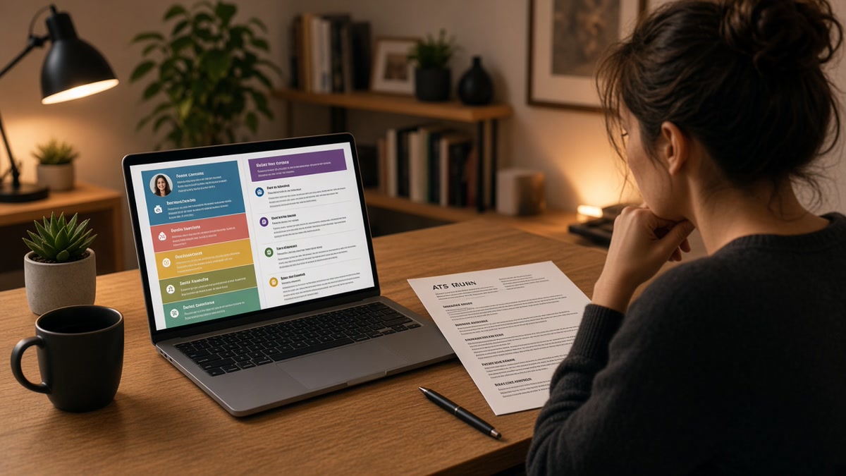
Before: Skills shown as icon row only, employer dates in a right column, email in a footer band.
After: Skills: Figma, Adobe CC, HTML/CSS. Acme Studio, Senior Designer, Jan 2022 to Mar 2025. [email protected] in line two of the body.
Before: Two-column Canva template with sidebar contact and center work history.
After: Single column with name, contact, Summary, Experience, Skills, Education stacked top to bottom.
Rebuild a design resume the parser can read
- Duplicate the file. Keep the pretty PDF for networking. Build a plain upload version.
- Collapse to one column. Move sidebar content into the main flow under standard headers.
- Replace every icon with words. Tools and certifications must be typed.
- Put contact info in the first five lines of body text, not in a banner graphic.
- Re-run the Notepad test on DOCX and PDF. Submit whichever paste matches your intent.
Copy-paste Skills block (swap your tools):
Skills
Figma, Adobe Creative Cloud, HTML/CSS, Webflow, design systems, user research, prototyping, accessibility (WCAG 2.1)
I've screened stacks of these in Greenhouse, and the file that wins is boring on the page but complete in the parser view. Link your portfolio for pixels. Let the resume carry searchable terms.
If layout is clean and you still hear nothing, shift to keyword alignment. Resume rejected by ATS covers the full diagnostic when parsing is not the only issue.
Layout mistakes designers repeat on every upload
- Proficiency bars instead of words: parsers skip images. Type the skill and prove it in a bullet.
- Two-column hero sections: contact info lands after education. Use one stack.
- Hidden Word tables: turn on gridlines and rebuild date lines as plain text.
- Footer-only phone numbers: many imports ignore footer regions entirely.
- Uploading the portfolio PDF as the resume: case studies belong on your site, not in the parser path.
Another repeat mistake: saving only as image PDF from design tools. If you cannot select text with your cursor, the ATS cannot either. Export from Word or Google Docs when the posting allows DOCX, or print to PDF from a text-native file.
A subtle accent color in PDF is fine when every word stays selectable. Fancy layout belongs in the portfolio, not in the upload file. How to convert a designed resume into ATS format walks a full Canva-to-plain rebuild if you are starting from scratch.
Verify the plain file before the next application
Run the upload version through HireFlow after the Notepad test passes. Formatting feedback catches issues plain paste will not, like margin cuts or non-selectable text layers.
Check your resume for free against the posting you're targeting. Pair that with Score your job match once keywords live in parsed fields, not buried in icons. If the role asks for a letter, Generate a cover letter that names the same tools you typed into Skills.
Pretty on screen, plain for upload
Why design resumes fail ATS is almost always a parsing problem, not a talent problem. Strip columns and icons, verify with Notepad, then tailor keywords into the plain file. Keep two versions if you want: one for humans at networking events and one for portals.
When the plain paste reads cleanly and your top three posting keywords appear in the first screen of text, you have done the hard part. The rest is tailoring bullets, not rebuilding layout from scratch every Sunday night.
Run the free ATS check on the upload version before you send the next application. One verified plain file always beats three gorgeous uploads the parser never read, and you will know exactly which version to trust going forward.
Read more
Frequently asked questions
Not always, but parsers often garble them. Columns read out of order, icons drop to blank space, and tables merge cells. A human might love the layout while Workday stores an empty Skills field. That looks like a weak match even when you are qualified.
You can design in Canva, but export a plain single-column version for upload. Toggle gridlines in Word or paste into Notepad before you submit. If Python or Figma vanish from the paste, the portal never saw them either.
Drop layout tricks that break parsing, not proof. Keep strong bullets, white space, and one accent color in PDF if text stays selectable. Move skills from icons into a typed Skills line. Your portfolio link carries the visual story.
Text-selectable PDF works when the design is truly single-column. DOCX is safer when the posting allows it or when hidden tables might lurk in the file. Run the same Notepad test on both exports before you pick one.