11 min read
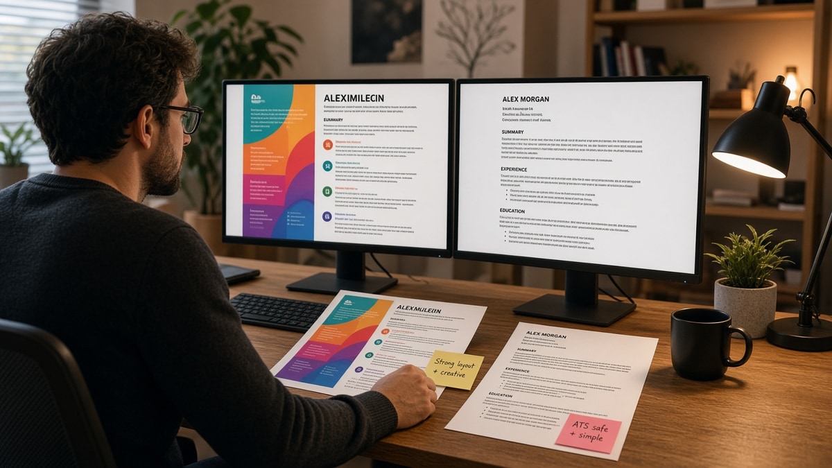
Your resume looks incredible in Canva. You've spent hours on typography and color. The upload preview shows your skills rail above your current employer and your phone number inside the summary field. That's not bad luck. You're not doing anything wrong with your experience. Creative layouts scramble parse order before keyword matching ever runs.
Check your resume for free on the same file before you blame the job market. It's usually three layout choices, not your background. Fix the export order tonight and you can still send a portfolio link for humans who want the visual version.
You've probably heard that keywords matter. They do, but only after the parser can read your employers in the right sequence. A two-column template can make a senior product manager look like their top job is Figma, Notion, and Jira. Same person. Wrong screen.
Below you'll see the symptom recruiters notice, three causes I flag most often, how to tell which one hit your file, and the fix for each. Job searching is exhausting. This page won't fix applying to roles you're not qualified for. It stops a qualified file from dying because the parser read your sidebar first. If you've been tweaking keywords on a two-column file, stop. Flatten first.
If the portal asks for a cover letter after upload, don't paste lines that repeat the same scrambled layout. Generate a cover letter from your corrected plain-text export so the note matches the employer order you fixed in Word.
Quick Wins
- Flatten any two-column template to a single column in Word before export.
- Replace icon skill rows with plain text on the same line as the job that used them.
- Paste your PDF into Notepad once and read employer order top to bottom.
The symptom: your file looks fine but the portal preview doesn't
The symptom isn't silence from recruiters alone. It's a mismatch between what you designed and what Workday, Greenhouse, Lever, or iCIMS imported. Skills appear above Experience. Dates detach from job titles. Contact lines land in summary fields.
What you feel: "I tailored this perfectly and still got auto-rejected." What the system saw: a jumbled text dump where your best bullet sits under the wrong employer because the left column parsed first.
Creative resumes fail ATS screening when parsers cannot reconstruct a linear work history. Humans might admire the layout in a PDF attachment. Many recruiters never open that attachment if the parsed profile already looks broken.
The gap between "looks great on my screen" and "imports cleanly" is where most design-heavy applications die. You won't see an error message. You'll see silence or a generic rejection email that doesn't mention formatting at all.
Taleo, iCIMS, and Lever follow the same broad pattern even when the preview UI looks different. Text extraction runs first. Ranking runs on whatever text survived. A sidebar that parses as your opening job title fails before a human ever judges your portfolio.
Read resume formatting errors that break ATS parsing for the wider layout story. This page focuses on design-heavy files specifically.
Three causes of creative resume ATS failures
Cause 1: Multi-column and sidebar layouts
Parsers read top to bottom, often left column before right. A marketing coordinator whose skills rail parses first looks like their current role is Google Analytics, HubSpot, and Mailchimp. The real employer line drops three rows down.
How to tell this is you: Plain-text paste shows tool names before company names. Upload preview lists Skills as the opening section.
Fix: Rebuild as one column. Move tools into bullets under dated employers. Use 11-point Calibri or Arial, no colored sidebar.
Before: Two columns: Skills left, Experience right, Canva grid.
After: Single stack: Name, contact, Experience with Month Year dates, Education, short Skills list last.
Cause 2: Icons, skill bars, and images instead of text
Infographic elements look sharp on screen. Parsers skip images entirely or read alt text inconsistently. A five-star skill bar for Python becomes an empty line. Your strongest technical proof vanishes.
How to tell this is you: Plain-text paste is missing entire skill sections. PDF search cannot find a tool name you know is on the page.
Fix: Spell out skills in body text. Put proficiency in bullets: Built ETL pipelines in Python and Airflow processing 2M rows nightly.
Before: Icon row for AWS, Docker, Kubernetes with no words.
After: Bullet under CloudCo: Migrated 14 microservices to AWS EKS; cut deploy time from 45 minutes to 12 using Docker and GitHub Actions.
Cause 3: Tables, text boxes, and header contact blocks
Invisible-border tables control spacing in many Word templates. Text boxes float beside names. Headers carry phone and email on every page. Each pattern reorders fields unpredictably across ATS platforms.
How to tell this is you: Contact info appears in the wrong preview field. Toggle Word gridlines and you see boxes around dates.
Fix: Move contact into body line one through three. Delete headers and footers. Replace tables with stacked lines.
Before: Phone and city in a Word header; summary inside a shaded text box.
After: Alex Rivera · Chicago, IL · 312-555-0142 · [email protected] on lines one through three; summary as normal paragraphs under contact.
Copy-paste ATS-safe header block
Paste at the top of a blank Word doc and replace bracketed lines:
[Full Name]
[City, ST] · [Phone] · [[email protected]] · [linkedin.com/in/handle]

SUMMARY
[Two lines max. Role + years + one proof metric tied to the posting title.]

EXPERIENCE
[Month Year] to [Month Year] · [Job Title] · [Company]
• [Bullet with tool names and outcome in the first eight words]
• [Second bullet]
Edge case: you're in a visual field like UX and want to show taste. Link your portfolio on line three. Keep the upload file boring. Edge case two: returning from a career break with a functional-style skills section up front. Put a dated contract or consulting line before the skills block so parsers attach tools to a real employer.
Pair 4: Nurse resume with specialty icons
Before: Heart and stethoscope icons beside ACLS, PALS, and BLS in a colored sidebar. Hospital roles in the main column without unit type in bullet one.
After: Staff RN, Med-Surg/Telemetry, 32-bed unit, 6:1 ratio on line one under County General with Month Year dates. ACLS and PALS spelled out on the contact block.
Icons vanish in plain text. A recruiter preview may show blank cert lines while your clinical bullets sit under the wrong facility name.
Pair 5: Sales resume with quota callout box
Before: Right-rail shaded box: FY24 quota 118%, $2.1M closed. Main column lists employers without metrics in bullets.
After: Account Executive, SaaSCo, Jan 2022 to Present · Exceeded FY24 quota at 118% ($2.1M ARR) in Salesforce; expanded territory from 42 to 67 active accounts.
Floating callouts detach from employers. Workday may show attainment with no company attached. Recruiters can't tell which role earned the number.
Pair 6: Software engineer with GitHub in footer
Before: github.com/handle on every page footer. Kubernetes and Terraform logos in a left rail without words.
After: github.com/handle on line three under email in the body. AWS and Kubernetes inside bullets under the employer where you ran production traffic.
Footers compete with Education for the last parse pass. Your repo link can appear as a stray sentence while your current title drops off page two.
How to tell which cause hit your file
Run one plain-text paste test. If tool names appear before company names, you're in Cause 1. If entire sections are missing, Cause 2. If contact fields are scrambled but employers are in order, Cause 3. Mixed signals mean you have two problems; fix columns first, then icons, then headers.
Don't spend an hour on keyword tailoring until paste order matches how you'd explain your career aloud. Tailoring a sidebar that parses first makes the mismatch worse, not better.
What broken creative resumes share
They optimize for the human glance on page one and ignore plain-text export. They treat the ATS upload and the portfolio as the same artifact. They add design elements that do not survive copy-paste.
The pattern: beautiful PDF, scrambled preview, zero callbacks. The fix is never "add more keywords to the sidebar." It's flatten, date, and stack.
Another miss: using creative section titles like "My Journey" or "Skillset Arsenal." Parsers map standard headings. Rename to Work Experience and Skills or the content may be skipped entirely.
I've passed on candidates whose PDF was strong but Greenhouse preview showed employers out of chronological order. The attachment sometimes never opened. Layout drove the decision.
Candidates also over-trust "ATS-friendly" labels on template marketplaces. A template can be single-column in the preview image and still ship with hidden tables once you download the Word file. Open gridlines before you trust the badge.
Another trap: exporting a designed PDF from Canva and assuming text is selectable. Some exports flatten text into curves. Ctrl+F won't find your job title. Rebuild in Word even if you keep the Canva version for networking PDFs you hand to humans in person.
Color blocks behind sections look modern but often parse as separate objects. A software engineer's gray background behind Skills can make the parser treat that block as a standalone document chunk. Remove backgrounds. Use bold section titles instead.
Decorative bullets (arrows, checkmarks, custom wingdings) sometimes convert to question marks in plain text. Stick to standard round bullets or hyphens. Your content should survive a copy into email without turning into punctuation soup.
Verify the file before the next application
Run your flattened export through a checker with the job description pasted in. You're looking for parse warnings, missing employers, and thin keyword coverage after layout is fixed.
Compare two exports if you're unsure: the creative PDF and a plain Word PDF from the same content. Upload both to the checker. The one with fewer parse warnings is your portal file. The other stays in your portfolio folder.
Run a free ATS check on the same PDF you'll upload. If warnings clear, score your job match against the posting to see which requirements still look thin on paper.
Edge case: you're applying through a referral and someone offered to forward your resume internally. Send the parser-safe version anyway. Internal forwards still land in the ATS of record. A pretty file that scrambles in Workday hurts warm intros the same way it hurts cold applications.
What to do in the next ten minutes
Open your creative file in Word. Turn on gridlines. If you see tables around dates or skills, rebuild that section as stacked text. Export a single-column PDF. Paste into Notepad and read employers top to bottom.
Pick one target posting. Highlight three required skills. Rewrite the first bullet under your current job so one skill lands in the first eight words. Save a new file name with the company slug so you don't accidentally upload the Canva export again.
Upload the boring version to the portal. Open the preview if the site shows one. If employers still scramble, switch from PDF to DOCX from the same single-column source and retest. Some older Workday configs parse Word more cleanly than design-heavy PDFs.
Why creative resumes fail ATS screening is almost always parse order, not talent. Save the design for your portfolio link. Send the boring file through the portal. That's the version that gets you to a human who can appreciate both.
Keep a "parser-safe" master in Word and a "showpiece" PDF for interviews. Same facts, different packaging. You don't have to choose between looking good and getting through the gate. You have to choose which file goes in which channel.
When in doubt, ask a friend to read your plain-text paste aloud. If they stumble on where you worked versus what tools you used, the ATS stumbled too. Fix that order once and every tailored version you spin off the master inherits the same clean parse path.
Read more
Frequently asked questions
Yes, if creativity stays in the cover letter or portfolio link and the resume file itself is single-column text. Subtle font weight changes and clean spacing are fine. Graphics, skill bars, multi-column grids, and icon bullets are what break parsers. Save the visual brand for your website, not the upload field.
Recruiters rarely see the creative version if the parser scrambles it first. When they do open a designed PDF, many appreciate clarity over flair for corporate roles. Design-forward resumes can work for in-person creative interviews, but the file you upload to Workday or Greenhouse should read like a plain document.
Rebuild in Word or Google Docs as a single column first, then export. Canva exports often hide text inside grouped objects. A text-based PDF from a clean Word source parses more reliably than a designed PDF with embedded shapes. Paste the export into Notepad and read top to bottom before you upload anywhere.
Removing colors alone rarely fixes column or table issues. Parsers care about reading order, not aesthetics. Flatten sidebars into the main body, replace icon skill rows with comma-separated text, and put Month Year dates on the same line as job titles. Color removal is cosmetic. Layout flattening is the real fix.
Copy the full file into a plain text editor. If sections appear out of order or skills show up before employers, the ATS will struggle too. Upload the same file to a free checker with the job description pasted in. Fix layout before you tweak keywords.