8 min read
That gradient header looked incredible in the template store. Workday read it as blank space where your name should be.
Check your resume for free before you assume the silence is about keywords. A creative shell can hide every skill you copied from the posting.
You're not vain for wanting a polished file. You're just optimizing for the wrong screen if that's the only version you upload.
Corporate US hiring still runs through parsers first. Design belongs in the portfolio lane; proof belongs in plain text the database can store.
If a friend gasps at how plain your upload version looks, that's a compliment. Boring is the format parsers reward.
What recruiters mean when ATS "rejects" a creative file
Rejection sounds final. In most stacks it's a parsing failure dressed up as a low match or an empty profile.
Parsers don't judge taste. They strip text, map sections, and store fields recruiters filter on later.
A creative PDF can look perfect attached while the parsed record shows no employer, no dates, and skills floating without context.
Recruiters searching "Salesforce" in Greenhouse won't find you if that word lived inside a chart the parser skipped.
Why ATS rejects creative resumes is less about art direction and more about missing structured text. The system can't score what it never stored.
Pair this with how ATS matches resumes to job descriptions so you know matchers read stored fields, not your color palette.
Taleo and iCIMS builds vary, but the pattern holds: text in, fields out. Anything that isn't text becomes noise or blank space.
Auto-disqualification rules exist at some employers, yet most pain comes from empty experience blocks recruiters never scroll to fix.
A creative file can still pass when it uses one column, standard fonts, and no images. That's a restrained design, not a default template from a design marketplace.
Creative resume vs parser-safe resume: side by side
Use the table as a decision lens. If you need more than one "creative" yes, build a second plain file for uploads.
| Criterion | Creative layout | Parser-safe layout |
|---|---|---|
| Columns | Two or three rails, sidebars | Single column top to bottom |
| Headers | Graphic banners, icons | Plain bold section titles |
| Skills proof | Word clouds, bar charts | Tools inside dated bullets |
| Contact | Icons, QR codes | Email and phone as text lines |
| File goal | Impress human eyes fast | Populate ATS fields accurately |
Before: Name inside a colored shape; experience in a right column the parser reads last.
After: Name as text line one; current employer and three bullets before page one ends.
Before: Skills displayed as a donut chart with no plain list.
After: Short Skills section plus each tool repeated once under the job where you used it.
Copy-paste parser-safe header order:
Contact (plain text)
Headline matching posting title
Summary (3 lines max)
Professional Experience (newest first)
Skills (short list)
Education
Decision rule: if the role's apply button is an ATS portal, lead with the parser-safe file. Send the creative PDF only when a human explicitly requests it outside that flow.
I've watched Lever profiles with stunning Canva exports score empty on must-have tools because the skills chart never became text. The recruiter assumed the candidate lacked the stack.
Marketing and design roles still need readable dates. Creativity belongs in the portfolio URL line, not in the only copy of your employment history.
When a light touch still counts as creative
Subtle color on headings rarely matters if the letters remain selectable text. Full-bleed background photos behind experience do matter, because parsers treat them as images.
Before: Job title set in all caps inside a shaded band across the page.
After: Title in title case on its own line with company and dates on the next line.
Before: Project thumbnails with captions under each role.
After: One bullet naming the project outcome with a plain portfolio link in contact lines.
If you're unsure which side of the table you're on, export to plain text in your editor. If the story still makes sense, you're closer to parser-safe.
Creative choices that break parsing first
- Text boxes used to align dates beside titles.
- White or light text on tinted bands that OCR misreads.
- Custom fonts that export as outlines without selectable characters.
- Logos and headshots that push experience below the parser's first pass.
- Tables mimicking grids from portfolio sites.
Before: Decorative section dividers made of repeated unicode characters.
After: A blank line and a standard header like Professional Experience.
See resume formatting errors that break ATS parsing for more traps that look fine in print preview.
Saving a screenshot as PDF is instant rejection territory. There's no text layer to extract.
Hiding keywords in white font is old spam behavior. Modern stacks flag it, and it still won't pair tools with real job dates.
Canva and similar exports often embed fonts in ways parsers dislike. Rebuild employment history in Word or Google Docs when uploads keep failing.
Fancy timelines with icons for each role look clear to you and jumbled to a linear reader. Stick to reverse chronological lines recruiters already know how to scan.
This won't turn a weak fit into an offer. It makes sure your real fit is visible when someone searches the req in Workday.
Test the plain version before you batch apply
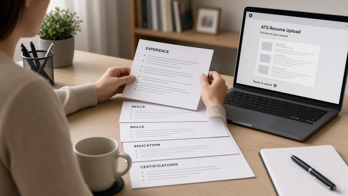
Upload the stripped file once. If parsed fields populate, keep that version for corporate portals even if you still share a designed PDF over email.
Compare parsed employer names to your source line by line. One mismatch means the creative shell is still winning over the text layer.
Batch the same flat file across similar reqs after a clean preview. You don't need a new theme per posting; you need accurate fields.
Save the preview screenshot with the date. When a portal updates its parser, you'll know whether a new glitch is on their side or yours.
Run the ATS check on the flat file after you remove columns and graphics.
Generate a cover letter to carry brand voice when the resume must stay minimal for parsers.
Pick the file the database can read
Why ATS rejects creative resumes isn't a moral judgment on your taste. It's a mismatch between design-first files and text-first storage.
Keep both versions if you want. Upload the boring one through the official link, and let your portfolio carry the visual story.
When parsed fields match your PDF, you've done your part on the machine side. Then you can argue fit like any other candidate.
Label files clearly: LastName-Role-ATS.docx for portals, LastName-Role-Visual.pdf for humans. Mixing them on tired apply nights causes repeat mistakes.
Job search is hard enough without fighting your own layout. Flatten once, test once, and spend your energy on roles that match your level.
Read more
Frequently asked questions
Not always with a hard bounce. More often the parser drops or scrambles content, so matchers never see your titles and tools in the right places.
Use a plain parser-safe file for the application and send portfolio links in the body or cover letter. The ATS path and the portfolio path are different audiences.
Only when a human asks for them outside the ATS and you still have a text version for the official apply link. Default to text-first for corporate US roles.
Multi-column layout. Flatten to one column before you touch fonts or color. Most scramble patterns disappear after that single change.