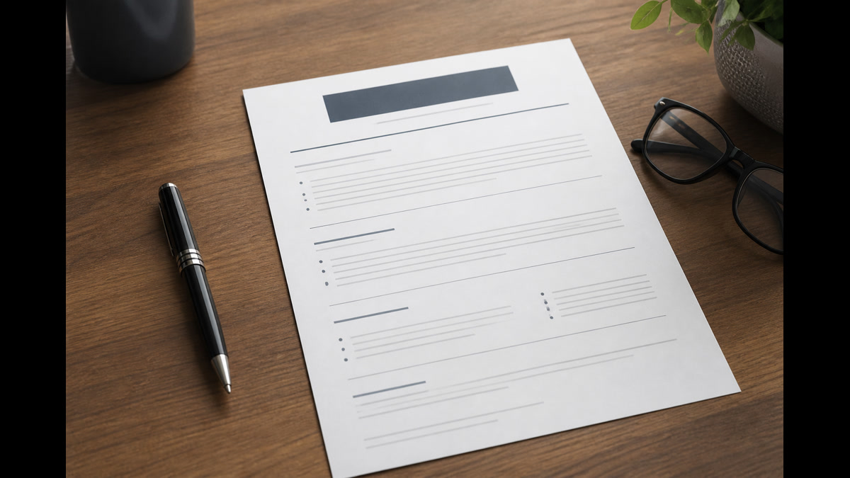
What should a resume look like in 2025 for the US job market? Use a single-column layout with 0.5–1 inch margins, Calibri or Arial at 10–12 pt, and standard sections in this order: contact block, professional summary, work experience, education, and skills. Skip photos, icons, skill bars, and multi-column templates so Workday, Greenhouse, and Taleo parsers read your text top to bottom. One or two pages is fine when every line supports the role you are targeting.
Job seekers often ask what resumes look like in general—trends, colors, creative layouts—when they should be asking what an ideal resume ought to look like for a specific application. This guide is prescriptive, not observational: these are the format, font, spacing, and section rules US recruiters and applicant tracking systems expect in 2025 and 2026. You will get numbered build steps, visual layout standards, a specification table, before-and-after examples, ATS upload rules, and a pre-submit checklist—not a roundup of design trends that break parsing.
Corporate career sites still run on structured parsers. A resume that looks modern in Canva but exports as scrambled columns never reaches a hiring manager. The layout rules below align with how enterprise ATS platforms index text, how recruiters skim in six to eight seconds, and how NACE resume guidance for students and graduates recommends clear hierarchy and measurable outcomes. Follow them and your file works for both software and humans.
Key Takeaways
- Single-column layout with standard headers—no tables or sidebars
- Calibri or Arial, 10–12 pt body, 14–16 pt bold section titles
- Contact, summary, experience, education, skills—in that order for most roles
- One or two pages with 0.5–1 inch margins; never shrink below 10 pt font
- Text-based PDF or DOCX; verify parse output before you submit
Eight steps to build the ideal 2025–2026 resume layout
Treat resume layout like a specification, not art direction. These eight steps produce the file most US corporate recruiters and ATS platforms handle without corruption. Work through them in order when you build from scratch or rebuild a template that failed an upload test.
- Set the page canvas. US Letter size (8.5 × 11 inches), margins between 0.5 and 1 inch on all sides, and a single column that spans the full content width. Disable text boxes, floating shapes, and newspaper-style columns in Word or Google Docs.
- Choose one readable font family. Calibri 11 pt or Arial 11 pt for body text is the default recommendation. Section headers at 14 pt bold. Your name at 18–22 pt bold centered or left-aligned—pick one alignment and keep it consistent.
- Build the contact block. Full name on line one; city, state, phone, email, and LinkedIn URL on line two. No street address required in 2026. No photo, no icon row of social logos. Plain hyperlinks are fine in PDF when exported from Word.
- Write a three-to-four-line professional summary. Target job title, years of experience, domain, and one metric-backed result. Place it immediately below the contact block with a "Professional Summary" or "Summary" header in bold caps or title case—match your other section labels.
- Format experience as employer blocks. Each role gets: job title (bold), employer name, city and state, and date range on one or two lines; then three to five bullet points with action verbs and numbers. Reverse chronological order. Align dates to the right only if you use tab stops—not a separate column table.
- Add education in plain lines. Degree, major, school, location, and graduation month and year on one line per credential. See our degree formatting guide for exact patterns that parse in Workday education fields.
- List skills as comma-separated text or a short bullet list. Group technical and soft skills when helpful, but avoid star ratings, progress bars, and infographic clouds. Spell tools exactly as the job description does when honest.
- Export and verify. Save as text-based PDF or DOCX. Upload to HireFlow's free ATS resume checker and confirm employers, dates, and skills extracted. Fix layout issues before you apply through Greenhouse or Taleo portals.
These steps intentionally exclude decorative elements. Recruiters reviewing hundreds of applications per req reward predictability: they know where to find your current title, your dates, and your degree without hunting through design flourishes. That predictability also matches how parsers segment documents into database fields.
Key Takeaway: build the canvas first—page size, margins, font, and column structure—before you write a single bullet; layout errors are expensive to fix after content is finished.
Visual layout rules your resume should follow
Visual hierarchy tells recruiters where to look in the first pass. Your resume should look clean, dense with accomplishments, and boring in the best sense—no element should distract from job titles, employers, and metrics. The table below lists recommended specifications for the 2025–2026 US market. Treat it as a target range, not a creative brief.
| Layout element | Recommended specification | Avoid |
|---|---|---|
| Page structure | Single column, US Letter, 1–2 pages | Two-column split, text boxes, sidebars |
| Margins | 0.5–1 inch all sides | Margins under 0.4 inch to cram content |
| Body font | Calibri or Arial 10–12 pt | Script, condensed, or sub-10 pt text |
| Section headers | Bold 14–16 pt, consistent label style | Icon headers, colored banners, underlined tabs |
| Bullet style | Standard round bullets, left-aligned | Custom symbols, numbered job duties, tables per role |
| Date placement | Same line as employer or right-aligned via tabs | Dates isolated in a sidebar column |
| White space | 6–10 pt space after section headers | Wall-of-text blocks without paragraph breaks |
| Color | Black on white; optional one muted header accent | Full-color backgrounds, skill heat maps |
Alignment matters for skimming. Left-align all body text. Centering your name is acceptable; centering entire sections is not. Job titles and employers should share the same indentation pattern across every role so a recruiter's eyes move in a straight vertical line. Inconsistent indentation reads as sloppy even when the content is strong.
The U.S. Bureau of Labor Statistics Occupational Outlook Handbook emphasizes clear documentation of qualifications for career planning. Your resume is that documentation in hiring: each section should be instantly identifiable by label, not by background color or graphic divider.
- Before: Two-column Canva template with skills bar chart in the left rail and jobs in the right column
- After: Single-column Word document: Summary, Experience, Education, Skills—each header bold, each role with plain bullets
- Before: Contact info with phone icon, envelope icon, and LinkedIn logo in a colored header band
- After: Jane Doe | Chicago, IL | 312-555-0142 | [email protected] | linkedin.com/in/janedoe
- Before: Job dates in a narrow left sidebar separated by a vertical line from employer names
- After: Senior Analyst, Deloitte — Chicago, IL | March 2021 – Present on one line, bullets below
Common Mistake: choosing a template because it looks impressive on Instagram—if the export hides employers in a sidebar, ATS and recruiters may never see them.
Fonts, margins, and spacing standards for US hiring
Typography on resumes should disappear into readability. Calibri became the default Word font for a reason: it stays legible at 10–11 pt on screen and in print. Arial and Helvetica offer the same predictability. Georgia works when you need slightly more presence at 11 pt, but stay with sans-serif unless you are in a traditional legal or academic niche that expects serif body text.
Margin choice controls density. At 1 inch, a one-page resume fits roughly four roles with three bullets each plus education and skills—enough for many mid-level candidates. At 0.5 inch you gain space but risk a cramped appearance; use the extra room only when you truly need two pages of relevant content, not to keep an outdated job from 2009. Line spacing between 1.0 and 1.15 keeps bullets scannable without ballooning page count.
Spacing between sections signals structure to both humans and parsers. Add a blank line before each major header. Do not rely on horizontal rules drawn as shapes—some parsers skip them or treat them as hard breaks that split employer names from dates. Bold headers plus white space are sufficient dividers in 2026.
File naming is part of presentation: FirstName-LastName-Resume.pdf is professional; Resume_Final_v7_REAL.pdf is not. The inside of the file should match that discipline—no mixed fonts, no random size jumps, no ALL CAPS paragraphs. Title case or sentence case for bullets; consistent date format across every role. Our resume dates format guide covers month-year versus year-only conventions that parsers expect.
When you tailor for a posting, change wording—not typography. Swapping fonts between applications creates inconsistency and invites formatting bugs on export. Set styles once in Word or Google Docs, then duplicate the file per application and edit content only.
Quick Check: zoom to 100% and stand arm's length from the screen—if you squint to read body text, increase font size or cut words before you shrink type.
Section order and what to include on every resume
What should a resume look like in 2025 in terms of section sequence? For most US corporate roles, recruiters expect contact information first, then a summary, then experience, education, and skills. Certifications, projects, and volunteer work follow only when they strengthen the application—never before your most relevant paid experience unless you are a student with no internships.
Contact information should fit two lines. Recruiters copy phone and email into ATS notes; make both easy to select. LinkedIn is optional but recommended for professional roles; GitHub or portfolio links belong here for technical jobs.
Professional summary replaces the outdated objective. It answers: who are you professionally, what role do you want, and what proof do you offer? Three lines beat eight. Keyword alignment from the posting helps ranking; see how to identify keywords in a job description for extraction steps that should inform summary and bullet wording—not font choices.
Work experience is the visual center of the page. It should occupy roughly half of page one for experienced candidates. Each bullet should follow accomplishment format: action, scope, tool, and result. Weak duties ("responsible for reports") waste the space that should show outcomes ("Built weekly Tableau dashboards for 12 stakeholders, cutting report prep time 40%").
Education sits below experience for hires with two or more years in the field. Recent graduates may move it above experience when degree and projects are the primary proof. Keep lines plain—no shield logos, no dean's list in a callout box.
Skills close the document or sit directly after summary for ATS-heavy technical reqs. List hard skills employers search: software, languages, frameworks, certifications. Soft skills belong in bullets where you proved them, not in a vague list of adjectives.
Omit sections that hurt more than they help: references available upon request, hobbies unrelated to the role, high school once you hold a bachelor's, and full street addresses. US employers rarely need references on the resume itself; they request them later. A lean layout looks intentional; padding with filler looks inexperienced.
Pro Tip: print your outline as headers only—Contact, Summary, Experience, Education, Skills—and confirm a stranger could guess your level and field from headers and job titles alone.
ATS-friendly design for Workday, Greenhouse, and Taleo uploads
Appearance and parseability are the same problem in online applications. Workday Recruiting, Greenhouse, and Taleo—the three most common enterprise stacks in US hiring—extract text from your upload to populate profile fields and power keyword search. When layout traps text inside tables or graphics, the attachment may look fine while structured data stays empty. Recruiters filtering on years of experience or employer name never see you.
Workday instances often attempt autofill on upload: name, email, phone, and recent jobs map to form fields. Single-column chronological text produces the highest autofill success rate in recruiter testing communities. Greenhouse shows parsed rows beside the PDF; mismatches signal layout risk. Taleo legacy deployments remain sensitive to headers embedded in text boxes—a common failure mode in older templates sold as "ATS optimized."
iCIMS and SuccessFactors index full resume text for Boolean search. Your layout should place job titles and employers in continuous lines so queries like "Manager AND Salesforce" match. Splitting employer across a graphic banner and job title across a table cell breaks that index even when human readers infer the connection.
Design elements to remove before upload: skill meters, QR codes, chart graphics, column breaks, footers with contact info duplicated from the header, and text saved as outlines in PDF. Export from Word or Google Docs with fonts embedded. Test on hireflow.net and read our Workday resume format guide when autofill mislabels employers or dates.
A resume that should look professional in 2026 is not the same as a resume that should look creative on a poster. Corporate reqs still favor conservative presentation. Save bold design for portfolio sites and bring a parse-safe file to the application portal. Our layout complexity guide walks through simplification when an existing template fails extraction.
Common Mistake: trusting the template label "ATS friendly" without running your actual export through a parser—verify extracted text, not marketing copy on the template sales page.
Pre-submit checklist for resume appearance and parse quality
Run this checklist before every upload to Workday, Greenhouse, Taleo, iCIMS, or Lever-hosted career pages. Layout mistakes are silent rejections—few employers explain that your sidebar prevented a keyword match.
- Single-column US Letter layout with 0.5–1 inch margins throughout
- One font family; body 10–12 pt; section headers 14–16 pt bold
- Contact block plain text—no icons, photos, or decorative header bands
- Professional summary present and under four lines
- Experience reverse chronological with title, employer, location, and dates visible
- Three to five bullets per recent role with metrics where honest
- Education as plain lines; degree level and major spelled out
- Skills listed as text; no charts, stars, or progress bars
- No tables, text boxes, or multi-column sections anywhere in the file
- File saved as text-based PDF or DOCX—not a scanned image
- File name: FirstName-LastName-Resume.pdf
- Extracted text verified on HireFlow or equivalent parse tool
- Portal autofill tested: name, email, and latest job populated correctly
If autofill fails, simplify before you apply: remove the header image, flatten columns, and re-export. Retype critical fields manually on the application even when tedious. Structured form data often gates knockout questions before a human opens the attachment.
Keep a master plain-layout file and a tailored copy per role. Tailoring changes bullets and summary keywords—not margins, fonts, or section architecture. Consistent presentation builds a reusable workflow that scales across dozens of applications per week.
Quick Check: select all text in your editor—if the selection order jumps between columns or skips sections, parsers will struggle the same way.
What should a resume look like in 2025 is a layout question with a concrete answer: single column, standard fonts, predictable sections, and plain text that Workday, Greenhouse, and Taleo can index. You do not need a trendy template—you need a specification that recruiters recognize in seconds and parsers read without corruption. Build the canvas with the eight steps, apply the visual rules table, keep section order conventional, and verify extraction before you submit.
When you are ready to test the finished file, scan it on HireFlow's free ATS resume checker at hireflow.net. Confirm employers, dates, and skills extract cleanly, then upload once on the employer portal and check autofill. A resume that looks right and parses right beats a beautiful attachment that never populates the database fields recruiters filter on.
Frequently asked questions
Use a single-column layout on one or two pages with 0.5–1 inch margins, Calibri or Arial at 10–12 pt body text, and standard section headers: contact block, professional summary, work experience, education, and skills. Avoid photos, icons, tables, and colored sidebars so Workday, Greenhouse, and Taleo parsers read your text in order. Lead experience with quantified bullets; keep the file as a text-based PDF or DOCX.
One page is ideal for candidates with under about eight years of relevant experience or recent graduates. Two pages are standard for mid-career and senior professionals when every line supports the target role. Never shrink font below 10 pt or crush margins to force one page—readability and parse quality matter more than page count. Recruiters accept two clean pages far more often than they accept one cramped page.
Calibri, Arial, Helvetica, or Georgia at 10–12 pt for body text and 14–16 pt bold for section headers. These fonts render consistently in Word, Google Docs, and PDF exports that enterprise ATS platforms index. Decorative or script fonts break parsing and look unprofessional in corporate screening. Use one font family throughout; bold and occasional italics provide hierarchy without custom typography.
Yes for most US applications. Place a three-to-four-line summary directly under contact information. It should name your target role, years of experience, core domain, and one proof point with a metric. Skip the objective statement unless you are a student with no experience. The summary is the first text recruiters skim after your name—it should mirror keywords from the job description when honest.
Minimal accent color on section headers is acceptable for human-facing networking PDFs, but the safest default for online applications is black text on white with no graphics. Icons, skill bars, charts, and headshots routinely fail ATS parsing in Workday and Taleo uploads. If you use color, keep it to one muted shade on headers only and test the file in an ATS checker before applying.
Standard order for experienced hires: contact information, professional summary, work experience, education, skills, and optional certifications or projects. Recent graduates may place education above experience when degree is the strongest credential. Career changers can add a targeted skills block after the summary. Do not bury experience below volunteer work, hobbies, or long course lists unless the role specifically values those items.
Follow the portal instruction. When the employer allows either, a text-based PDF exported from Word or Google Docs is the default choice—it preserves layout across devices. Avoid scanned image PDFs or design-tool exports. Some Workday and iCIMS instances parse DOCX more reliably; if autofill fails on PDF, retry DOCX. Always confirm the upload preview shows readable text, not blank columns.
Upload your file to HireFlow's free checker at hireflow.net and confirm contact lines, employers, dates, and skills appear in extracted text. Then test once on the employer's career site and verify autofill populated name, email, and recent job fields. Missing structured data usually means tables, columns, or headers trapped your text—even when the PDF looks fine to human eyes.