10 min read
Canva made everyone think resumes should look like event flyers. Corporate recruiters don't open your file in Canva. They open a plain import in Workday or Greenhouse and decide in one skim whether the proof is there. Professional isn't dull for its own sake. It's readable after parsing.
If you're choosing a template tonight, pick the one that survives a paste test, not the one with the boldest header band. You can polish verbs after layout is stable. Don't swap fonts twice before you confirm the export still reads in order.
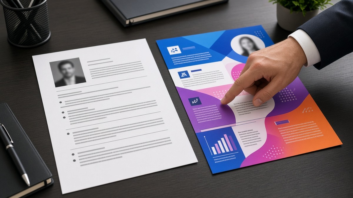
The comparison below isn't about taste. It's about what still makes sense when the portal strips your colors and squishes your columns into one text stream.
Check your resume for free on the export you plan to upload. Professional files pass parse checks with section order intact and bullet one still on top.
When a posting asks for a cover note, match the calm tone of a professional resume in the cover letter generator . Flashy design in the resume plus hype in the letter reads inconsistent.
Below you'll see professional versus flashy across layout, typography, bullets, and upload behavior, plus a copy-paste audit and traps that look polished but fail import.
Professional ATS resume means parser-safe and recruiter-fast
Proof first, decoration never. A professional file answers what you did, where, and when without making the reader fight layout. Flashy files optimize for thumbnail impact on a template marketplace. Corporate hiring optimizes for imported text that still makes sense.
I've compared side-by-side imports in Lever for years, and the professional column almost always keeps job titles, dates, and bullet order intact. The flashy column often merges contact into Skills or drops the second page of bullets entirely. The candidate lost the screen before anyone judged the writing.
Professional also signals judgment. Finance, healthcare, and enterprise tech roles expect restraint. A infographic resume for a compliance analyst role tells the recruiter you don't know the room.
For baseline section order, read best resume section order for ATS . This comparison is what that order looks like in practice versus template noise.
Professional vs flashy: what changes after upload
| Element | Professional ATS resume | Flashy template resume |
|---|---|---|
| Layout | Single column, top to bottom | Sidebars, tables, text boxes |
| Font | Arial, Calibri, Georgia, 10 to 12 pt body | Display fonts, tiny footer text, icon bullets |
| Bullets | Verb, action, scope or metric | Buzzword lines, graphics, skill bars |
| Skills | Plain list after Experience | Charts, stars, crowded tags |
| After import | Order matches intent | Scrambled sections, missing dates |
Layout: one column wins the import
Before: Two-column template with contact and Skills in a colored left rail. Imported text shows Skills and phone number before the current job title.
After: Single column: Name, phone, email, city, Summary, Experience with title and dates on one line, Skills as a simple list. Paste test reads the same story you designed.
Bullets: proof beats polish
Before: Flashy row: Dynamic leader driving synergy across cross-functional teams. Icon bullet, bold color stripe.
After: Professional row: Led 6-person implementation team through Workday go-live, finishing UAT 2 weeks early for 1,200 employees. Plain round bullet, no icon.
Typography and headers
Professional headers are words, not shapes. EXPERIENCE in bold 12 pt beats a gradient band that becomes garbage characters in plain text. Keep headers standard so parsers treat them as section breaks.
Dates belong on the same line as title and company, right-aligned or tabbed in a simple way. Fancy date pills in colored boxes often vanish on import.
Copy-paste professional audit
Professional ATS audit (Y/N each):
[ ] Single column, no sidebar tables
[ ] Body font 10–12 pt, standard family
[ ] Bullet one under current role has verb + scope
[ ] Skills list plain text, after Experience
[ ] Paste test: contact → summary → job title → bullets in order
[ ] No photos, icons, or skill bar charts in upload file
When a little design is still professional
Light gray section lines, one accent color on your name, and consistent spacing read polished without breaking parsers. The test is whether the file still works when stripped to plain text. If the story survives, you're in professional territory.
Design roles are the narrow exception. Even there, keep an ATS-safe plain export for portals and save the portfolio PDF for humans who asked for work samples. Two files, two audiences.
Contact and summary: professional vs flashy
Before: Contact inside a circular icon row with LinkedIn logo image, summary inside a shaded text box with rounded corners.
After: Name on line one, phone and email on line two, city and state on line three. Summary as three plain lines: level, core proof, one posting-aligned phrase. No shapes, no icons.
Professional contact blocks parse as text. Flashy blocks often import as empty lines or random characters where your email should be. That failure happens before anyone reads bullet one.
Length and page count
Professional corporate resumes for mid-career applicants usually land on one page up to ten years of relevant experience, two pages when every line earns its space. Flashy templates waste margin on graphics, pushing real bullets to page two where many recruiters never scroll.
If you're trimming, cut decorative elements first, then older roles, never bullet one under your current title. Professional layout makes that priority obvious. Flashy layout hides weak content behind design.
Industry expectations
Banking, insurance, healthcare administration, and enterprise SaaS all skew conservative. A professional ATS resume matches that room: calm type, proof bullets, no headshot. Creative agencies tolerate more design in human-facing PDFs, but corporate HR portals on the same application still want the plain upload.
Compare with resume readability: how to make your resume easier to scan when you're tuning spacing and headers after you drop the flashy template.
Professional-looking traps that fail ATS
Skill bars and star ratings. Parsers read words, not filled rectangles. Replace bars with tool names you used in bullets.
Header and footer repeat blocks. Some templates repeat your name in the footer on page two. Imports sometimes treat that as body text and shove Experience down.
Text boxes for summary blocks. Floating boxes import last or out of order. Put summary in normal body flow under Contact.
Photos and logos. US corporate portals often reject images. They also waste space where bullet one should live.
PDF exports from design tools. Vector PDFs from non-Word sources can look crisp and parse poorly. Word or Google Docs to PDF is the safer professional path for uploads.
For formatting errors that trip parsers, read 11 resume formatting mistakes that trip up ATS . Fix layout before you debate font personality.
Validate the professional export
Upload the same PDF you will send to the employer. Professional means the checker sees your sections in order and your bullets intact.
Run a free ATS check on the plain export. If bullet one disappears or Skills jumps above Experience, simplify layout before you rewrite content.
Build a plain resume if your current template fails paste test twice. Starting from a single-column base beats fighting a flashy file for an hour.
Choose boring that parses
What makes an ATS resume professional is not lack of ambition. It's respect for how files are read: one column, standard type, proof in Experience, calm Skills, paste test passed. Flashy loses when import scrambles your best bullet.
- Run the professional audit checklist on tonight's export.
- Keep a plain upload version even if you hold a designed PDF for networking.
- Polish verbs after layout survives the checker.
Recruiters remember outcomes, not header gradients. Give them bullet one in plain text and let the work speak.
Read more
Frequently asked questions
One column, standard font at 10 to 12 point body size, clear section headers, and bullets that start with verbs and end with scope or outcomes. Contact sits at top, Experience carries the proof, Skills lists tools you repeated upstairs. No icons, charts, or photo blocks in the upload file.
Templates with sidebars, text boxes, tables, and heavy graphics often import out of order or drop content. Creative layout can work for in-person networking PDFs. For corporate portal uploads, professional plain structure wins because parsers and recruiters both read top to bottom without repair work.
Minimal accent color on headers is fine if the export stays readable in grayscale and plain text. Neon blocks, gradient headers, and icon bullets add noise without proof. If color carries meaning the parser cannot see, move that meaning into words in the bullet.
Run a paste test: copy what the portal imported into Notepad. If section order matches your intent and bullet one still reads first, the file is professional enough for ATS. Scrambled titles or missing dates mean simplify layout before you polish wording again.