6 min read
Structure isn't decoration. It's the path a recruiter's eyes take when they've got four minutes and sixty applications.
You don't need a creative layout. You need the sections in an order the parser won't scramble and a human won't get lost in.
Check your resume for free after you reorder sections. If plain-text paste shuffles your jobs, fix structure before you tweak another bullet.
Use the checklists below section by section. Tick each box on your current file tonight.
Quick Wins
- Switch to single column if you're on a two-column template.
- Move skills below experience unless you're early career.
- Cap each job at five bullets; trim older roles harder.
The section stack recruiters expect
US corporate hiring runs through parsers first, humans second. Both follow a top-down scan when the file is clean.
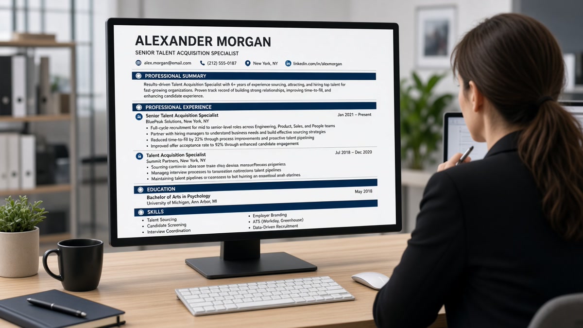
The winning stack is contact, summary, experience, skills, education. Optional: certifications after education when the license is the filter, projects only when you're early career or the role is portfolio-driven.
| Section | Purpose on the skim | Size rule |
|---|---|---|
| Contact | Reach you, confirm location | 3 to 4 lines, no text box |
| Summary | Role fit in ten seconds | 2 lines max |
| Experience | Proof of outcomes | 3 to 5 bullets current job |
| Skills | Keyword confirmation | 1 to 2 rows, 8 to 12 items |
| Education | Credential check | Degree, school, year |
Two-column templates break this path. The parser reads left column top to bottom, then right column. Your best bullet can land after your education block in the extracted view.
Page length follows the same logic. One page for most candidates under ten years. Two pages only when every line earns its space. If page two holds jobs from fifteen years ago with four bullets each, move that history off the main file or cut bullets first.
White space is part of structure. Margins between 0.7 and 1 inch, line spacing around 1.0 to 1.15, and blank lines between jobs help both parsers segment sections and humans find the current role fast.
Checklist by resume block
Contact block checklist
- Full name on line one, 14 to 18 point bold.
- Phone, professional email, city and state (no full street address).
- LinkedIn URL optional; portfolio link when the role expects work samples.
- Same font size as body text. No icons, no text boxes.
Before: Contact info inside a sidebar text box that paste tests as gibberish.
After: Name, phone, email, Denver CO on four plain lines at the top.
Summary checklist
- Two sentences. Role title, years, domain, one outcome type.
- No first-person pronouns. No buzzword stacks.
- Matches the posting's role family, not the company name pasted in.
Experience checklist
- Reverse chronological. Month Year to Month Year dates.
- Company, title, location on one line each job.
- Bullets start with a verb. One metric or scope signal per bullet where honest.
- Strongest bullet first under each role.
Before: Responsible for managing client relationships and reporting.
After: Managed 12 enterprise accounts ($2.1M ARR), cutting churn tickets 18% in two quarters.
Skills row checklist
- Eight to twelve items in one or two comma-separated rows.
- Hard skills first: tools, languages, platforms the posting names.
- No proficiency bars, stars, or graphics.
- Soft skills only when the posting repeats them as filters.
And if a skill matters, prove it once in a bullet above the list. The skills row confirms. It doesn't carry the application alone.
Education and optional blocks
- Degree, school, graduation year on one to two lines.
- GPA only when requested or when you're within two years of graduation.
- Certifications after education when the license is required (CPA, RN, PMP).
- Projects section only for students or portfolio roles; otherwise link out.
Mid-career candidates often give education half the space it currently uses. Trim it and give those lines back to your current role bullets.
Copy-paste block: structure audit
Copy-paste structure checklist
[ ] Single column, margins 0.7-1 inch
[ ] Contact: plain lines, no text boxes
[ ] Summary: 2 lines under contact
[ ] Experience: reverse chron, Month Year dates
[ ] Current role: 3-5 metric bullets, best first
[ ] Skills: 8-12 items, 1-2 rows, below experience
[ ] Education: degree, school, graduation year
[ ] Plain-text paste: sections in correct order
[ ] PDF opens on phone without horizontal scroll
I've opened thousands of uploads in Greenhouse where the candidate buried strong work under a skills wall. Move proof into bullets first. Let the skills row confirm what the bullets already show.
Layout choices that break the skim
Two-column Canva templates. Pretty on Instagram. Out of order in the parser.
Skills section longer than experience. Reads like keyword padding. Proof belongs in bullets.
Graphics for proficiency bars. Many parsers skip images entirely.
Headers and footers for contact info. Some systems drop footer text on import.
For formatting traps beyond structure, read 11 resume formatting mistakes that trip up ATS .
Build and verify the structure
If you're rebuilding from a broken template, start in a plain single-column builder instead of fighting a design file.
Build your resume with the section order above, then run the free ATS checker on the exported PDF. Structure fixes should show up in the plain-text view before you wordsmith bullets again.
When the posting also asks for a letter, generate a cover letter using the same plain formatting. Matching margins and fonts across both files signals one careful application, not two rushed uploads.
Run the checklist once
The resume structure that improves interview rate isn't a secret template. It's a fixed path: contact, summary, experience, skills, education, one column, metric bullets up top.
- Reorder before you rewrite.
- Paste-test before you upload.
- Trim older roles so the current job owns the page.
Print your file. Highlight each section as you tick the checklist. When every block passes, spend your remaining time on the first bullet under your current role. That's what the recruiter reads twice.
Read more
Frequently asked questions
Contact block, two-line summary, experience in reverse chronological order, skills, then education. Certifications follow education if they're role-critical. Keep everything in one column. That order matches how Workday and Greenhouse display parsed fields and how recruiters skim on a first pass.
Below experience for most mid-career US roles. Recruiters trust bullets that prove a skill more than a skills list that claims it. Move skills above experience only when you're early career and projects matter more than job titles, or when the posting is certification-heavy and licenses are the primary filter.
Three to five for your current role, two to four for the prior role, and one to two for older roles you keep on the page. If you need six bullets to explain your current job, combine two weak lines instead of adding a seventh. Density slows the skim.
Structure comes first. A keyword in a text box or a sidebar column may never reach the parser. Once the file reads cleanly, keywords inside the first two experience bullets do more work than a long skills paragraph. Fix layout, then tune language.