12 min read
You've downloaded five templates this week. Each one adds a new section you've never heard of. The universal US resume template isn't a Canva link. It's a section order recruiters can parse in ten seconds: contact, experience, education, skills. Everything else is optional and often pushes your job title off the first screen.
If you're not sure whether your file matches that skeleton, check your resume for free before you apply again. Parsers read top to bottom. Extra sections above experience become the headline recruiters search.
This page diagnoses what belongs, what to cut, and three causes when your template still fails after you followed the checklist.
Quick Wins
- Contact, experience, education, skills. That order.
- Cut photo, references, and objective lines.
- Title above employer on every role block.
The symptom: pretty template, wrong section order
You used a "universal" template with twelve sections. Workday imported your volunteer block as your current job. Recruiters searched your name and saw a skills cloud instead of a title. The symptom isn't missing talent. It's a file where optional sections outranked experience in parse order.
US corporate resumes are short and front-loaded. Recruiters expect contact lines, then jobs with metrics, then degree, then tools. Deviations are fine when they earn their space. Most don't.
I've screened files where the only fix was deleting a half-page summary and moving certifications below experience. Same candidate, same jobs, different search bucket the next morning.
Universal US resume template: include vs skip
Include: contact block (three lines max)
Name, phone, email, city and state or "Remote (US)", LinkedIn URL as plain text. No full street address unless the posting requires it for on-site roles.
Before: contact trapped in a header graphic with icons for phone, email, and location.
After: "Jane Smith | 312-555-0142 | [email protected] | Chicago, IL" on three plain lines under the name.
Include: professional experience (the spine)
Reverse chronological roles. Each block: title, employer, dates, three to five bullets with metrics. This section should start on page one and consume most of the page.
Copy-paste experience block: "Job Title | Employer | City, ST | Month Year to Month Year" then bullets starting with verb plus metric plus tool.
Include: education (compact)
Degree, school, graduation year or "Expected May 2027" for current students. GPA only when recent and above 3.5 or the posting asks.
Include: skills (short list)
One to two lines of tools the posting names, or skip the section if every tool already appears in bullets. Duplicate skill blocks in a sidebar and a footer confuse parsers.
Skip: photo and personal details
Photos, age, marital status, and full home address are out for US corporate ATS. They add bias risk and column layout parsers misread.
Skip: references and "available upon request"
Wastes lines. Recruiters ask later. The phrase tells them nothing searchable.
Skip or shrink: objective and generic summary
Replace with a two-line summary only when you pivot careers or translate an internal title. Otherwise let bullet one carry the pitch.
Before: half-page summary repeating soft skills with no metrics.
After: two lines: "Enterprise Account Manager (Partner Success Advocate) targeting SaaS renewals roles" then straight into experience.
Cause 1: optional sections above experience
Certifications, projects, and volunteer blocks belong below jobs unless you're a new grad with no internships. Parsers and recruiters both weight top-of-file content as current focus.
Cause 2: two-column "universal" downloads
Templates marketed as universal often mean universal design, not universal parse success. Flatten to one column even if it looks less flashy.
Cause 3: every job you've ever had
Ten pages is not a template problem. It's a relevance problem. Keep the last ten to fifteen years detailed; older roles get one line or drop off.
How to tell which cause is yours
Open the portal preview. If certifications imported as your current employer, cause one is yours: move optional sections below experience. If skills appear twice, cause two: flatten columns. If recruiters see twenty-year-old roles first, cause three: trim history.
Fix for cause 1: reorder sections
Drag certs, projects, and volunteer blocks below Professional Experience. Keep one optional section only when it proves a posting requirement, such as security clearance or active license.
Fix for cause 2: flatten layout
Rebuild in Word with one-inch margins. Move contact from sidebar to top. Delete text boxes. Run the Notepad test before you call the template done.
Fix for cause 3: trim history
Before: full detail on a 1998 retail job above current director role.
After: "Earlier roles include retail management (1998 to 2004)" in one line at the bottom of experience.
New grad variant of the universal template
Lead with Education when you have fewer than two full-time roles. Still keep contact on top. Projects and internships sit under Education before the Skills line. No photo. No objective paragraph about being a hard worker.
Executive variant (still US corporate)
Two pages allowed when every line carries scope: revenue, headcount, geography. Summary may be three lines naming industries and deal size. Still no photo. Board seats go after operating roles, not before.
Tech workers with many short contracts should group by function when stints were similar: "Senior Software Engineer (Contract)" with client names in bullets, not twelve micro-headers with two-month gaps that read as instability.
Teachers and academics moving to corporate training roles should lead with the corporate-facing title translation in the headline while keeping school employer names honest for background checks.
Read how to build a resume from scratch step by step when you need the bullet-writing layer on top of this skeleton.
Where universal templates go wrong
Treating design as substance. Color blocks do not replace metrics in experience.
Adding every certification above job one. Pushes titles to page two on SAP and Workday imports.
Keeping hobbies unless they prove a job skill. Marathon running rarely helps a finance req.
Using UK CV sections on US applications. Personal statements and long academic preambles read foreign to US recruiters.
Stuffing keywords in a skills cloud. Tools belong in bullets with proof, not floating word art.
Read the difference between a CV and a resume when you're importing a UK file into a US template.
Listing every online course. Three relevant certs beat twelve Coursera lines.
QR codes and fancy links. Plain URLs parse. QR images do not.
Optional sections that sometimes earn their place
Licenses and certifications belong when the posting requires them: RN license, CPA, PMP, active security clearance. Put them after experience unless you are a new grad with license but no jobs yet.
Publications and patents matter in research and some engineering reqs. One line each with title and year beats a full bibliography on a corporate resume.
Volunteer leadership counts when it proves management scope you lack in paid roles. One bullet under a Volunteer header, not a full page that pushes your paid title to page two.
Languages belong when the posting asks for bilingual support. "Spanish (professional working proficiency)" on one line is enough.
Military experience belongs in Professional Experience with plain-language title translation: "Team Lead (Squad Leader, U.S. Army)" with bullets about people managed, budget, and systems, not MOS jargon alone.
Career breaks can be one line in experience or a short note in a cover letter, not a full section that pushes jobs down. "Career break, family care, 2022" is enough when the gap is recent and explained.
Page one layout recruiters expect
Top third: name and contact. Middle two thirds: current role and prior role with metrics. Bottom third: start of a third job or education if you are early career. Skills may sit at the bottom of page one or top of page two when you have ten plus years of jobs.
Before: page one is summary, skills cloud, certs, and hobbies; first job starts on page two.
After: page one opens with two full jobs and measurable bullets; summary deleted; certs moved below all jobs.
Margins at one inch, font 11 pt, line spacing single or 1.15. White space is fine. Empty decorative boxes are not.
Remote workers should still list a city and state or "Remote (US)" on the contact line when the posting filters by location eligibility. Missing location does not help you on hybrid reqs.
Students should list expected graduation month and year next to the degree so recruiters can sort campus reqs without opening the cover letter.
Freelancers should name the client industry in bullets when NDAs block company names: "B2B SaaS client (under NDA)" with scope metrics still parses cleaner than anonymous project titles alone.
Warehouse and logistics workers should keep WMS and safety cert names in bullets with throughput numbers. A separate equipment list above experience rarely survives Workday and SAP imports intact.
Read chronological vs functional resume in 2026 when you are tempted to hide dates with a functional layout. US ATS imports still prefer reverse chronological blocks.
Start from a parse-safe skeleton
Upload your draft to HireFlow's free ATS resume checker and confirm experience imported before skills and certifications.
When a posting asks why you omitted a summary, draft two lines with the cover letter generator instead of bolting a paragraph onto the resume.
Strip to the universal US resume template tonight
The universal US resume template is not about looking like everyone else. It's about making the parser and the recruiter see the same career story in the same order. When those two match, you stop losing screens to layout noise.
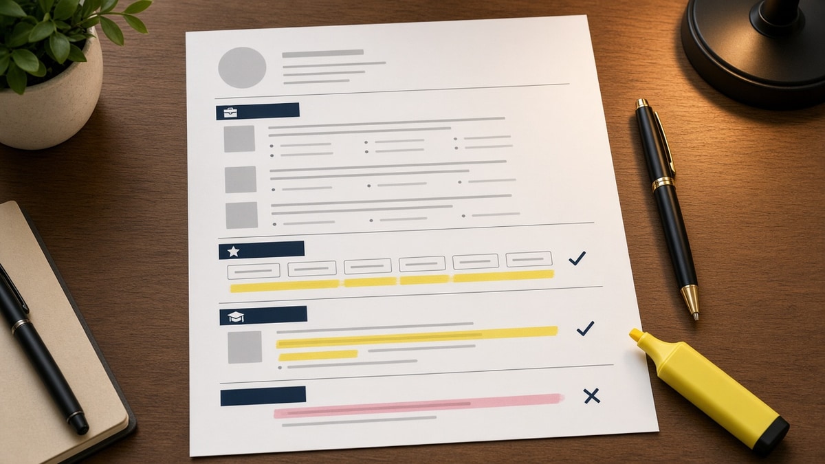
Print your current file. Highlight every section that is not contact, experience, education, or skills. Delete or move each highlight below job one. Re-read page one. If experience does not dominate, keep cutting.
Federal resumes are the main exception: longer formats, series and grade lines, and structured duty blocks. Corporate US reqs still want the short skeleton on this page unless the posting explicitly asks for a federal-style CV.
The universal US resume template is contact, experience, education, skills. Cut what does not earn search value. Move certs and projects down. Flatten columns. Let title-employer-dates lead page one.
Save a stripped version as your master file. Tailor bullets per req, not section order per template shop. You'll apply faster and parse cleaner on the next Workday upload.
Compare your file to a senior colleague's resume in the same function. Match section order, not font flair. Recruiters in that industry already trained their eyes on that shape.
- Experience starts on page one under plain contact lines.
- No photo, references, or objective paragraph.
- Skills line matches tools named in top bullets.
Name your master file Universal_US_Resume.docx and resist the urge to reformat per company unless preview fails. Tailoring is for bullets and the optional two-line summary, not for reinventing section order weekly.
Ask a recruiter friend to skim page one for ten seconds. If they cannot state your current title and employer aloud, your template still has too much noise above experience.
Save two versions: a one-page file for early-career applies and a two-page file for senior roles. Same section order in both. Only depth changes, not skeleton.
Delete one optional section, run the checker, and submit. The universal US resume template wins when it's boring enough for a parser to read straight through.
Boring is the goal. Searchable beats stylish on every US corporate req until a human asks for a portfolio link in the interview stage.
Strip one more decorative line tonight. You are closer than you think, and parsers reward the cut.
Read more
Frequently asked questions
Contact with phone and email, Professional Experience with title-employer-dates and bullets, Education, and Skills or tools named in bullets. Everything else is optional and often hurts parsing when placed above experience.
No for most US corporate applications. Photos add layout complexity, can trigger bias concerns, and push text into columns parsers misread. Exceptions are rare performance or modeling roles with explicit instructions.
One page through early career. Two pages when ten plus years of relevant experience need room for metrics. Three pages only in federal, academic, or executive contexts that expect depth.
Only when it adds a title translation or career pivot line bullets cannot carry in eight words. Otherwise experience bullets outperform a generic summary paragraph on ATS imports.