7 min read
That Canva template looks sharp in a thumbnail. It also sends your Q3 revenue bullet to an internship from 2019 once Workday finishes parsing. Recruiters aren't rejecting you for taste. They're opening a profile where the machine attached your facts to the wrong blocks, and that's not something you can fix with stronger bullet verbs alone.
You don't need a prettier font. You need one column where job title, company, and dates land on a line a parser can read without guessing which column came first.
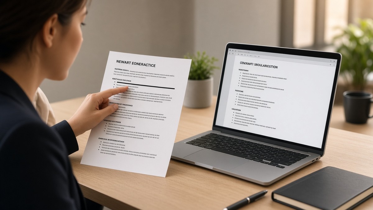
Before you reformat again, check your resume for free on the export you'll upload tonight. Paste the file into plain text. If your current title and dates stay together, you're fighting wording. If they split, you're fighting layout.
Below you'll see why boring wins, the exact experience header recruiters expect, when a designed file is still fine, and what to change in the next ten minutes.
Job searching is already draining. You shouldn't lose screens because a sidebar looked professional on your laptop and empty in Greenhouse. You'll fix that faster with a paste test than with another template download.
Quick Wins
- Collapse to one column before you swap fonts.
- Put title, company, and dates on consecutive plain lines.
- Paste into Notepad and confirm your current role stayed intact.
The resume format recruiters prefer on one screen
Corporate recruiters spend seconds on the first pass. They look for current title, recent employer, and proof bullets under the right job. The resume format recruiters prefer and why it works is simple: one text stream, top to bottom, newest job first.
Contact block. Name on line one. Phone and professional email on line two. City and state on line three. No headshot for US corporate roles. No QR codes. No social icons that replace plain text.
Experience block. Each role gets a header recruiters can scan in one beat, then three to five bullets with verbs and outcomes. Skills and education come after you've shown proof, not before.
Typography. Calibri, Arial, or Georgia at 10 to 12 point body. Bold job titles and section headers. Standard round or hyphen bullets. Margins around 0.7 inch. One page for early career, two when every line still earns its space.
Parsers in Lever, Taleo, and iCIMS follow the same read order humans use when the file is plain. That's why the boring file often outruns the designed one on upload, even when both look fine as PDFs on your screen.
The experience line parsers and recruiters both read
The failure mode isn't missing keywords. It's a title on the left, dates floating in a right margin, and company name trapped in a table cell. On import, dates stick to whichever text block the parser hit last.
Strong header (paste this shape):
Operations Analyst | Northline Health | Chicago, IL
March 2022 to Present

• Built weekly churn dashboards in Looker, cutting reactive tickets 11% in Q3
• Owned Salesforce case routing for a 12-person support pod
Title, employer, and location share line one when they fit. Dates sit on line two in Month Year to Month Year format. Bullets start immediately under that header, not in a second column.
Weak header (what sidebars do): job title alone on the left, company in a colored pill, dates in a right rail, city dropped entirely. That layout photographs well and imports badly.
I've screened stacks of these in Workday and Greenhouse, and the file that wins is boring: one column with title, company, and dates on lines the parser reads left to right.
For how file type changes the same layout, see PDF vs Word resume for ATS . Fix the header shape first, then pick the export.
Layout choices that look fine until upload
Template shops sell visual hierarchy. Portals sell parser accuracy. Two columns, tables, icon bullets, and page footers with your name often scramble imports before a recruiter opens the PDF.
This won't fix applying to roles you're not qualified for. It stops a qualified file from dying because the parser invented a weaker timeline.
When a designed resume is still okay
Plain is the default for Workday, Greenhouse, Lever, Taleo, and iCIMS uploads. Exceptions are narrow: a hiring manager who requested your resume by email may open the PDF directly, and some creative postings expect visual samples alongside a plain parseable file for HR.
When in doubt, keep two files. Plain upload for portals. Designed copy for humans who explicitly asked. Never send the designed file through a portal that parses before a recruiter opens it.
What to change in the next ten minutes
Open your master resume in Word or Google Docs. Don't swap templates yet. Fix these four items on the file you already have.
- Collapse to one column. Move sidebar skills into a list under Experience.
- Rewrite each job header so title, company, and dates sit on consecutive lines without tables.
- Replace icon bullets with standard hyphens or round bullets.
- Export DOCX, paste into Notepad, and confirm your current role's title and dates stayed together.
Before and after: job headers
Before: Job title in left column, company in a colored pill, dates in a right rail.
After: Operations Analyst | Northline Health | Chicago, IL on line one, March 2022 to Present on line two.
Before: "Title | Company | 2022 to 2024" as one pipe-separated line.
After: Title on line one, company and city on line two, Month Year dates on line three.
Copy-paste job header template
[Job Title] | [Company Name] | [City], [State]
[Month Year] to [Month Year or Present]

• [Verb-led bullet with tool and outcome]
If the paste test fails, the portal test will too. Swap bullets only after headers import clean.
Month-year dates beat year-only when you want credit for recent work. Pick one format and use it on every role. Mixed formats confuse humans and parsers alike.
For date formatting detail, read month-year vs year-only on resume dates . For why silence happens after upload, pair with why your resume never reaches a human .
Test the layout before you apply again
Format fixes are faster when you know which field broke on import. Run the export you'll upload, not an older version from your desktop.
Run a free ATS check on that file. If title and dates map to the right employer, shift time to bullet wording. If they don't, stay on layout until the paste test passes.
Draft a cover letter for referrals while your plain file goes through the portal. Keep job titles and dates identical between both documents.
Build your resume in a single-column template if you're rebuilding from scratch. You'll export DOCX with headers already stacked the way Workday expects, instead of undoing a designed template line by line.
Boring layout, attached facts
Recruiters prefer a single-column resume because it matches how parsers read and how humans skim under time pressure. Title, company, dates, bullets. Contact up top. Proof before skill lists.
You can't control every knockout question on the application. You can control whether your current job imports as your current job. Fix the header lines tonight, run the paste test, then tailor bullets with confidence.
Read more
Frequently asked questions
Recruiters hate designs that break read order on upload. A light accent on section headers may survive. Two columns, skill bars, and icon bullets often scramble title and date fields in Workday or Greenhouse. If you love the template, keep it for email. Send plain single-column through the portal.
Yes for corporate uploads. Put job title and company on line one, city and Month Year to Month Year on line two, or fit all four on one line if it still reads left to right without a table. Parsers attach dates to the nearest title block. Splitting title and dates across columns is how metrics land under the wrong employer.
Either works when the layout is plain. DOCX from Word or Google Docs usually preserves line order better than PDFs exported from design tools. If the posting allows both, run a paste test on each export. Upload whichever keeps your current job title and dates together in plain text.
After Experience for most US corporate roles. Recruiters skim proof first. A long skills block above jobs pushes your best bullet off the first screen. List tools you also used in a bullet upstairs. Duplication beats a sidebar chart the parser ignores.