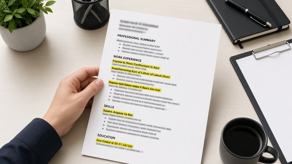
11 min read
Your experience is solid and recruiters still bounce in one scroll. That's usually not a keyword problem. It's a spacing and sections US resume layout problem: the current role doesn't pop, section headers don't register, and every job runs together like one paragraph. You didn't fail the screen. The file failed to show where your proof lives.
Before you rewrite bullets, check your resume for free on the same PDF you upload to Workday. You're checking whether Experience imported as a distinct block, not chasing a vanity score. When section gaps collapse, parsers glue Skills to your last employer and humans never find bullet one.
Job searching is exhausting enough without guessing why a qualified file gets ignored. This page walks the symptom you'll recognize, three layout causes, how to tell which one is yours, and the fix for each. No design degree required. You'll work in Word with normal margins and headers recruiters already know.
And if you're tailoring for a posting tonight, don't squeeze more text into tighter spacing to fit a third page. That's how sections disappear. Open the posting, pick three must-haves, and give each one a bullet with room to breathe. Generate a cover letter after the layout is fixed so your note doesn't repeat a wall of text the resume already buried.
Quick Wins
- Set 0.5-inch to 0.75-inch margins and 11-point Calibri or Arial before you edit content.
- Rename creative headers to Professional Experience, Education, and Skills.
- Insert one blank line between jobs and between major sections.
- Paste the export into Notepad once. If blocks merge, spacing failed before a human saw the file.
The symptom: qualified on paper, invisible on screen
You meet the years-of-experience line. Your bullets name real tools. Still no callback. On the recruiter side the file opens as a gray slab: contact lines, a summary paragraph, then six lines of text with no obvious current employer. The scan ends before anyone reaches your best metric.
Spacing and section breaks are how you tell the reader where to look. US corporate screens in Workday and Greenhouse reward the same visual rhythm parsers expect: name and contact, optional short summary, dated Experience with clear job blocks, Education, then Skills. When vertical gaps disappear, both machines and humans treat the page as one continuous field.
A composite operations manager whose roles run together looks like they've been "handling logistics" for twelve years with no promotion path. The 2024 manager title is on line eighteen, buried under bullets that never broke between employers. Same career, worse story, because layout hid the ladder.
I've screened files where the PDF was two pages of dense 10-point text with 0.3-inch margins. The candidate wasn't underqualified. The file was unreadable in the thirty-second window recruiters actually use. Spacing isn't decoration. It's the map.
Edge case: career changers who front-load a long Skills section before any dated job. Parsers read top to bottom. Your Salesforce cert parses as the headline while your nursing role drops to row nine. Move dated work above undated lists unless you're a new grad with one internship.
When columns are the main culprit, read why columns and tables kill resume accuracy first. This page assumes a single column and focuses on vertical rhythm and section labels.
Spacing and sections US resume layout: three causes and how to tell
Most layout failures fit three buckets. Cause one is cramped margins and line spacing. Cause two is non-standard or missing section headers. Cause three is inconsistent gaps between jobs so employers blur together. Run the plain-text test below before you buy a new template.
Cause 1: Margins and line spacing are too tight
Symptom: you fit three pages onto two by shrinking fonts and killing white space. Recruiters squint and close. Parsers still read the text, but humans never reward the effort.
Before: 10-point font, 0.25-inch margins, 1.0 line spacing, six-line bullets under one employer.
After: 11-point Calibri, 0.6-inch margins, bullets capped at two lines, three to five bullets per recent role. Same facts, half the visual noise.
Fix: reset margins to at least 0.5 inch. Trim old internships before you shrink font below 10.5. Recruiters forgive a third page with air more than they forgive a wall on page one.
Cause 2: Section headers don't match what parsers map
Symptom: Workday preview shows your coursework under Skills and your jobs under "Additional Information." Creative labels failed the field map.
Before: Headers read Career Highlights, Technical Toolkit, and Academic Foundation.
After: Professional Experience, Skills, Education. Each header on its own line with bold styling, blank line below before body text starts.
Fix: rename headers to US standard labels. See ATS section order best layout for field order after labels are boring.
Cause 3: Job blocks run together without vertical breaks
Symptom: plain-text paste shows Employer A bullets immediately followed by Employer B title on the next line with no gap. Recruiters think it's one job. Parsers sometimes merge dates.
Before: Jan 2022 to Present · Logistics Lead · Northline Foods followed instantly by Mar 2019 to Dec 2021 · Coordinator · Same company formatting with no space between roles.
After: Blank line between jobs. Title line format: Jan 2022 to Present · Logistics Lead · Northline Foods, Dallas TX. Then bullets. Then blank line. Then prior role.
Fix: in Word use 6pt space after each job's last bullet and 12pt before the next employer line. Never rely on hitting Enter three times without applying paragraph spacing. Exporters collapse random enters.
How to tell which cause is yours
Export PDF, copy all text, paste into Notepad on Windows or TextEdit in plain mode on Mac. Read top to bottom once. If you can't tell where Experience starts, cause two or three is winning. If you can find sections but your eyes tire on bullet three, cause one is winning. If Workday preview mislabels blocks while Notepad looks fine, add blank lines after each header and re-export.
Keep a one-line log per application: portal, preview result, spacing pass yes or no. Ten rows beats guessing whether layout or tailoring failed.
Fix for cause 1: margin and bullet rhythm
Open Page Layout. Set margins to 0.6 inch all sides. Select body text, 11-point font, line spacing 1.08 to 1.15. Limit bullets to two lines by cutting adjectives, not by shrinking font. Delete high school awards before you touch margin size.
Nurses and clinical roles: put license and ACLS on the contact block, not in a shaded box. Shaded boxes fight spacing rules and parse as floating objects.
Fix for cause 2: standard section stack
Use this order for most US applicants: contact, optional two-line summary, Professional Experience, Education, Skills, optional Certifications. Each section gets a bold header and one empty line beneath it. Summary longer than three lines belongs in a bullet under your current role instead.
Teachers moving districts: label roles with school name and district on the employer line. "Classroom Experience" is not a parser field. "Professional Experience" with dated school rows is.
Fix for cause 3: employer block template
Repeat the same employer line pattern every time: Month Year to Month Year · Title · Employer · City, ST. Bullets follow. Blank line. Next employer. Consistency trains the eye down the left margin in the zigzag recruiters actually use.
Before and after: software engineer
Posting wants backend ownership and clear tenure. Candidate has strong work hidden in dense formatting.
Before: Skills grid above jobs, 9.5-point font, employer lines italicized with no dates on the same row.
After: March 2021 to Present · Senior Software Engineer · Relay Payments · Austin, TX. Bullet: "Owned billing microservices in Go on Kubernetes; cut failed payment retries 18% after idempotency fix in Q3 2025." Skills list after Experience with comma-separated terms.
Before and after: registered nurse
Posting stresses med-surg and precepting. File buried unit type inside paragraph text.
Before: One paragraph per hospital with ratios buried mid-sentence, no line breaks between facilities.
After: June 2023 to Present · Staff RN, Med-Surg · County General, 32-bed unit, 5:1 ratio · Precepted 4 orientees; maintained fall-rate below unit average in FY25.
Before and after: account executive
Posting wants enterprise SaaS quota proof. Resume used a sidebar callout for attainment.
Before: Right margin text box: FY24 quota 118%. Main column lists employers without metrics.
After: Jan 2022 to Present · Enterprise AE · CloudLedger · Denver, CO. Bullet: "Closed $2.1M in new ARR in FY24 at 118% of quota using Salesforce and Outreach sequences."
Edge case: two-page resumes with orphaned headers
A section header alone at the bottom of page one with content on page two looks like a blank section. Keep at least one employer line with the Experience header. If you must break pages, break between jobs, not between header and first bullet.
Copy-paste US resume spacing block
Paste into a blank Word doc and replace bracketed lines. Spacing notes are in comments for you only; delete before export.
[Full Name]
[City, ST] · [Phone] · [[email protected]]
[Optional summary: two lines max, title level and scope only]
Professional Experience
[Month Year] to Present · [Title] · [Employer] · [City, ST]
• [Verb + scope + tool + outcome in one to two lines]
• [Second bullet]
[blank line here before prior job]
[Month Year] to [Month Year] · [Title] · [Employer] · [City, ST]
• [Bullet]
Education
[Degree] · [School] · [Year]
Skills
[Comma-separated tools aligned to posting]
Export PDF from this file. Paste into plain text. If Professional Experience and the first employer line aren't separated by a break you can feel, add 12pt space after the header and try again.
For skim path on top of spacing, see how to make your resume easier to skim . Layout buys the seconds; bullet lead words spend them.
Where spacing fixes still break on US uploads
Shrinking font to avoid deleting content. 9.5-point text saves space and costs readability. Cut old roles instead.
Using tables to align dates in the right margin. Tables erase the blank lines parsers use as section cues. Put dates on the employer line in the left margin.
Mixing paragraph jobs with bullet jobs. One employer as prose and the next as bullets looks like one blob. Pick bullets for every role after college.
Stuffing Skills with soft lines to fill space. "Team player" and "fast learner" don't need their own row. Replace them with tools from the posting.
Applying spacing fixes only on page one. A airy first page with a cramped second page still fails the plain-text test. Scroll the whole doc.
Trusting template marketing over your export. "ATS-friendly" on a Canva cover doesn't guarantee section gaps survived export. Notepad is the judge.
Adding color bands instead of white space. Gray section backgrounds parse as noise in some Workday tenants. Bold headers and blank lines beat shaded bars.
Test section order before the next application
Upload your spaced file to the free ATS checker with a target posting pasted in. You're confirming Experience imported as its own block and your current title sits above Skills, not below a merged paragraph.
If you're rebuilding from scratch, build your resume in a single-column layout with standard section headers, then tailor bullets. Fixing spacing in a broken template costs more time than exporting clean once.
Do this now: Reset margins, rename headers, insert blank lines between jobs, plain-text paste, then run the checker. That sequence beats buying another template pack.
Fix spacing and sections tonight
Spacing and sections US resume layout that gets read is not about looking fancy. It's about giving recruiters and parsers the same map: standard headers, air between jobs, margins that let 11-point type breathe, and a current role that shows up before anyone gives up scrolling.
- Reset margins and font size before you cut more bullets.
- Rename sections to Professional Experience, Education, and Skills.
- Insert blank lines between employers and major sections.
- Plain-text paste once per export. Merged blocks mean spacing failed.
- Run a free ATS check before the next batch of uploads.
Open the req you care about most. Fix layout on the DOCX source, export, and run HireFlow's free resume check before you hit submit. This won't land you roles you're not qualified for. It stops qualified files from dying because nobody could find your current title in the gray block.
Read more
Frequently asked questions
Leave one blank line between major sections such as Experience and Education, and a slightly smaller gap between jobs inside Experience. In Word that usually means 12pt after a section header and 6pt between bullets. When sections touch with no break, parsers often merge Education into the last employer line and recruiters read one gray block. White space is not wasted paper. It is how you signal where one chapter ends.
Single spacing at 1.0 is fine when margins are reasonable and bullets stay short. Pushing to 1.15 helps human readers on dense roles without changing parse order. What breaks imports is custom line-height tricks, text boxes, and tables that hide section breaks. Export from Word with normal paragraph spacing, then paste into plain text once. If Experience and Skills run together in Notepad, fix section gaps before you upload to Workday or Greenhouse.
Below Experience for most mid-career applicants unless the posting is entry-level and your paid work is thin. Recruiters scroll to your current title first. Parsers in Workday often weight dated job rows above undated skill lists. A Skills block above Experience can parse first and push your manager title down the profile. Put must-have tools inside bullets when you can, then list leftovers in Skills after your jobs.
No. Parsers map standard labels to profile fields. My Journey, Where I've Been, and Core Competencies often land in uncategorized text while your real employer lines miss the Experience bucket. Use Professional Experience, Education, and Skills. Boring headers are a feature. They tell both the importer and the recruiter what block they're entering.
You shouldn't. PDF tweaks hide problems that return on the next export. Fix spacing in the DOCX source, then export a text-based PDF. If the portal accepts DOCX, upload that after you confirm section breaks in plain text. A pretty PDF with invisible compression still parses like the scrambled source underneath.