12 min read
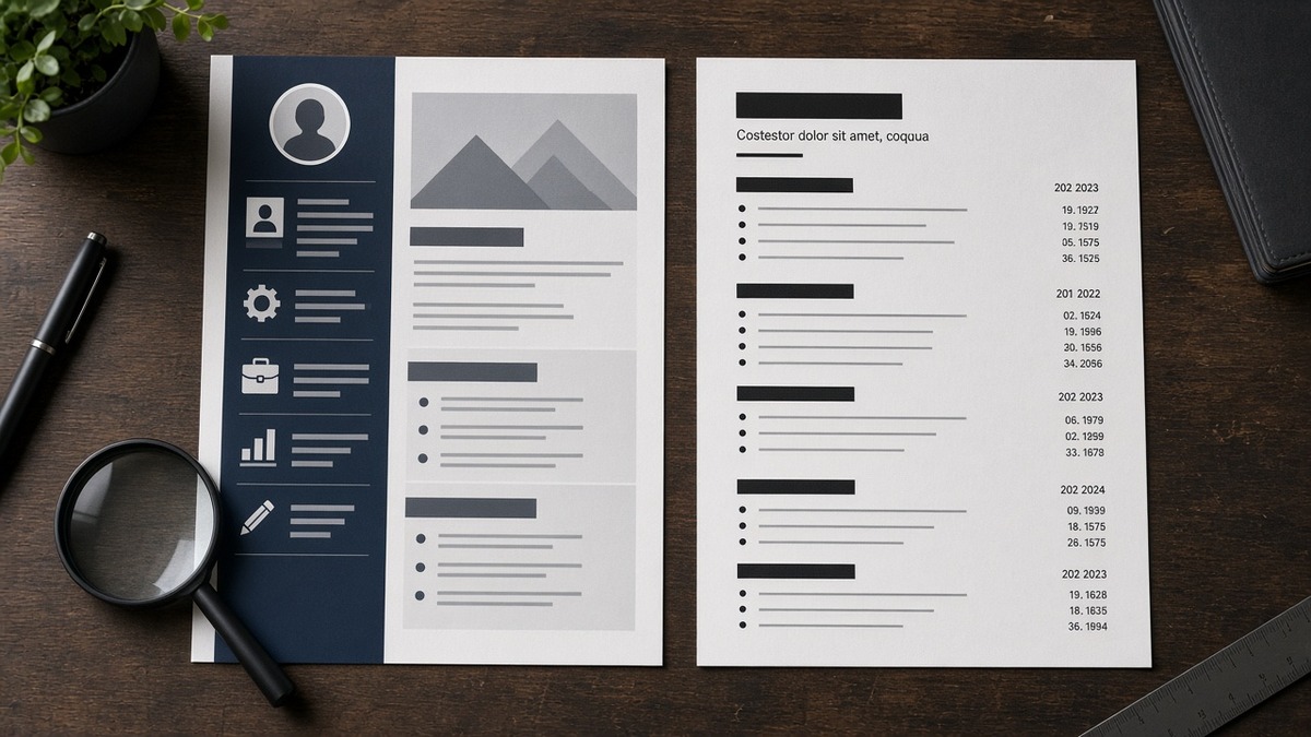
How visual design reduces resume accuracy is straightforward: parsers read your file in linear text order, not the layout you'll see on screen. Two columns, tables, text boxes, and icon bullets scramble that order, so employer names, dates, and skills land in the wrong fields or vanish. Export a single-column DOCX or text-based PDF with standard bullets and Calibri or Arial before you upload. That fix won't invent qualifications you lack. It stops a qualified file from looking empty in the preview recruiters screen, and it doesn't require a designer.
You're not failing because your story is weak. You're losing accuracy when the designed version you love and the string Workday stores are two different documents. Before you strip another keyword, check your resume for free and confirm Experience still shows distinct Month Year ranges after export. If bullet one parsed under Education instead of your latest employer, design broke the file, not your experience.
Below: why design breaks parsing, the exceptions that still let subtle formatting through, what to change now, and before-and-after pairs you can paste tonight. No design portfolio lecture. Just parser mechanics and recruiter skim habits. I've screened stacks of these in Workday and Greenhouse, and the accurate file is almost always the boring one.
Quick Wins
- Single column. No skill tables in the margin.
- Replace icon bullets with plain hyphens.
- Spell contact lines as text, not glyphs.
- Read the portal preview before Submit.
Why visual design breaks parser accuracy
Applicant tracking systems do not admire your header band. They chunk text into employer, title, start date, end date, education, and bullet fields. When you split contact details across a coloured sidebar, the importer may read your phone number after your degree block. When skills sit in a right column, they often detach from the job where you used them.
The PDF you email yourself is not the data recruiters search. Greenhouse and Workday store a parsed profile built from character order. A two-column Canva export can look polished while the stored string places your latest title under Certifications. You then fail title search filters you would have passed with a boring layout.
Humans skim visually. Recruiters with four hundred files open ctrl-f through the parsed view or skim bullet one in the native PDF. Visual noise slows the human read. Scrambled parse data breaks the machine read entirely. Both paths reduce accuracy: the system mislabels you, or the recruiter never finds the metric you buried under a graphic.
Design tools encourage tables for alignment. Tables are the fastest way to merge two jobs into one undated block on import. Text boxes for summaries float outside heading hierarchy, so Profile prose sometimes imports as a footer after Skills.
Fancy fonts add another failure mode. Script and condensed faces parse as odd characters or blank spaces. Stick to Calibri, Arial, or Times New Roman at 10 to 12 point. Bold headings are fine. Full-page watermarks are not.
Headers and footers with page numbers and repeated logos look professional on print. On import they sometimes duplicate your name three times or insert page 2 before your second job block. Turn off running headers in the master Word file before you export for upload.
Infographic-style skill bars show proficiency as shaded rectangles. Parsers read the label if it sits beside the bar as typed text. When the label lives inside the shape as an image, the skill never enters the stored profile. Write Python and SQL as words in bullets, not as chart graphics.
Multi-page creative layouts often put contact details only on page one inside a coloured band. If page one strips on a bad import, page two opens with a job title and no phone number. Repeat email and phone as plain text at the top of page one without wrapping them in a table.
For how parsers match text after layout is clean, read how ATS matches resumes to job descriptions . Structure first. Keywords second.
How visual design reduces resume accuracy: what to flatten
Strip layout before you rewrite bullets. One flatten pass tells you whether accuracy problems are design-driven or content-driven.
Two-column marketing resume
Posting wants paid social, reporting, and client management proof.
Before: Left column Experience, right column Skills with Meta and GA4 icons. Dates mixed as 03/22 and Present.
After: Bright Wave Agency, Austin. Digital Marketing Manager | March 2022 to Present. Ran Meta Ads for three B2B clients; cut cost per lead 14% in Q2 2025 using GA4 funnel views. Skills line removed; tools sit in bullets beside dated roles.
Operations resume with table header
Posting searches scheduling, inventory, and P&L language.
Before: Contact row built as a three-cell table with logo banner. Job titles centered in coloured bands.
After: Name and phone on plain lines. Logistics Coordinator | June 2021 to Present. Ran weekly rota for 18 warehouse staff; held overtime spend within 3% of forecast in FY 2024.
Engineering resume with icon skill row
Posting lists Python, AWS, and CI/CD ownership.
Before: Python and AWS as badge icons under a divider. GitHub link only as a button shape.
After: Software Engineer | January 2023 to Present. Built Python ETL jobs on AWS Lambda processing 2.1M events daily; cut batch runtime 22% after pipeline refactor. GitHub: github.com/handle on its own text line.
Copy-paste block: flatten checklist before export
FLATTEN PASS
1. One column only. Remove sidebars and text boxes.
2. Contact: name, phone, email, city on plain lines.
3. Headings: Experience, Education, Skills as typed words.
4. Bullets: hyphen or round dot, not icons.
5. Dates: Month Year on every role, same format throughout.
6. Export DOCX from Word; PDF only if portal requires it.
7. Open portal preview; read employer and title fields line by line.
Run that pass once per master file. Save the designed version for networking PDFs if you want. Upload the flat version to Lever, Workday, Greenhouse, and iCIMS.
Finance resume with merged education table
Posting wants ACA progress, audit exposure, and Excel modelling language.
Before: Education and Qualifications share a two-row table with centred ACA badge art. Employer dates read 2019 to 21 in mixed short formats.
After: Audit Associate | September 2019 to Present. Built Excel models for three statutory audits; cleared senior review with two query cycles on FY 2024 files. Education: BSc Accounting, University of Manchester, 2019. ACA (ICAEW) Part Qualified, June 2024.
Customer success resume with timeline graphic
Posting searches retention, onboarding, and CRM ownership.
Before: Vertical timeline with dots and lines replaces standard job headings. Zendesk and Salesforce appear only inside graphic labels.
After: Customer Success Manager | April 2022 to Present. Owned Zendesk queue for 180 SMB accounts; lifted renewal rate from 88% to 93% in FY 2024. Onboarded 40 new logos quarterly in Salesforce with playbooks sales reused.
When accuracy still drops after flattening, read PDF vs Word resume for ATS for file-type rules that sit underneath layout choices.
Exceptions: when minimal design still works
Accuracy is not the same as ugliness. A few visual choices survive import when you keep the body plain.
Bold section headings and one font weight change. Experience in bold above plain bullets parses fine. A coloured heading band across the full page width sometimes strips on older importers. Bold text rarely does.
One accent colour on your name only. Dark navy on a white page is readable for humans and usually survives text extraction. Neon body text does not.
Horizontal rules between sections. Simple line breaks beat graphic dividers. If you use a rule, keep it as a plain border under a typed heading, not an image.
Two-page length with consistent structure. Page count does not reduce accuracy. Page two with a second column on page one only does. Keep both pages single column.
Edge case: creative roles sometimes want portfolio links up top. Put one plain URL on its own line. Do not hide the link inside a button icon. Parsers skip shapes.
Edge case: some government portals recompress uploads. When your flat DOCX previews wrong on a board but looks fine on the employer careers site, apply directly with the same file instead of trusting the intermediary viewer.
Edge case: designers applying to brand roles sometimes want layout flair on the resume itself. Keep the upload flat and put visual work in a portfolio link on one plain line. Recruiters open portfolios after the file parses. They rarely fight a broken upload to find your Behance URL buried in a shape.
You flatten design but keep hidden white text for keywords. Some portals still read tiny footer strings. Recruiters who open the native PDF flag it immediately. Put each term once beside the role where you used it.
You trust the template marketplace badge that says ATS friendly. Many shipped templates use tables under the hood. Open the file in Word and turn on paragraph marks. If you see table gridlines around Experience, rebuild before upload.
I've screened files where the candidate's designed PDF showed ten years of scope and the parsed view showed two lines. Accuracy loss that stark is almost always layout, not keyword density.
Test accuracy after you flatten design
Upload the flat file and posting to HireFlow's free ATS resume checker . You'll see whether employer blocks, titles, and dates still parse as separate lines instead of one merged paragraph.
Rebuilding from a broken template? Use the free resume builder for a single-column skeleton, then paste your bullets back in without icon rows or tables.
When the role needs a letter and the portal strips design from uploads anyway, draft plain structure in the cover letter generator so nothing contradicts the flattened resume text.
What to do now
How visual design reduces resume accuracy comes down to reading order. Columns, tables, icons, and text boxes scramble the string recruiters search. Single column, plain bullets, typed headings, Month Year dates.
Open your master file tonight. Delete the sidebar. Move skills into dated bullets. Export once. Read the preview. Send one application you can trust to parse the same way you read it.
Your experience did not shrink. The layout made it disappear. Flatten the file and let the proof show up where Workday expects it.
Read more
Frequently asked questions
Not always, but it fails often enough that you should not bet an application on it. Parsers read left column top to bottom, then right column, or merge cells unpredictably. Skills in a sidebar frequently detach from employer blocks. Single column removes the gamble.
Yes, sparingly. Bold section headings and your name are fine in Calibri or Arial. Full-page background color, gradient headers, and light grey body text reduce contrast for humans and sometimes strip on import. Keep body text black on white.
Both cause trouble. Star, checkmark, and phone icons replace words the parser expects. Use a hyphen or a standard round bullet. Spell LinkedIn and email as plain text lines, not glyphs in a contact row.
Humans read visual hierarchy. Parsers read character order in the file. A designed PDF preserves appearance while scrambling sequence. Export from Word with one column and read the portal preview before you submit.
DOCX is the safer default when the portal allows it. Text-based PDF from Word usually works. Scanned PDFs and Canva exports are where accuracy drops hardest. Match the requested format, but flatten design in the source file first.