9 min read
You spent an hour picking accent colors and icon sets. The portal still asks for the same job title twice because the parser never attached your last role to the right employer. That's usually layout, not talent.
Check your resume for free on the file you're about to upload, not the version that looks great in preview mode. Most corporate stacks in Workday, Greenhouse, Lever, Taleo, or iCIMS build a text profile before a recruiter opens your PDF.
Below you'll see what a parser-safe export looks like, before/after pairs for the visual traps I see most, what scrambled plain-text pastes share, and a copy-paste header block you can drop into Word tonight. Job searching's exhausting. This page stops qualified files from dying on graphics; it doesn't debate whether filters are fair.
If you've been tweaking keywords while a sidebar still parses first, flip the order. Flatten layout, then tailor bullets. You can't match a posting when the software thinks your skill icons are your current employer. After you fix export order, generate a cover letter from the corrected text so the note matches the employer lines you just saved.
Quick Wins
- Paste your PDF into a plain text editor and read employer order once.
- Flatten two-column templates to one column before export.
- Replace icon skill rows with words inside dated Experience bullets.
- Move contact lines out of headers and footers into the body under your name.
What parsers pull when resume visuals confuse screening software
Applicant tracking software does not see your Canva-style polish. It ingests a file, strips most styling, and maps text into fields recruiters scan in list view. Fonts disappearing is expected. Your Salesforce line showing up as a job title is not.
The bar your upload must clear: a plain-text paste reads in human skim order: name and contact, optional summary, Experience with Month Year dates on each employer line, Education, then Skills. Each bullet stays under the employer it belongs to.
A composite marketing coordinator whose left rail lists HubSpot, GA4, and SQL before any employer name looks like those tools are the current role. The real company line drops to row four. Same person, same career. Different screen because visuals drove parse order.
I've screened stacks of these in Greenhouse and Workday, and the file that survives is boring on purpose: 11-point Calibri, one column, no icons, dates inline with titles.
Read resume rejected by ATS for the wider filter story. This page is the visual layout teardown and what to change before export.
Naming an ATS is fine. Claiming secret scoring rules is not. Stick to what you can test: paste order, selectable text, and whether your phone number still appears after upload preview.
Before/after pairs for visual layout failures
Each pair shows a design choice, what parsers tend to do with it, and the export fix. Swap in your employers. Illustrative titles only.
Pair 1: Two-column template with a colored sidebar
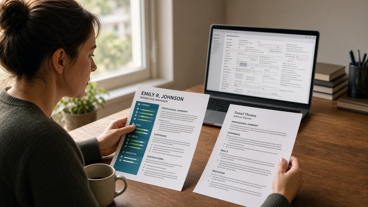
Before: Left rail holds Skills, Certifications, and software icons. Right column holds Experience. Colored sidebar background.
After: Single column, black text on white. Skills appear inside bullets or one short list after Experience. Icons removed.
Parsers often read the left column first. Your Tableau and SQL lines become the opening job. Fix the column, not keyword density.
Pair 2: Skill proficiency bars and star ratings
Before: Horizontal bars at 90% for Python, 70% for SQL, decorative stars beside each tool.
After: Under the DataCo role: Built churn dashboards in Looker and Python, cutting reactive tickets 11% in Q3. Stack named in the bullet, not a chart.
Bars are images or shapes parsers skip. The label may survive without the employer context you intended.
Pair 3: Contact block inside a Word header
Before: Phone, email, and city repeat in a header on every page. Name centered in the body.
After: Name on line one, city and phone on line two, email on line three, all in the body. Headers and footers empty.
Headers parse early. Screening software may map your mobile number into a summary field while your first job title lands under Education.
Pair 4: Skills grid in a Word table
Before: Three-column table: Technical | Tools | Soft Skills with twenty cells and light gray borders.
After: One line under each role: Stack: Python, SQL, Airflow, Looker. Or a comma-separated Skills block with no grid.
Tables flatten row by row. An analyst's Looker bullet can separate from the employer that used it.
Pair 5: Summary inside a shaded text box
Before: Gray floating box beside the name with a three-line summary and a colored border.
After: Summary as normal paragraphs under contact lines, same width as Experience, no shading.
Floating objects parse late or drop. A strong summary in a box may never reach the profile field recruiters skim.
Pair 6: Operations manager with logo watermark
Before: Faint company logo watermark, wingding bullets, dates in the left margin beside a two-column project list.
After: Standard hyphen bullets. Month Year dates at the start of each employer line. One column, no watermark.
Before: Led warehouse rollout; managed $3.2M budget; supervised 14 leads.
After: Mar 2022 to Present · Operations Manager · LogisticsCo · Led WMS rollout across 6 distribution centers; held cutover under $3.2M budget and 14-person shift lead team through Q1 2025 go-live.
Copy-paste parser-safe header block
Paste this at the top of a blank Word doc and replace bracketed lines:
[Full Name]
[City, ST] · [Phone] · [[email protected]]
[Optional one-line summary with title level and scope]
Professional Experience
[Month Year] to [Month Year or Present] · [Employer] · [Title]
[Bullet with verb, scope, tool, and outcome]
Export PDF from this file only when the posting requires PDF. If plain-text paste scrambles, upload DOCX from the same source. See PDF vs Word resume for ATS when the portal lets you choose.
Visual habits that still break plain-text export
Trusting the PDF because it looks fine on your screen. Recruiters may open a parsed profile first. Layout already buried your current role under Skills.
Using light text on a dark background band. Some exports drop low-contrast lines entirely. Stick to black on white for portal files.
Embedding QR codes or portfolio images. Parsers skip images. Put github.com/handle and your site URL as plain text on line three under email.
Uploading a scan of a printed resume. OCR guesses characters. Employer names and dates are the first casualties.
Keeping invisible tables from online builders. Toggle gridlines in Word. If you see a grid around dates, rebuild that section as stacked lines.
Stuffing keywords into a sidebar after a failed upload. More text in the wrong column worsens parse order. Flatten first, then tailor bullets.
Using creative section headers. My Journey and Where I've Been do not map to Experience and Education in most parsers. Standard labels are dull on purpose.
Fixing only page one of a multi-page file. A clean page one with a two-column page two still scrambles the full profile. Scroll the entire doc before export.
Verify plain-text order before you upload
Run the export through the free ATS checker with the job description pasted in. You're confirming employer-title pairing and whether skills landed in Experience, not chasing a vanity score.
If you're rebuilding from a design-heavy file, build your resume in a single-column layout, then paste your corrected bullets in. Parse order first. Keyword swaps second.
Strip layout risk, then tailor keywords
How resume visuals confuse screening software comes down to parse order, not bad luck. Columns, icons, shaded boxes, and tables reorder text before keyword matching runs. Flatten to one column, move contact into the body, kill floating boxes, and read a plain-text paste once.
Pick the next req on your list. Apply the copy-paste header block. Run a free ATS check. Upload when employer lines stay paired with the right titles.
This won't turn a design portfolio into a parser-friendly file without edits. It does stop qualified candidates from losing screens because their best bullet landed under Skills while a sidebar full of tools became their fake first job.
When you need a clean base file, use the single-column builder above before you tailor for the posting. Visual polish can wait until a human is already in the room.
Read more
Frequently asked questions
Most parsers strip styling and read text in document order. Losing color is normal. Losing employer lines or reading your skills column before your current job is not. Fix layout first. Colors and fonts are secondary.
No. Icons and rating graphics are images or special characters parsers skip. Write proficiency in words inside dated bullets: Advanced Python on the DataCo role line, not five stars beside Python in a sidebar.
It fixes most reorder problems from sidebars and skill tables. It does not fix scanned PDFs, password-protected files, or text boxes that float outside the main flow. After you flatten columns, paste the export into a plain text editor and read top to bottom once.
Upload what the portal accepts, then confirm text is selectable in the file you chose. Export PDF from the same single-column Word source. If plain-text paste scrambles on PDF, try DOCX from that source. Visual layout matters more than the extension.
Yes. Keep a polished PDF for humans who already know you. Use a parser-safe single-column file for Workday, Greenhouse, Lever, Taleo, and iCIMS uploads. Two files, two jobs. Do not send the pretty one through a portal that builds a parsed profile.