8 min read
That Canva template isn't lying to you. It's lying to the upload preview.
You can have perfect metrics and still get archived because the parser thinks your skills block is your most recent job. That's a styling problem, not a talent problem.
And if you've been told to "stand out visually," remember recruiters aren't judging art. They're racing a queue before standup.
Styling impacts screening twice: once when software flattens your layout, again when a human can't find bullet one without zigzagging across columns.
Check your resume for free after you flatten layout so you can see the same text order recruiters get in Greenhouse.
Below: designed PDF versus plain single-column, where fonts and bold help, and what to fix before you reapply.
Designed PDF vs plain single-column screening
Designed PDFs win on aesthetics; plain columns win on order. Parsers strip boxes and columns into one stream. Humans still need employer, title, and dates on one line they can grep with their eyes.
| Element | Styled template | Plain single column |
|---|---|---|
| Parser read order | Skills rail may precede current role | Top-to-bottom matches your intent |
| Human ten-second scan | Color draws eye away from bullet one | F-pattern lands on latest job fast |
| Workday preview | Dates sometimes detach from employers | Dates usually stay on the same row |
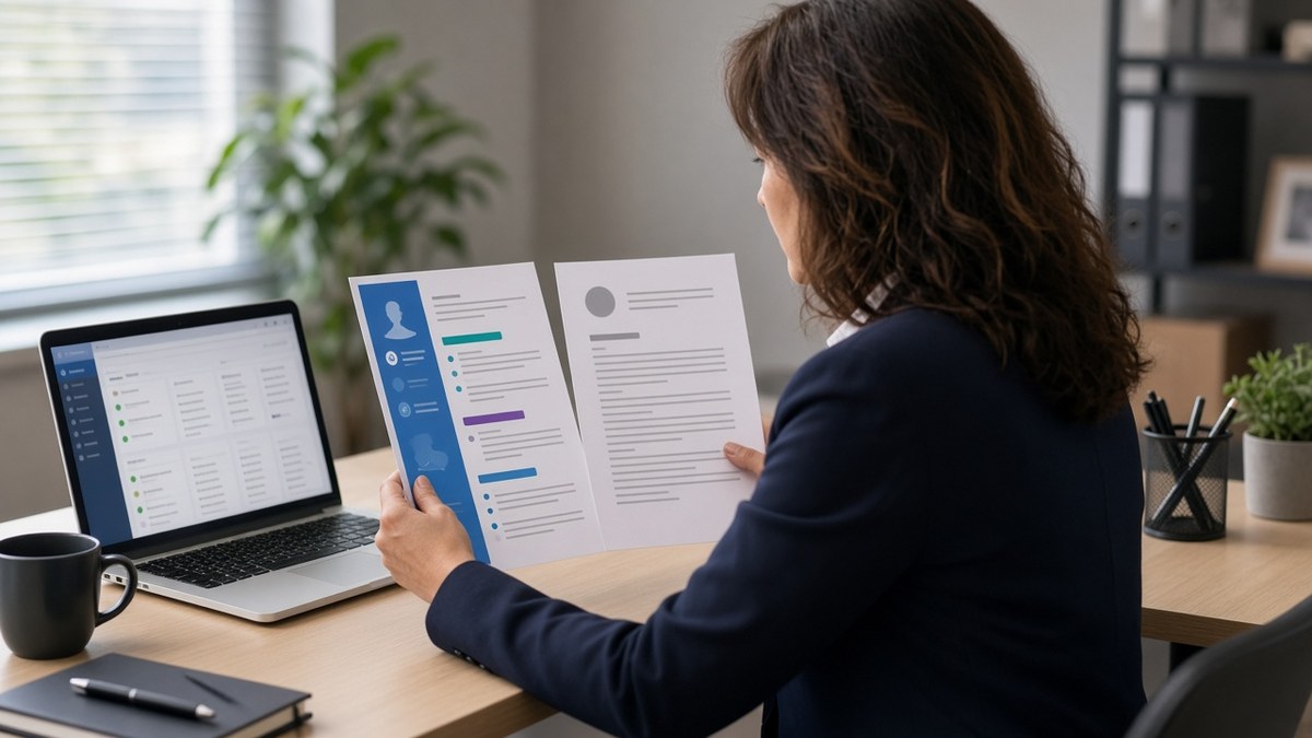
Before: Two-column Canva layout with teal headers, skill icons, and a photo circle. Plain-text export lists Adobe Illustrator before your 2024 employer.
After: Single column, 11 pt Calibri, bold employer names only. Export shows current role first, then prior jobs in reverse chronological order.
Before: Light gray body text (#CCCCCC) on white for "modern" feel. Printed preview looks fine; OCR drops half the bullets.
After: Black body text, gray reserved for one-line location strings. Every bullet survives copy-paste into a notes field.
See resume formatting errors that break ATS parsing for upload-specific breaks; this page is the styling side of the same screen.
When you're choosing between pretty and plain, run the plain-text test first. If the story survives without color, you can add one accent later. If it doesn't, color won't save the upload.
Designers aren't exempt. Portfolio sites can stay expressive; the screening PDF should read like a bank statement with verbs.
Margin tricks also fail: squeezing 11 pt text into 8 pt boxes to fit a sidebar still exports as tiny strings recruiters won't squint at.
White space is not your enemy. A second page with readable type beats a one-page mosaic that parsers shred.
Fonts, bold, and color: what changes screening
Fonts: readable beats branded
Stick to one family for body and one for headers max. Mixing five weights reads like a flyer, not a employment record.
Bold: signposts, not decoration
Bold employer and title rows. Don't bold every metric; the eye stops caring. One bold phrase per bullet is plenty.
Color: humans only
Parsers ignore your hex codes. Use color on section rules or your name line if you must, not on keywords you need matched.
Columns: one lane for machines
If you won't give up a sidebar, move must-have tools into bullet one under the job where you used them. Don't rely on the rail alone.
Narrow sidebars hurt less than 50/50 splits, but they're still read before your summary in some exports. Test before you assume the sidebar is harmless.
Icons in place of words (phone glyph instead of "mobile") sometimes vanish entirely in text view. Spell it out in characters parsers can read.
Copy-paste styling reset:
1. Switch to single column; delete text boxes and icons.
2. Set body to 10.5–11 pt Arial or Calibri, black on white.
3. Bold only employer + title rows; keep bullets regular weight.
4. Export PDF, then copy all text into Notepad and read order aloud.
5. Re-upload only when current job appears before skills.
I've rejected otherwise strong designers when the plain-text dump opened with "Figma, Sketch, Adobe CC" and their lead role showed up on line forty. The PDF was gorgeous; the screen was empty.
Match how to use Canva and still pass ATS when you want to keep brand colors but need a parser-safe export path.
Bold headers won't fix scrambled order. Neither will a fancier font. Order is the product; styling is packaging.
If you're printing for a career fair, carry the plain export. Handing someone a beautiful PDF that fails their internal upload later wastes both of your time.
Resume styling choices that fail the second pass
- Tables for work history instead of simple employer rows.
- Header/footer bands that repeat your name and push page one content down.
- Skill meters, star ratings, or progress bars parsers can't score.
- Justified text that adds weird gaps OCR reads as line breaks.
- Embedding logos as the only place a company name appears.
- Using columns on page one but single column on page two (mixed order).
When you're proud of the design, send the plain-text export to a friend. If they can't tell your current title in five seconds, recruiters won't either.
Photos and headshots rarely help corporate screens and sometimes trigger policy filters. Let LinkedIn carry the face; let the resume carry outcomes.
Watermarks and background graphics are another silent killer. They survive PDF export but turn into noise in OCR, which means missing verbs in keyword scans.
Pair layout fixes with a short cover letter that repeats bullet one in prose so humans see the same story after the parser flattens your file.
Test styling after you flatten the file
Paste the posting and your updated PDF into a checker run. You're confirming section order and date pairing, not font taste.
Run the ATS check on the single-column export before you mass-apply with the old template.
Build your resume in one column if you need a clean baseline without reopening design software tonight.
When styled PDFs still make sense
Creative fields sometimes want a designed PDF in addition to a plain upload. Send both when the portal allows: parser-safe file first, portfolio PDF second if the recruiter asks.
Academic CVs are a different species. This guidance targets US corporate one- to two-page screens in Workday, Greenhouse, Lever, and iCIMS, where styling impacts screening the moment you hit submit.
Keep a master styled version for networking if it helps you feel confident. Just don't confuse that file with the one you mass-upload at midnight.
Make the screen boring on purpose
How resume styling impacts screening isn't a ban on taste. It's a rule about order: machines read one stream, humans skim one column. Fix order first, then add one design accent if you still want it.
Flatten one template tonight, re-export, and apply with the plain file. If callbacks move, your old layout was costing you more than you thought.
Save the styled version as a reminder of what not to upload, not as your default. Most candidates only need one parser-safe master and a short cover note per req.
How resume styling impacts screening is the hidden tax on otherwise qualified people. Pay the tax once by fixing layout, then stop paying it on every application.
Tomorrow's task is maintenance: when you add a new role, paste into the plain template first, then decide if any styling accent still survives export.
Plain isn't punishment. It's the format that survives both the parser and the tired human at the end of the queue.
Read more
Frequently asked questions
They care about speed. A clean single column lets them hit employer, title, and bullet one in under ten seconds. Heavy color and sidebars push that scan off the page. Design is fine in portfolios; the screening file should read like a spec sheet.
They often scramble order. Parsers read left to right across the full width, so a right rail of skills can land before your current job in the text export. That makes you look junior or misaligned even when the PDF looks polished.
Arial, Calibri, Helvetica, or Times at 10–11 pt. Decorative scripts and ultra-light weights disappear in OCR. If you wouldn't print it on office paper, don't upload it to Workday.
Yes, sparingly. Bold on employer names and section headers is enough. Save color for links you expect humans to click, not for body bullets. If the plain-text export loses your emphasis, the parser did too.