11 min read
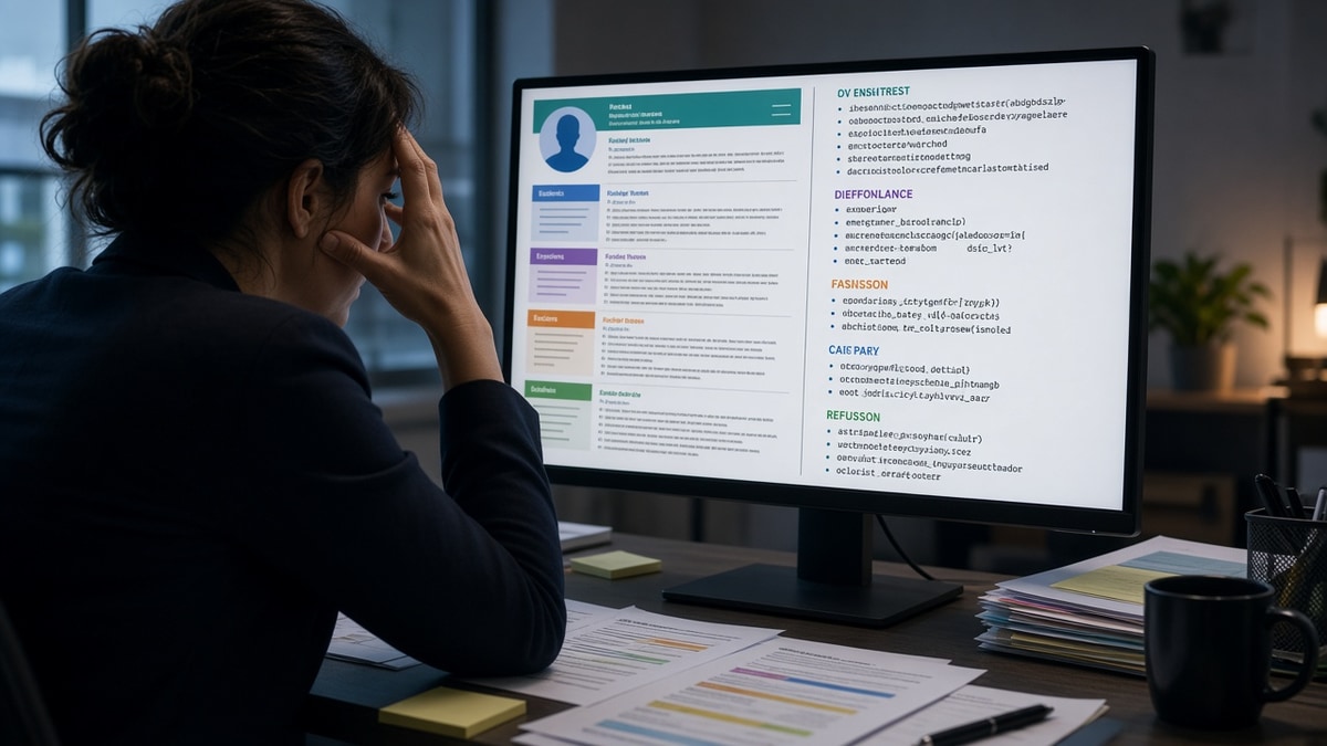
Your resume looks sharp on your laptop. Margins are even. The accent color matches your portfolio. You hit submit and wait. Weeks pass with no reply, and you never get a rejection that mentions layout. That silence is often how resume design cost interviews: the parser read your file in the wrong order, so the recruiter never saw the role you're actually in.
Check your resume for free before you send another application. If the extracted text shows skills where your job titles should be, design is the problem, not your experience. You're not doing anything wrong on paper. The portal just didn't read the paper the way you do.
Below you'll see what breaks in Ashby and Greenhouse, which design choices scramble parse order, when a designed file is still fine, and a plain layout you can paste tonight. You don't need a new template shop subscription. You need one column, real text, and a quick parse check.
Job searching is stressful enough without guessing why strong files go quiet. This won't fix applying to roles you're underqualified for. It stops a qualified file from dying because the sidebar read before the employer name. If you've already rebuilt bullets twice, start with layout before you rewrite content again.
Quick Wins
- Switch to single-column, left-aligned text before your next upload.
- Replace icons and skill bars with plain words the posting uses.
- Compare extracted text to on-screen order after every export.
Why resume design cost interviews you never hear about
Parsers do not see your layout. They read a stream of text top to bottom, left to right, as if someone flattened the page. A two-column design that puts skills on the left and jobs on the right often becomes one jumbled block: Excel, Python, Acme Corp, Tableau, 2021 to 2024. The recruiter's preview then shows a skill list where your current title should be.
The pattern: you look qualified on PDF. The ATS profile looks empty or out of date. Nobody emails you to ask for a cleaner copy. You just fall out of the queue.
I've screened stacks of these in Workday and Greenhouse, and the designed file that loses is almost always the one the candidate is proudest of. Canva exports, infographic templates, and heavy Word text boxes create the same failure mode: missing employers, duplicated dates, skills floating without context.
Humans have the same problem on a fast scan. If your eye has to hunt for the current role because color blocks split the page, the recruiter moves on. You get under ten seconds on the first pass. Design that looks polished to you often costs the interview before anyone reads bullet three.
Think of the parser as a copy machine that only reads left to right. It does not understand that your job history lives in the wide column on the right. It will print skills, then a date, then another skill, then half a company name. That jumble becomes your official profile inside iCIMS or Lever. Hiring managers trust that profile when they schedule screens.
When resume design cost interviews in your last search, you probably blamed keywords or timing. Check the portal preview first. If the preview is wrong, no amount of tailoring fixes the underlying file. Layout is not a cosmetic choice. It is the order of facts recruiters use to decide whether you are in the right role today.
Edge case: you applied through a referral and still got silence. Referrals skip some filters, but the hiring manager still opens the attached PDF. If dates parse wrong in the internal profile, the manager questions the timeline even with a warm intro.
Edge case two: creative roles. A designer or marketer sometimes needs visual proof. Still ship a plain text-friendly version for the portal and label it clearly. Save the portfolio PDF for the link in your header, not as the only upload.
For how recruiters order their first glance after parse, read what recruiters look at first on a resume . If design scrambled the header, that glance never lands on your best bullet.
Rebuild layout so parsers read employers in order
You do not need a design degree. You need one column, standard fonts, and sections in an order the parser expects. Work through these six moves on your current file before you apply again.
Move 1: Flatten to one column
Delete sidebars. Move contact lines to the top center or top left as plain text. Put skills after experience unless the posting demands otherwise. If you must keep two columns for print, build a separate single-column version for uploads.
Move 2: Swap graphics for words
Remove star ratings, progress bars, and logo strips. Type the skill name exactly as the job description spells it. Parsers match strings, not shapes.
Move 3: Kill tables and text boxes
Tables that align dates in a grid often export as random cell order. Replace with Company, Title, City, Month Year to Month Year on one line, then bullets below. Same information, no grid.
Pair 1: Marketing coordinator layout
Before: Colored sidebar with icons for Mailchimp, Canva, and SEO; jobs listed in a narrow right column with gray timeline dots.
After: Name and email centered; Experience section with BrightPath, Marketing Coordinator, Austin TX, Jan 2023 to Present; first bullet leads with campaign metrics; Skills line lists Mailchimp, Canva, SEO as comma-separated text after experience.
The weak version parsed as a skill dump with no current employer. The strong version put BrightPath first in the text stream.
Pair 2: Data analyst with chart header
Before: Full-width banner image, pie chart of skills, experience inside a bordered text box in the footer.
After: No images; Analyst, Riverstone Health, SQL and Looker in bullet one; skills as a short list below the last job.
Banner headers often become blank lines or garbage characters. Footer boxes sometimes drop entirely on upload to Lever.
Move 4: Standardize fonts and bullets
Use 10.5 to 11 point Calibri, Arial, or Times New Roman. Stick to round bullet characters, not custom icons. Avoid headers and footers for page numbers or repeated contact info; those fields often duplicate or vanish.
Move 5: Export and read the text layer
Open the PDF, select all, paste into Notepad. Read top to bottom. If your latest job is not near the top of that paste, fix order before you upload.
Move 6: Match file type to the portal
When the form accepts DOCX and you authored in Word, DOCX is fine. When it demands PDF, print to PDF from the plain Word file, not from a design tool. Re-paste into Notepad after export every time.
Edge case: the posting says creative format welcome. Send the plain file in the ATS box anyway and mention the portfolio link in your summary line. Hiring managers who want visuals will click. Parsers still need text first.
Edge case two: you rebuilt in Google Docs. Docs exports can add hidden breaks. Download as DOCX, open in Word, strip any section breaks, then export PDF if required. The extra hop is worth a clean parse.
Copy-paste section order block
Rebuild your file in this order when parse keeps scrambling:
[Full Name]
[City, ST] · [Phone] · [Email] · [LinkedIn URL]

SUMMARY
[Two lines max, no text box]

EXPERIENCE
[Company] · [Job Title] · [City] · [Month Year] – [Month Year]
• [Action + metric bullet]
• [Action + metric bullet]

[Repeat per role, reverse chronological]

SKILLS
[Comma-separated tools from the posting]

EDUCATION
[School] · [Degree] · [Year]
Pair 3: Operations lead using a template with a photo circle and skill wheel.
Before: Photo left, skill wheel right, jobs centered in colored cards.
After: No photo in the ATS file; Operations Lead, FleetCo, first bullet names cost savings; skills line lists WMS and Excel only.
Photos rarely hurt parse on their own, but they signal a template built for visuals first. Strip decoration, keep proof.
Design choices that fail without a warning email
They hide job titles inside shapes. A text box titled Current Role does not always export as text. The parser sees an empty gap where your title should be.
The fix: type titles as normal lines under the company name, same style as the rest of the body.
They use light gray body text for style. Low contrast looks modern on screen and disappears when a recruiter prints in black and white or when OCR struggles on a phone preview.
They stack multiple columns on page two only. Page one parses fine; page two shuffles education before your oldest job. Always paste the full export into Notepad, not just page one.
They rely on hyperlinked icons instead of typing the URL. Some portals strip links and leave blank squares. Type linkedin.com/in/yourname as plain text.
They upload the designed PDF and a plain DOCX with different dates. Recruiters notice mismatches. Pick one canonical file and send that version everywhere.
They choose fancy section names parsers do not map. Calling experience My Journey instead of Experience can drop the block from structured fields in Taleo. Use standard headings.
They shrink margins to fit more text on one page. Dense blocks look efficient and read as a wall. White space is not wasted space. It tells the scanner where one job ends and the next begins.
They use decorative lines between sections. Horizontal rules sometimes become repeated dash characters that break keyword matching on the line below. A blank line between sections parses more reliably than a graphic divider.
For broader parser behavior, see why ATS rejects resumes . Design is often the first gate, not keyword density.
Confirm parse before you apply again
You fixed the layout. Now prove the portal will read it the same way you do. A five-minute check beats another week of silence.
Run a free ATS check on the file you plan to upload. If employer names and dates land in the right order, your design fix worked. If not, flatten one more decorative layer and test again.
Then generate a cover letter that repeats the same employer names and dates as the plain resume. A designed resume with a mismatched letter looks like two different candidates.
Edge case: the portal shows a parsed preview after upload. Screenshot it. If the preview is wrong, withdraw and resubmit a plainer file the same day rather than hoping a human overrides the system.
Edge case two: you already have callbacks on the designed file. Keep using it for those employers, but build the plain version before you widen your search. Mixed results usually mean some portals parsed you fine and others did not. Standardize on the file that extracts cleanly everywhere.
Send the plain file tonight
Open your current PDF. Paste it into Notepad. If the job you hold today is not obvious in the first screen of that paste, resume design may have already cost you interviews you never knew about.
Flatten to one column. Replace icons with words. Rebuild experience as company, title, dates, bullets. Export, paste, check. Upload the boring version.
Boring is the goal. Parsers and recruiters both reward files they can read in ten seconds without decoding your layout. Save the designed PDF for humans who ask for a portfolio, not for the first upload box.
And when a role is worth the extra effort, tailor bullets after the layout is stable. Structure first, story second. That order is how you stop losing callbacks to a sidebar that read before your employer name.
Keep a folder with two exports: Designed for networking events, Plain for every corporate portal. Name them with the date you last updated content so you do not send the wrong one under pressure. Most candidates only need the plain file for the next six months of applications.
When a friend asks why you stopped using the fancy template, tell them the truth: recruiters never complimented the layout. They asked whether you really led the project listed on line four. A plain file that parses cleanly answers that question faster than any color block.
Read more
Frequently asked questions
Strong bullets do not fix scrambled parse order. If the parser reads your sidebar skills before your current employer, the profile shows a gap or wrong title. You will not get a rejection email explaining that. You will simply not get a call. Fix layout first, then tune content.
Not always, but they are risky. A narrow sidebar with contact info only sometimes survives. A sidebar that holds skills, dates, or job titles often gets read as one long column out of order. Single-column PDF with left-aligned text is the safer default for corporate portals.
Follow the posting. If it says PDF only, send PDF. If both are allowed and you built the file in Word, DOCX often parses cleaner because there is less hidden layering. If you designed in Canva or a graphics tool, export to a plain Word file and rebuild sections as normal paragraphs before you upload.
Yes, when they replace text. A row of star icons for Excel does not give the parser the word Excel. Text boxes that hold your phone number often disappear entirely. Use words for skills and keep contact lines in the main body, not in a floating shape.
You rarely get told. Signs include applications that never move past Received, recruiters asking for a simpler copy, or a parsed preview in the portal that shows wrong dates or missing jobs. Run your file through a checker and compare the extracted text to what you see on screen.