8 min read

How Layout Choices Affect Screening: Resume Format & ATS Compatibility

September 2, 2026

Learn how layout choices affect screening. Discover resume formatting rules that improve ATS compatibility and boost interview chances with HireFlow.

Your resume's layout is not just about aesthetics—it directly impacts whether hiring managers and applicant tracking systems (ATS) can read, parse, and rank your qualifications. Understanding how layout choices affect screening is critical in a competitive job market where many resumes never reach human eyes. The formatting decisions you make—from column structures to font choices to spacing—can mean the difference between landing an interview and being filtered out automatically.

In this guide, you'll learn:

  • Why resume layout matters for both ATS and human recruiters
  • How different layout structures impact parsing and screening
  • Common formatting mistakes that trigger automatic rejection
  • Best practices for creating ATS-friendly layouts
  • Step-by-step guidance for optimizing your resume structure

Why Resume Layout Matters for Screening

Most recruiters spend less than six seconds reviewing a resume on first pass. During that brief window, layout determines readability. But the real challenge happens before human eyes ever see your document: ATS software must first extract and parse your information. If your layout confuses parsing algorithms, your strongest qualifications become invisible.

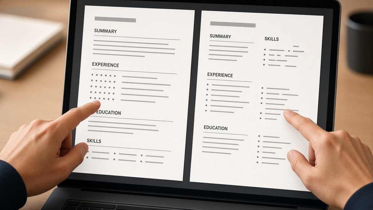
Layout affects screening in two critical ways. First, ATS systems read resumes linearly, left to right, top to bottom. Complex multi-column designs, sidebars, and creative formatting break this linear flow, causing data loss. Second, recruiters use visual hierarchy to quickly identify key information. Poor spacing, inconsistent formatting, and cluttered layouts make it harder for human reviewers to spot your best achievements, even if the ATS successfully parsed everything.

Key Layout Elements That Impact Screening

Single-Column vs. Multi-Column Design

Single-column layouts are the gold standard for ATS compatibility. They present information sequentially, allowing parsing software to read content without confusion. Multi-column designs—particularly those with sidebars for skills or contact info—create parsing nightmares. ATS systems often read sidebar content out of order or miss it entirely, fragmenting your qualifications across the parsed output.

When recruiters manually review resumes, single-column layouts also feel more professional and easier to scan. Your eye naturally flows down the page, following a logical narrative of your career progression. Multi-column designs force the reader to jump between sections, creating cognitive friction that reduces the likelihood they'll absorb all your key accomplishments.

Spacing and Whitespace Strategy

Whitespace is not wasted space—it's a critical design element that affects both ATS parsing and human readability. Adequate margins (0.5 to 1 inch), line spacing (1.15 to 1.5), and gaps between sections help ATS algorithms identify distinct content blocks. Cramped layouts with minimal whitespace confuse parsers and make resumes harder for humans to read quickly.

The challenge is balance. Too much whitespace wastes valuable real estate on a one-page resume. Too little creates a dense wall of text that both ATS systems and recruiters struggle with. Aim for 0.5-inch margins and consistent spacing between job entries and sections. Use single spacing within bullet points but add space between entries to create visual separation.

Font Selection and Size Consistency

Font choice matters more than most job seekers realize. ATS systems can parse most standard fonts (Arial, Calibri, Times New Roman), but decorative or unusual fonts often cause parsing errors. Stick with widely supported fonts and maintain consistent sizing throughout. Your body text should be 10-12 points; headers can be 12-14 points. Avoid varying font sizes dramatically, as this signals poor formatting to ATS algorithms.

Bold and italics are generally safe for emphasis, but avoid underlining, which can be misinterpreted during parsing. Colored text is risky—some ATS systems strip colors entirely, potentially losing emphasis you intended. When in doubt, rely on formatting hierarchy (bold for section headers, regular for body text) rather than color or unusual styling.

Header and Section Organization

Clear section headers help both ATS systems and human readers understand your resume's structure. Standard sections (Professional Summary, Experience, Education, Skills) are recognized by most ATS software. Non-standard headers like "Core Competencies" or "Key Achievements" may not be parsed as expected. Use conventional section names to ensure ATS systems categorize your information correctly.

Within each section, maintain consistent formatting. If you bold job titles in one entry, bold them in all entries. If you use bullet points for achievements, use them throughout. Consistency signals to ATS algorithms that your resume is well-structured and helps them extract data accurately.

Common Layout Mistakes That Trigger Rejection

  • Multi-column layouts with sidebars: ATS systems read these out of order, fragmenting your qualifications. Stick to single-column design for maximum compatibility.
  • Tables and text boxes: While visually appealing, tables confuse ATS parsing. Information in table cells often gets lost or misaligned during extraction.
  • Graphics, logos, and images: ATS systems cannot parse visual elements. Logos and graphics are stripped during processing, wasting valuable space and potentially hiding text.
  • Headers and footers: Information placed in document headers or footers is often lost during ATS parsing. Keep all critical content in the main body.
  • Inconsistent bullet formatting: Mixing bullet styles (dashes, asterisks, custom symbols) confuses parsers. Use standard bullet points consistently throughout.
  • Excessive special characters: Symbols, arrows, and decorative characters often fail to parse correctly. Stick to standard punctuation and alphanumeric characters.

Best Practices for ATS-Friendly Resume Layout

  • Use a single-column layout: Present all information sequentially from top to bottom. This ensures ATS systems read content in the correct order and humans can easily scan your resume.
  • Maintain standard margins: Use 0.5 to 1-inch margins on all sides. This provides adequate whitespace while maximizing content area and ensuring proper parsing boundaries.
  • Choose ATS-safe fonts: Stick with Arial, Calibri, Times New Roman, or Verdana. These fonts are universally supported and parse reliably across all ATS systems.
  • Keep font sizes between 10-12 points: This range is readable for humans and compatible with ATS parsing. Avoid dramatic size variations that signal poor formatting.
  • Use standard section headers: Stick with Professional Summary, Experience, Education, Skills, and Certifications. Avoid creative naming that ATS systems may not recognize.
  • Implement consistent formatting: Apply the same formatting rules throughout. If you bold job titles, bold all titles. If you use bullet points, use them consistently.
  • Prioritize content over design: ATS systems prioritize substance over style. A plain, well-organized resume outperforms a visually creative one that confuses parsing algorithms.
  • Save as .docx or .pdf strategically: Most modern ATS systems handle both formats, but .docx is slightly safer for compatibility. Test your resume in both formats before submitting.

Step-by-Step Guide to Optimizing Your Resume Layout

  1. Start with a blank document: Open a new Word or Google Docs file. Avoid using templates with complex formatting, as these often contain hidden elements that confuse ATS systems.
  2. Set margins to 0.5-1 inch: Go to Page Layout (or Format) and adjust all margins. Consistent margins ensure proper parsing boundaries and professional appearance.
  3. Select your font: Choose Arial, Calibri, or Times New Roman at 11-12 points. Apply this font to your entire document for consistency.
  4. Create section headers: Use standard headers (Professional Summary, Experience, Education, Skills). Format headers in bold or slightly larger font for visual hierarchy.
  5. Organize experience chronologically: List jobs in reverse chronological order (most recent first). Include company name, job title, dates, and location for each position.
  6. Use bullet points for achievements: Format accomplishments as bullet points using standard bullets (•). Keep bullets concise and achievement-focused.
  7. Add consistent spacing: Insert one blank line between sections and 0.5 lines between job entries. Use consistent spacing throughout to create visual rhythm.
  8. Review for ATS compatibility: Remove tables, images, and special characters. Check that all text is in the main body (not headers/footers). Save as .docx and test with an ATS parser if possible.
  9. Proofread and test: Review for typos and formatting inconsistencies. Open your resume in different programs to ensure it displays correctly across platforms.

How Specific Layout Choices Directly Impact Screening Outcomes

Research on resume formatting errors that break ATS parsing shows that layout directly affects whether your resume reaches human reviewers. Resumes with multi-column designs have a 40% higher rejection rate at the ATS stage compared to single-column layouts. This isn't because the content is weaker—it's purely a formatting issue.

When ATS systems encounter complex layouts, they often fail to extract key information correctly. A job title might be parsed as a company name. Dates might be lost. Achievements might be fragmented across multiple fields. When the ATS then ranks your resume against job requirements, it's working with incomplete or misaligned data. Even if you're perfectly qualified, poor layout can result in a low ATS score that prevents your resume from reaching the hiring manager.

For human reviewers, layout affects perception and decision speed. The resume structure that improves interview rate research indicates that clean, well-organized layouts increase the likelihood of positive screening decisions. When a recruiter can quickly identify your most relevant experience and key skills, they're more likely to advance your application. Cluttered or confusing layouts, even with strong content, create friction that reduces interview chances.

Conclusion: Layout as a Strategic Screening Tool

How layout choices affect screening cannot be overstated. Your resume's format is the first gatekeeper between your qualifications and hiring managers. A single-column layout with consistent formatting, appropriate whitespace, and standard fonts dramatically increases the likelihood that ATS systems will parse your information correctly and that human reviewers will quickly identify your strengths.

The good news: creating an ATS-friendly layout doesn't require sacrificing professionalism or visual appeal. Clean, well-organized resumes are inherently more readable and more likely to convert screening into interviews. Start with a blank document, apply consistent formatting throughout, and prioritize clarity over creativity. Test your resume in different formats and systems before submitting. By treating layout as a strategic tool rather than an afterthought, you significantly improve your chances of reaching the interview stage.

Frequently asked questions

Two-column layouts look modern and can save space, but they're problematic for ATS systems. Most ATS software reads left to right, top to bottom. When it encounters a two-column design, it often reads the left column completely, then jumps to the right column, resulting in scrambled information. For maximum compatibility, stick with single-column layouts. If you want visual interest, use bold headers, consistent spacing, and strategic line breaks instead.

While color can make resumes visually appealing, it's risky for ATS compatibility. Many ATS systems strip colors during parsing, meaning your color-coded emphasis is lost. Additionally, when resumes are printed or converted to different formats, colors may not display consistently. For maximum safety, avoid colored text. If you want visual emphasis, use bold formatting, larger fonts, or strategic spacing instead. These elements are reliably preserved across all ATS systems and formats.

Both formats work with modern ATS systems, but they have different strengths. PDFs preserve formatting exactly as you designed it, which is good for human readability. However, older ATS systems sometimes struggle with PDF parsing. Word documents (.docx) are slightly more compatible with ATS software and are the safer choice if you're unsure about the employer's system. When possible, check the job posting for submission format preferences. If no preference is stated, .docx is the safer default.

Whitespace is essential for both ATS parsing and human readability. Aim for 0.5 to 1-inch margins on all sides and at least one blank line between sections. Between job entries, use 0.5 blank lines to create separation without wasting space. Within bullet points, use single spacing to keep content compact. The goal is balance: enough whitespace to make the resume readable and properly parsed, but not so much that you waste valuable real estate on a one-page format.

Body text should be 10-12 points for optimal readability and ATS compatibility. Section headers can be 12-14 points to create visual hierarchy. Avoid dramatic size variations (like 8-point text or 16-point body text), as these signal poor formatting to ATS algorithms. Maintain consistent sizing throughout your resume. This consistency helps ATS systems identify section headers and body content correctly, improving parsing accuracy and your overall ATS score.

Place your name and contact information at the top of your resume in the main body, not in a document header. ATS systems often fail to parse information in document headers and footers. Your name should be prominent (bold or slightly larger) at the very top, followed by phone number, email, and LinkedIn URL. This placement ensures ATS systems capture your contact information correctly and recruiters can easily reach you if your resume advances past screening.

Tags

how layout choices affect screeningresume layoutATS resume formatresume formattingresume structureATS compatibilityresume designjob application screening