11 min read
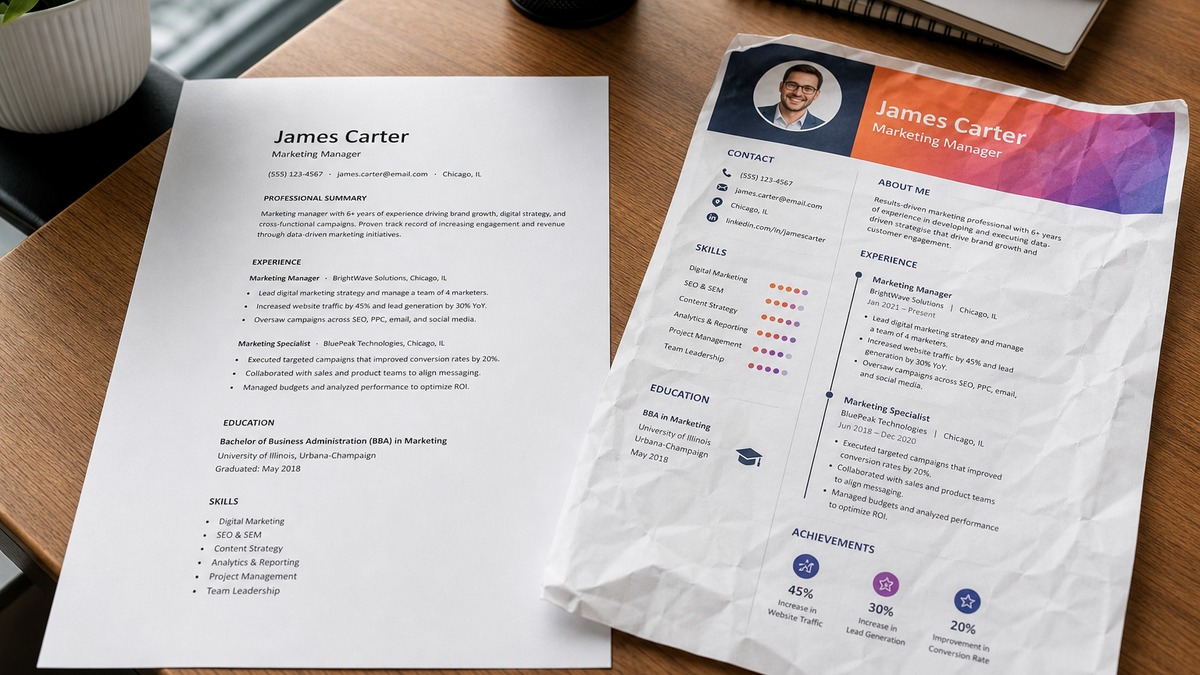
You don't need a design degree. You need a file that still reads top to bottom after Greenhouse chews on it. Most premium templates fail because invisible tables, icon fonts, and text boxes look sharp on your laptop and won't survive a plain-text paste. The simple resume template premium recruiters actually open is boring: Calibri 11pt, single column, white space, and bullets that start with verbs instead of icons.
Check your resume for free on the PDF or DOCX you'll attach, not the preview in the design app. Below you'll see weak versions next to strong ones across five roles, what the weak files share, and a copy-paste skeleton you can drop into Word tonight. Job searching is already draining. You shouldn't lose screens because a gradient header looked expensive in Canva and broke in Workday.
Premium is readability plus proof, not decoration. Humans scan name, title, and bullet one. Parsers scan employer, Month Year dates, and plain text order. When those two paths agree, you'll look polished without fighting the layout.
Quick Wins
- Switch to single-column Calibri 11pt with 0.75-inch margins before you tweak colors.
- Put contact on one line: city, phone, email. Skip icons that replace letters with glyphs.
- Export plain text and confirm each employer row shows Month Year dates on one line.
- Bold section labels only. Let white space carry the premium feel.
How to judge any simple resume template premium before you upload
Judge templates on import order, not Pinterest appeal. Open the posting, highlight three must-have terms, and ask whether bullet one under your current job could carry them without a sidebar. If the answer is no, the layout is decoration.
Premium files share the same skeleton. Name and target title on line one. Contact on line two without icon fonts. Optional three-line summary. Experience with Month Year dates flush left. Education. Skills as a plain comma list or short bullets, not bubble charts. One font family. No header table hiding your email in a cell parsers skip.
Humans notice spacing first. Recruiters in Workday often see a plain-text strip before the formatted PDF. When that strip reads like a ransom note, the pretty version rarely saves you. White space between roles, consistent bullet indents, and 11-point body type signal care without graphics.
I've screened stacks of these in Workday and Greenhouse, and the file that wins is boring and specific. The candidate who looked "designed" often lost dates to a two-column skills rail. The candidate who looked premium used margins and verbs, not colors.
Read common Workday parsing mistakes US applicants make if your upload already failed once. Format fixes belong before you rewrite bullets.
Before and after: five roles on the same boring template
Same rules for every role: single column, Calibri 11pt, bold section headers, Month Year dates, verbs in bullet one. Only the proof changes.
Marketing coordinator (consumer brand)
Before: Two-column Canva layout with coral header band, star icons for skills, and a photo block. Experience sits in a text box. Bullets: Managed social media and assisted campaigns. Skills: Creative, Photoshop, teamwork.
After: Single-column DOCX. Marketing Coordinator | Brand Studio, Austin TX | 512-555-0142 | [email protected]. Experience: Marketing Coordinator, BrightCart Retail, Jun 2021 to Present. Bullet one: Owned weekly email calendar in Klaviyo for 240k subscribers; lifted click rate 0.4 points in Q2 after subject-line tests. Bullet two: Briefed agency on 6 product launches; kept asset delivery within 48-hour SLA using Asana boards.
Software engineer (backend, mid-level)
Before: Sidebar with proficiency bars for Python and Java. GitHub link buried in an icon row. Bullets list frameworks without scope. Dates appear under Skills because the template uses invisible columns.
After: Software Engineer | [email protected] | github.com/handle. Experience: Backend Engineer, LedgerPay, Mar 2020 to Present. Bullet one: Built payment retry service in Go on Kubernetes; cut failed capture events 14% over 8 weeks. Bullet two: Paired with SRE on Grafana dashboards for queue depth; shaved mean incident triage 22 minutes. Skills line: Go, Python, PostgreSQL, Kafka, AWS ECS.
Registered nurse (hospital to corporate wellness)
Before: Clinical template with stethoscope watermark, three colors, and duties listed as paragraphs. No employer dates on one line. Skills cloud lists Epic once with no rollout proof.
After: Plain white PDF. Registered Nurse | Wellness Program Candidate. Experience: Staff RN, Metro General, Jan 2018 to Apr 2025. Bullet one: Precepted 4 orientees on 28-bed med-surg unit; maintained 98% medication scan compliance during Epic Rover go-live. Bullet two: Facilitated 10 employee health screenings per quarter; documented outcomes in Cerner for occupational health team. Skills: Epic Rover, patient education, triage, BLS.
Financial analyst (FP&A)
Before: Template with shaded table cells for each job. Month-end close buried under a graphic timeline. Parser reads 2023 under the wrong company.
After: Financial Analyst | Chicago IL. Experience: FP&A Analyst, Northline Foods, Aug 2019 to Present. Bullet one: Owned weekly sales flash in Anaplan for $410M category; flagged variance drivers within 24 hours of close. Bullet two: Partnered with supply chain on inventory model; reduced write-offs $1.2M in FY24. Education: BBA Finance, UIUC, May 2019. Skills: Anaplan, Excel modeling, SAP, variance analysis.
Customer support lead (SaaS)
Before: Friendly template with speech-bubble icons and a pie chart for CSAT. Bullets say helped customers and worked with product. No ticket volume or tooling.
After: Customer Support Lead | Remote US. Experience: Support Team Lead, CloudRelay, Sep 2020 to Present. Bullet one: Led 9-person tier-2 pod on Zendesk; held CSAT 4.6/5 while clearing 850+ tickets monthly. Bullet two: Shipped 12 help-center articles from repeat ticket themes; cut billing-related contacts 11% in one quarter. Skills: Zendesk, Salesforce Service Cloud, WFM, escalation routing.
Project manager (construction to tech)
Before: Heavy borders, logo-style initials in a circle, skills rated with filled circles. Experience bullets read Responsible for schedules with no tool names.
After: Project Manager | PMP. Experience: Project Manager, RidgeBuild Construction, Jan 2017 to Jun 2024. Bullet one: Ran $18M commercial build schedule in Procore; held RFIs under 5-day median across 14 trades. Bullet two: Coordinated city inspections and owner walkthroughs; delivered punch list 3 weeks ahead of contract date on 2 of last 3 jobs. Targeting tech PM roles: add one bullet naming Jira and cross-functional sprint planning if true.
Copy-paste premium layout skeleton
FULL NAME | Target Title
City ST | phone | email | portfolio URL (plain text, no icons)
SUMMARY (optional, 2 lines max)
[Title] with [years] in [domain]; [one proof metric or scope from posting].
EXPERIENCE
Job Title, Employer, Mon YYYY to Mon YYYY
• [Verb] + [scope number] + [tool from posting] + [outcome you can defend]
• [Second bullet with cross-team or stakeholder proof]
EDUCATION
Degree, School, Month Year
SKILLS
Tool, tool, certification (comma-separated, one line or wrapped list)
Numbers inside examples show proof shape, not hiring statistics. Swap bracket lines per posting. Keep employer names and dates honest. One page if under eight years relevant work; two pages when every line supports the target role.
What the weak premium templates had in common
Invisible tables and text boxes. Designers hide structure so you can drag blocks. Parsers read cells out of order. Dates slide under Skills. Contact email vanishes when the header is a single-row table.
Icon fonts instead of words. Phone and email glyphs look tidy until export strips the font. You get empty squares where recruiters needed digits. Spell out phone and email in ASCII.
Two columns and sidebars. Skills rails and photo columns push Experience to the right. Greenhouse imports read down the left column first, then the right. Your latest job can look two years older than it is.
Graphics where bullets should live. Skill bars, timelines, and pie charts do not keyword match. They also fail plain-text paste. Replace each graphic with one bullet that names the tool and scope.
Decoration without bullet one proof. Gradient headers do not fix Responsible for reporting. Premium feel comes from spacing plus a first bullet with a number, tool, and outcome. Everything else is optional paint.
Edge cases when simple still needs a tweak
Creative roles with a portfolio link. Keep the resume boring. Put visual work on a portfolio URL in plain text on line two. Do not embed images inside the PDF you upload to Workday. Hiring managers click out when bullet one proves craft with scope.
Academic CVs versus corporate resumes. Faculty CVs can run long with publications. Corporate uploads want one or two pages and Month Year dates. Export a corporate cut from the same master file instead of uploading the 8-page version to a Greenhouse form.
International formats. Some EU samples show photos or birth dates. US corporate uploads usually should not. Match the employer sample, not the prettiest template from another country. Read UK CV versus US resume format rules before you merge formats in one file.
Long employment gaps. One honest line beats a designed timeline graphic. Career break, Mar 2022 to Jan 2023, family care. Then return to Month Year employer rows. Parsers flag holes; humans forgive them when dates are clear.
Parse before you polish the template
Run the export through run an ATS check on the file you will upload. Template swaps often break employer rows when you add a second page of bullets. Confirm dates still import on one line per role.
Then Build your resume from a single-column starter if your design app keeps reinserting tables. Paste your strong bullets from the pairs above, export DOCX or PDF, and parse again. Two clean passes beat an hour of color tweaks.
Ship the boring file tonight
Pick one saved posting. Strip columns, icons, and tables. Paste the layout skeleton. Rewrite bullet one on your current role with a verb, tool, and number you can defend on a phone screen. Export plain text once before you celebrate the margins.
A simple resume template premium enough for humans is the same file parsers can read. That won't fix applying to roles you're not qualified for. It stops a qualified resume from dying because a gradient header looked expensive and broke in Workday. When you need a cover letter after the file parses clean, use the cover letter generator and name the same proof from bullet one in line one.
Read more
Frequently asked questions
Yes, when margins, type size, and section order do the work. Recruiters read name, current title, and the first bullet under your latest job in under ten seconds. A single-column Calibri 11pt file with 0.75-inch margins and bold section labels reads intentional. Gradient headers and icon fonts often scramble import order in Workday before anyone sees the layout you designed.
Calibri or Arial at 11 points for body text, 12 to 14 for your name, and bold 11-point section headers. Keep one font family end to end. Fancy display fonts break parsing in some portals and look dated on screen shares. Line spacing around 1.08 to 1.15 with 6 points after bullets gives air without wasting a second page.
Skip two columns for corporate uploads unless the employer sample shows one. Sidebars push dates under the wrong employer in Greenhouse and Taleo imports. A simple resume template premium on human eyes is still one column with contact on line one, summary optional, Experience, Education, Skills last. Design belongs in your portfolio link, not inside the parse path.
Follow the upload button. When the portal accepts PDF, export a text-selectable PDF from Word or Google Docs, not a flattened image export. When it asks for DOCX, send DOCX. Image-only PDFs look sharp but fail keyword import. Run plain-text paste into Notepad once: if employer rows scramble, simplify before you attach the pretty file.
Black text on white with one accent on your name or section rules is enough. Full-color skill bars and shaded table cells often become gray blobs on print and confuse parsers that strip background fills. If you want visual hierarchy, use bold, caps on section labels, and white space between roles instead of colored boxes.