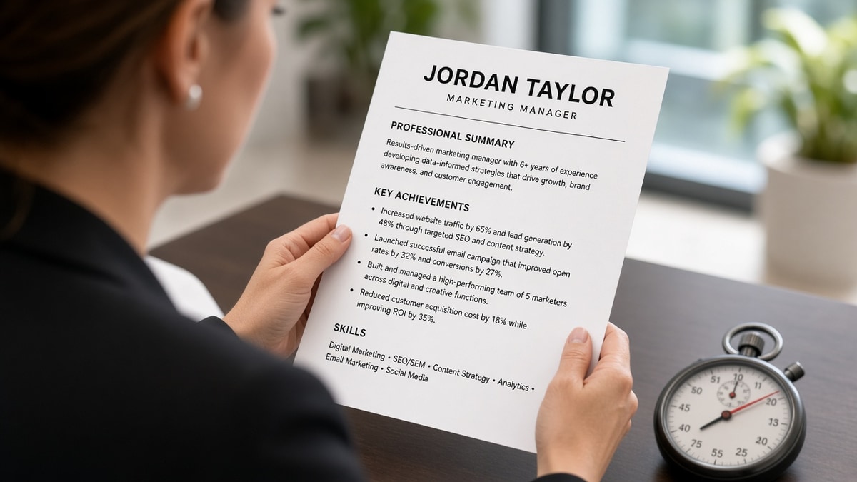
7 min read
You don't get thirty seconds. You get one scroll. US recruiters scanning a full req inbox look for title match, employer name, and one proof line before they decide to keep reading. If you're wondering how to write a US resume that skims in 10 seconds, the answer isn't a prettier font. It's putting the req title and your best metric where the eye lands first.
Check your resume for free after you reorder bullet one. If parse warnings clear and the first screen still feels dense, you're looking at a skim problem, not a keyword gap. Below you'll get three causes, how to tell which one is yours, fixes for each, and before/after pairs. Don't add a third page until the first screen answers what role you want and what you moved.
Job searching in US corporate portals means two audiences: the parser and the recruiter on a phone between meetings. They want the same thing in different order. Parseable blocks first. Scannable proof second. You won't win either with paragraph essays under each employer.
And skim speed isn't rudeness. It's volume. When fifty files arrive overnight, recruiters triage before they read. Your file either passes the first glance or it doesn't get a second one. That's fixable without dumbing down your scope.
US resume norms differ from CV length in other regions. Two pages is fine for ten-plus years when page one carries recent proof. Three pages rarely skim well on a first pass unless the posting asks for publications or a portfolio list.
Quick Wins
- Headline matches posting title within one seniority level.
- Bullet one under current job: metric, scope, tool name in the first line.
- Max three lines per bullet. No paragraph blocks under employers.
- Recent role gets three to five bullets; older jobs get one line each.
The symptom: qualified but closed in one glance
You pass ATS. You still hear nothing. The recruiter opened your file, scrolled once, and moved on. The skim failed, not always the fit.
What a passing first glance shows: req-aligned headline, current employer on line one of Experience, one metric in the first bullet, standard section labels a recruiter's eye knows where to jump. If any of those four are missing, fix order before you tweak wording.
Cause 1 and cause 3 overlap when old jobs eat page one. Trim history until current employer and bullet one metric share the first screen without scrolling on a standard laptop view.
I've screened US corporate stacks where the candidate buried Operations Manager inside a four-line summary while bullet one said supported cross-functional initiatives. Qualified scope. Invisible in ten seconds. The fix wasn't more keywords. It was moving the title and metric up one screen.
Read how recruiters interpret job titles when your headline and posting title use different words for the same work.
How to write a US resume that skims in 10 seconds: three causes
Work through causes in order. Most files fail cause one before they ever hit cause three.
Cause 1: Title and proof live below the fold
Summary paragraphs, logo bands, and skills clouds push Experience down. Recruiters never see bullet one on the first screen.
How to tell: Open your PDF on a laptop without scrolling. If you don't see current employer and one metric, you failed cause 1.
Before: Half-page summary, skills grid, then Experience. Bullet one metric sits below the fold.
After: Two-line headline with req title. Experience starts on screen one. Bullet one: Cut order cycle time 14% across three warehouses using NetSuite in 2024.
Fix: Delete or shrink summary. Move Skills below recent Experience or cap at six terms.
Cause 2: Paragraph blocks instead of bullets
Dense paragraphs force serial reading. Bullets let the eye hop. US corporate resumes expect bullets under each employer.
How to tell: Any employer block with more than four lines of prose without a bullet marker.
Before: Single paragraph under 2022 employer describing responsibilities for stakeholder management and reporting.
After: Three bullets, max two lines each. First bullet carries req keyword and metric. Others support scope.
Cause 3: Metrics stranded on page two
Candidates list every job since 2008 at five bullets each. Page one is old history. Recent proof sits where few recruiters scroll on first pass. US hiring managers often never reach page two on the first open.
How to tell: Your current role starts after page one or has fewer bullets than a job from 2014.
Before: Page one covers 2009 to 2016 in detail. 2024 role gets two bullets at the bottom of page two.
After: Recent decade gets three to five bullets each. Pre-2015 roles one line: Company, title, years. Metric moved to bullet one on page one.
Fix: Trim old scope. Front-load recent wins matching tonight's req.
Before/after: marketing coordinator skim pass
Before: Creative layout, portfolio link band, skills in two columns. First screen shows design awards, not HubSpot scope.
After: Plain single column. Headline: Marketing Coordinator. Bullet one: Ran lifecycle email in HubSpot for 3 product lines; lifted MQLs 22% in H1 2025. Recruiter sees fit without scrolling.
Before/after: analyst skim pass
Before: SQL, Python, and Tableau in a tall Skills section. Experience bullets say assisted with reports.
After: Bullet one: Built weekly revenue dashboards in Tableau from SQL extracts; flagged $1.2M forecast variance for finance leads. Tools listed once in Skills as backup.
Before/after: operations manager skim on US screen
Before: Summary opens with seasoned leader language. Experience starts mid-screen. Bullet one under current job is bullet four after soft skills lines.
After: Headline: Operations Manager. Bullet one on screen one: Owned $4.2M vendor spend; cut stockouts 9% using NetSuite in 2024. Recruiter sees fit before scrolling.
Copy-paste ten-second skim test
Copy-paste before every apply:
1. Open PDF without scrolling. See req title and current employer?
2. Bullet one has metric, scope, and tool in first line?
3. No paragraph blocks under any employer
4. Recent job: 3–5 bullets. Jobs 10+ years ago: one line each
5. Skills capped at six terms below Experience
6. Paste into Notepad. Blocks in order?
7. Read bullet one aloud in one breath. If you gasp, shorten.
Pair with resume language that increases interview rates after the skim test passes.
What slow skims share on US corporate screens
Objective statements from 2009. They tell recruiters what you want, not what you moved.
Italic quotes and testimonial blocks. They eat space and rarely parse.
Multiple font sizes per page. Eyes lose the hierarchy.
Headers that rename standard sections. Career Highlights instead of Experience slows search.
Objective statements from 2009. Replace with a two-line headline aligned to the req. Save story for the cover letter when they ask for one.
Italic quotes and testimonial blocks. Recruiters skip them on first pass. Put proof in your own bullet voice with dates.
Multiple font sizes per page. One body size, bold employer lines only. Fancy hierarchy looks polished and skims slow.
Headers that rename standard sections. Use Experience, Skills, Education. Creative labels force recruiters to hunt.
Photo headers and icon rows. US corporate resumes skip photos. Icons break paste tests and push proof down.
Burying req keywords in bullet four. If the posting repeats Salesforce eight times, your first Salesforce mention should land in bullet one or two under the current employer, not at the bottom of a five-bullet block.
Using full job descriptions under each title. Copy-pasted duty lists from an old performance review read dense and skim slow. Three tight bullets beat twelve lines of responsibilities.
Edge case: academic CV uploaded to corporate req. Cut publications to a line unless the posting asks for them. Lead with industry-relevant scope.
Edge case: two-page resume where page break splits bullet one from the employer line. Move the break so employer name, title, dates, and bullet one stay on the same screen. A metric orphaned at the top of page two fails cause 3 even when the number is strong.
Edge case: remote-only candidate with city omitted. Fine for contact block, but headline should still name the role level the req expects. Skim pass needs title and proof, not travel willingness in paragraph form.
This won't fix stretch roles you haven't done. It stops qualified files from getting closed before bullet one loads.
Test parse and skim on the same export
Paste the posting, then run a free ATS check on the file you'll upload. Clear parse warnings, then run the ten-second skim test on screen one. Parser failure and skim failure feel the same when you're getting silence.
Building from scratch? Build your resume in a plain single-column layout before you decorate. A plain file that skims fast beats a designed PDF that parses badly.
After reordering bullet one, ask someone else to glance at screen one for five seconds and tell you what role you want. If they guess wrong, your headline or first bullet still buries the title.
Pass the first scroll tonight
Learning how to write a US resume that skims in 10 seconds means front-loading title, employer, and one metric on screen one. Cut summary bloat, break paragraphs into bullets, and trim old jobs so recent proof isn't on page two. Run the copy-paste skim test before you apply.
Open your export without scrolling. If you can't name the req you'd fit from screen one alone, reorder before you tweak verbs. This won't fix gaps you don't have. It stops qualified candidates from getting closed on a glance.
When the posting asks for a cover letter, generate a cover letter that repeats bullet one in prose. Letter and resume should tell the same story in ten seconds each.
Run the skim test on mobile too. Many recruiters open attachments on a phone between meetings. If screen one fails on a phone PDF viewer, it fails in real triage.
Read more
Frequently asked questions
On first pass in a full inbox, yes for many corporate screens. That pass is not a full read. Recruiters look for title match, employer name, and one proof line in bullet one before they decide to scroll or close. A file that hides the title in a summary paragraph or buries metrics on page two often gets closed in one glance even when the candidate is qualified.
For most US corporate roles, a two-line headline plus Experience beats a long summary block. Summaries eat skim time without adding parse weight. If you keep a summary, cap it at two lines with title, segment, and one metric. Put the metric again in bullet one under your current employer so both parser and human see it early.
Three to five for recent roles, one to two for older jobs. More than five on your current employer slows the skim without adding proof. Lead with the bullet that matches tonight's req. Trim nice-to-have wins from ten years ago to one line each so the first screen stays on recent scope.
No when you use a single-column plain layout. ATS wants parseable blocks. Humans want the same blocks in a predictable order: name, headline, Experience with bold employer lines, Skills backup. Fancy columns hurt both. Plain Word or PDF exports that pass a Notepad paste test usually skim well too.
Bold the employer line and maybe one number in bullet one if your template stays readable. Bolding every metric creates visual noise and slows the skim. One strong number on screen one beats six highlighted figures below the fold.