11 min read
Short answer: you'll put your portfolio on a URL line under your contact header. The upload file should be a boring single-column PDF or DOCX with plain section headings so Greenhouse and Workday can read Adobe Creative Cloud, Figma, and Illustrator in your Skills block. Don't use inline images, sidebar grids, or logo headers. Creativity lives on the link. The resume is the parser's job.
You've spent hours on a layout that looks incredible in PDF. You upload it to a brand role and hear nothing. The file probably never reached the creative director. The parser stripped your Skills column, dropped your dates, or read your two-column grid out of order. That's not a comment on your taste. It's a formatting mismatch between design software and corporate hiring stacks.
Check your resume for free with the posting pasted in before you rebuild the whole file. A graphic designer resume for ATS isn't supposed to win a design award on upload. It's supposed to survive parsing so a human can click your portfolio link ten seconds later. We'll cover why pretty files fail, the safe rules, the exceptions, and what to change tonight.
If the posting allows a letter, generate a cover letter after the plain resume is done. Don't paste portfolio spreads into the letter either. One URL, two clean files. You'll send the same portfolio link twice, and that's fine.
Quick Wins
- One portfolio URL on its own line. No thumbnails in the upload.
- Single column, 11-point Calibri or Arial, standard round bullets.
- Skills spelled out: Adobe Creative Cloud, Figma, Illustrator, InDesign.
- Export from Word or Google Docs. Skip Canva for the application file.
Why your designed resume dies before anyone opens the portfolio
Corporate design hires still run through Workday, Greenhouse, Lever, and iCIMS. The parser reads your file like a text document, not like InDesign. When you embed hero images, color blocks, or icon fonts, the system often skips whole regions or reads columns left-to-right across sections. Your Figma line lands under Education. Your current title vanishes.
The split recruiters expect: boring upload, beautiful portfolio. They want a searchable file with employer names, Month Year dates, and tool names spelled in plain text. They want proof you can follow a brief. Your Behance or personal site carries the visual argument. Mixing both jobs in one PDF is where most designer files break.
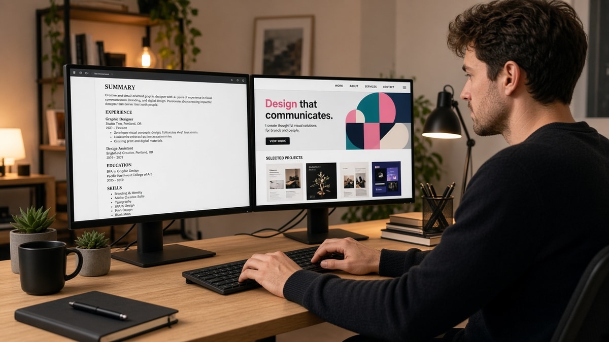
A composite mid-level brand designer kept a two-column Canva resume with a photo header and six portfolio tiles down the right rail. Greenhouse parsed her as a freelancer with no Skills block. After she moved to a single-column Word export, listed Adobe Creative Cloud and Figma under Skills, and put behance.net/username on line three of Contact, the same work history screened for three in-house roles in a month. Same projects. Different container.
Edge case: the posting says submit a portfolio PDF plus a resume. Upload two files when the portal allows it. The resume stays text-only. The portfolio PDF is the second attachment, not a merged document with inline spreads.
Edge case: you're applying to a small studio that asks for a designed one-sheet by email. That's a human inbox, not an ATS upload. Send the designed piece they requested. Keep a plain master file for corporate portals so you're not rebuilding from scratch every Monday.
Edge case: your portfolio is password protected. Note the password in the cover letter or the URL line only if the employer allows it. Some parsers truncate long URLs. Shorten with a clean domain you control rather than a ten-parameter tracking link.
If you're rebuilding from an old designed PDF, read how to build an ATS resume from an old PDF before you paste layers into Word. Extraction order matters as much as fonts.
Graphic designer resume for ATS: safe formatting rules
These rules are intentional. They're how you keep Adobe CC and Figma visible to the parser without dressing up the upload like a mood board.
Contact block: text only, portfolio on one line
Name, city and state, phone, email, LinkedIn URL if you use it, portfolio URL. No headshot. No logo mark. No QR code image. Parsers treat images as holes in the text stream.
Before: Color banner with embedded logo, phone inside a text box, portfolio link hidden in a footer graphic.
After: Four plain lines of text. Portfolio: https://yourname.com on its own row under the email.
Layout: one column, standard headings
Use Summary, Experience, Skills, Education in that order unless you're a new grad with thin work history. Left-align everything. No text boxes, tables, or sidebars. Section titles in bold 12 to 14 point. Body at 10.5 to 11 point.
Before: Skills column on the left, jobs on the right. Parser reads "Figma" before your current employer name.
After: Skills section after Experience. Each tool on its own line with commas or bullets, not icons.
Skills: spell tools the way the posting does
Mirror the job description once. If they write Adobe Creative Cloud, don't abbreviate to CC only. Include Figma, Illustrator, InDesign, and Photoshop as words. Add one bullet under your current role that names the tool plus outcome: "Redesigned onboarding emails in Figma, lifting trial activation 9% in Q2."
Experience: metrics in bullets, not in charts
Company name on one line. Title on the next. Month Year to Month Year on the third. Three to five bullets with campaign scope, channels, and one number where you have it. Illustrative metrics inside bullets are fine. Claims about industry-wide callback rates are not.
Before: Infographic bar chart pasted under each role showing engagement growth.
After: "Produced 24 social assets per sprint in Illustrator; average post engagement rose from 2.1% to 3.4% over two quarters."
File type: text-first export
Build in Word or Google Docs, then export PDF if the portal requires PDF. Open the PDF, select all text. If you can't highlight sentences, the file is image-based and parsers will struggle. DOCX is often the safest default when the upload dropdown offers it.
Edge case: the employer's portal strips hyperlinks on upload. Write the full https:// URL anyway. Recruiters copy-paste when the link doesn't click. A bare "Portfolio" label with no URL helps nobody in Greenhouse search.
Edge case: you're a motion or 3D designer with reel links. Same rule. Vimeo or YouTube URL on one line in Contact. Don't embed a video frame in the resume body. The parser can't watch your reel. It can index the word Cinema 4D if you spell it in Skills.
Copy-paste contact header
Jane Doe
Brooklyn, NY · (555) 555-0198 · [email protected]
Portfolio: https://janedoe.design
LinkedIn: linkedin.com/in/janedoe
Swap in your real links. Keep the portfolio on a dedicated line so parsers and recruiters can copy it in one gesture.
Where safe formatting rules bend (without breaking parse)
You hide typography skills in the layout instead of the bullets. Hiring managers still care how you typeset. Show hierarchy with heading size and spacing inside a single column. Don't prove taste with columns parsers can't read.
You keyword-stuff Skills without proof. Listing Figma fourteen times does not help. One Skills line plus one bullet that shows client work in Figma matches the posting and reads human.
You send the portfolio as the only upload. Some designers skip the text resume because the work speaks for itself. Recruiters search employer names in the ATS first. No text file means no match on "in-house" or "agency" history.
You use decorative bullets or icon fonts. Arrows, stars, and custom glyphs often paste as garbage characters in Lever previews. Stick to standard round bullets from Word.
You shrink margins to fit a designed sidebar. Tiny type fails human skim even when the parser survives. If content doesn't fit, cut old freelance gigs to two lines instead of shrinking below 10 point.
You duplicate the same client under agency and brand names. If you designed for Nike through an agency, pick one employer line for the agency contract and name the client in a bullet. Two headers for one calendar year look like job hopping in Lever sort views.
You list every Adobe app as a separate design. A row of colored squares is still a graphic. Write the tool names. Let the portfolio show the UI. Parsers and recruiters both prefer readable strings over decoration.
Read resume formatting errors that break ATS parsing when your plain file still garbles in preview. Tables and headers cause designer files to fail even without images.
Test the boring file before the creative one ships
Run the plain upload through the free ATS checker with the posting pasted in. Confirm Adobe Creative Cloud, Figma, and brand keywords appear where the parser expects them. Fix Skills and bullet one before you touch portfolio slides. A second pass with the posting URL copied from Greenhouse catches missing tool names better than eyeballing the PDF alone.
If you're starting from scratch, build your resume in a single-column template, then paste your portfolio URL into Contact. Export DOCX for the upload and keep the designed portfolio separate. Two files, two jobs.
Fix the upload tonight, keep the portfolio bright
A graphic designer resume for ATS should read like a spec sheet, not a poster. Single column. Plain headings. Tools spelled out. Portfolio on a URL line. That's how Greenhouse sees Figma in Skills and how a recruiter gets to your best work in one click.
Open your current PDF. Try to highlight bullet text. If you can't, rebuild in Word tonight. Paste the contact block from above. Run the checker on one posting you care about. You'll still be a designer tomorrow. You'll just stop losing screens to a parser that never saw your tools.
I've screened plenty of designer files where the portfolio was strong and the upload never made it to triage. Boring wins the gate. Your site wins the interview.
Read more
Frequently asked questions
No. Inline images, logo headers, and layout grids inside the upload file get skipped or scrambled by Greenhouse and Workday parsers. Put one portfolio URL on its own line under your email and phone. Recruiters click after the file parses. They do not need thumbnails in the PDF to know you design.
Follow the posting. When the portal accepts both, a text-based DOCX often parses cleanest. PDF is fine when you exported from Word or Google Docs without Canva layers. Never upload a portfolio PDF as your resume. That file is for humans after screen, not for the parser on upload.
Spell them out in a Skills section with plain headings, and repeat each tool once in an Experience bullet where you used it. Write Adobe Creative Cloud, Photoshop, Illustrator, and Figma as words, not icons. Parsers read text. Icon fonts show up as blank squares or wrong characters.
Rarely. Sidebars push Skills into the wrong order in iCIMS and Taleo. A single column with Contact, Summary, Experience, Skills, and Education top to bottom is the safer default for corporate uploads. Save the grid layout for your portfolio site, not the application file.
One page for under eight years of client or in-house work. Two pages when you have lead or art director titles with measurable campaign outcomes on page one. Length is not the risk. Embedded graphics and tables are. A boring two-pager beats a one-page Canva poster every time in Greenhouse.