13 min read
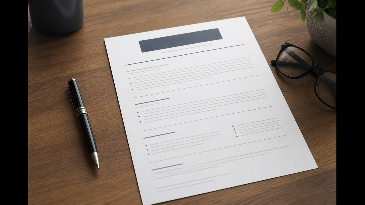
The format question has a boring answer, and boring is what parsers like. One column, normal fonts, plain headings, dates beside titles. If you can't paste your export into Notepad and read it top to bottom, recruiters won't read it either because the row may never store cleanly.
You're not choosing a format to win a design award. You're choosing a file shape Workday and Greenhouse can split into employer, title, and date fields. Before you debate serif versus sans, check your resume for free on the file you'll attach. You're confirming section order, not chasing aesthetics.
Below is the direct layout spec for 2026, the exceptions (creative fields, academia, federal), and the mistakes that still show up in my inbox every week.
Pair this page with how to write an effective resume in 2026 when you're ready to wordsmith bullets. Format first, proof second.
When a posting wants a letter too, generate a cover letter on the same single-column rules so the PDF upload matches your resume export.
If you're returning after years away, format drift is real: older resumes used objectives and serif fonts everywhere. Update the shell before you tailor wording.
Students often cram campus roles into one page with 8pt type. Loosen to two pages only if every line proves internship outcomes, not club titles alone.
Quick Wins
- Single column only; kill sidebars and tables.
- Put phone and email in the first five body lines.
- Use Month Year dates beside each title.
- Paste PDF into Notepad before you submit.
Resume format guidelines for 2026: the short spec
Column count: one. Sidebars become footnotes in plain text. Skills tables detach from jobs. Recruiters search Experience; don't bury jobs in graphics.
Margins: 0.5 to 1 inch on all sides. Smaller margins trigger unreadable auto-shrink on print and don't help parsers.
Font: Arial, Calibri, Helvetica, or Times New Roman between 10.5 and 12 pt for body; 14 to 16 pt for your name line only.
Section order: Contact block, headline or target title, Experience, Education, Skills, Certifications if needed. Summary optional after contact, before Experience.
Dates: Month Year to Month Year or Present on the same line as title or directly under employer. Year-only ranges confuse overlap checks.
File type: DOCX when the portal allows it; simple PDF exported from Word otherwise. Avoid Canva PDFs unless you paste-test and win.
Exceptions: portfolios for design roles still need a plain resume attachment. CV-style pages for academia can run longer with publications, but keep a one-column core for HR systems.
Federal USAJOBS flows have their own builder; this guide targets corporate ATS uploads most US job seekers hit daily.
White space between sections should come from paragraph spacing, not empty text boxes. Boxes often fail paste tests while looking airy on screen.
If you use a template from a prior decade, delete the objective statement block entirely. Objectives date the file and rarely parse into useful fields.
Right-to-left language names in bilingual resumes still need a Latin-character line for US corporate ATS. Add an English header line recruiters can search.
When you list patents or publications, use a separate section after Skills with standard title Publications. Don't embed long titles inside job bullets.
Line spacing at 1.0 to 1.15 keeps page count honest without crowding. Double spacing entire resumes wastes page two on white space.
Page numbers in footers sometimes import as random digits in contact fields. Omit page numbers on one- and two-page files.
Horizontal rules between sections look clean in PDF and often vanish in paste tests. Use blank lines instead of rule characters.
Columns in Education for degree and year side-by-side fail in many parsers. Stack degree on one line, dates on the next.
Language skills belong in Skills with proficiency labels: Professional working proficiency in Spanish. Avoid flag icons.
Military experience should use plain job titles civilians understand, with MOS or rank in parentheses once if helpful.
Gaps under six months rarely need explanation lines. Longer gaps get one honest labeled row rather than fake freelance titles.
References sections are outdated for US corporate. Use "available upon request" only if the template forces a section; otherwise omit.
How to apply resume format guidelines on your next export
Rule 1: Flatten columns and tables
Select all, remove text boxes, convert tables to plain paragraphs. Each job should read as employer line, title line, date line, bullets.
Before: Skills in a left column table; jobs on the right.
After: Jobs stacked top to bottom; Skills section after Education.
Icons for phone and email often import as blanks. Type Phone: and Email: labels in plain text.
Rule 2: Standardize headings parsers recognize
Use Experience, Education, Skills. Creative headings like "Where I've Made Impact" reorder in import. Recruiters still search "Experience" fields.
All caps headings are fine if consistent. Mixed fonts between headings and body are not.
Don't nest bullets three levels deep. Two levels max; parsers flatten deep nests unpredictably.
Rule 3: Contact block in body text
Line one: name. Line two: city, state, phone, email. Line three: LinkedIn URL. No photos for US corporate unless asked.
Before: Name in header image; phone in footer.
After: Name and phone visible in first screen of body text in Notepad paste.
Work authorization lines belong in forms, not footers recruiters skip.
Rule 4: Bullet mechanics
Use standard round bullets or hyphens, one line break between bullets. Avoid text boxes for each bullet.
Keep bullets to one or two lines where possible. Wrapped paragraphs inside bullets parse as separate jobs in some systems.
Bold inside bullets is okay sparingly; all-bold sections read as headers and shift order.
Rule 5: Choose PDF or DOCX with a paste test
Export both from the same source file. Paste each into Notepad. Pick whichever preserves order; upload that format if the portal allows.
Scanned PDFs fail. Image resumes fail. Camera uploads fail.
File name: Firstname-Lastname-Role.pdf without version spam like final_FINAL2.
Rule 6: Preview in the portal when available
Greenhouse and some Workday configs show a preview pane. Scroll it like you're a recruiter: missing email is a stop sign.
I've seen perfect-looking PDFs store Skills above Experience in Lever previews. That's a reorder bug you fix by moving Skills down the source file, not by adding keywords.
Screenshot a clean preview for your records before you click Submit.
Copy-paste block: 2026 format checklist
[ ] Single column, no tables for layout
[ ] Margins 0.5 to 1 inch
[ ] Font Arial/Calibri/Times 11 pt body
[ ] Contact in body, not header/footer
[ ] Headings: Experience, Education, Skills
[ ] Dates: Mon YYYY to Mon YYYY on title rows
[ ] Paste-test PDF and DOCX in Notepad
[ ] Portal preview matches source
[ ] File under 10 MB
Creative roles: keep the plain attachment even when you send a portfolio link. HR still files the parseable resume.
Two-page files are fine when page two is recent proof, not ancient history with tiny font.
See Word vs PDF for ATS when a portal accepts only one type.
Print preview in Word shows page breaks you won't see in Draft view. Avoid orphaned signature lines when letters share a file.
Hyperlink styling: blue underlined URLs are fine; hide links behind text only when the URL is extremely long.
Track changes must be accepted and hidden before export. Review markup in PDF looks like you sent a draft by mistake.
Compare character encoding when you copy from web job boards into Word. Smart quotes are fine; odd bullets may need find-replace.
Section breaks (next page) are safer than dozens of Enter keys for page two. Excess blank paragraphs confuse some importers.
When using templates from your university career center, strip logo banners that push contact info into margins.
Color text for headings is unnecessary. Black body text on white background maximizes contrast for aging monitors in recruiting bullpens.
Test dark-mode PDF viewers: some candidates send white text on dark backgrounds that print as blank pages.
Align left for all body text. Full justification creates river gaps that hurt skim reading.
Indentation: use hanging indents for bullets via Word list tools, not manual spaces that misalign on paste.
Recruiters often read on phones between interviews. Short sentences in the closing and signature survive small screens better than block paragraphs.
Keep file metadata clean: author field in PDF properties should be your name, not "Microsoft Word User."
When you update one document, update the paired file the same day. Resume-only edits without letter edits cause name drift.
Avoid all-caps closings. THEY READ AS SHOUTING in email threads forwarded to hiring managers.
If you work with a career coach, make sure their suggested closing still sounds like your voice. Robotic formality fails culture fits.
Track which closings got replies in your spreadsheet. Patterns beat guessing, even without claiming universal stats.
Sleep on the closing before submit when possible. Fresh eyes catch pleading tone you won't feel at midnight.
Accessibility: don't rely on color alone in PDF letters to emphasize the closing. Bold once if needed, then stop.
Some portals strip formatting on paste. Have a plain-text version of the closing ready for text-only boxes.
When recruiters reply, mirror their tone in your signature on the reply, not the original essay formality.
Keep emoji out of corporate closings unless the company brand is openly casual and you have signal.
If you include a portfolio link in the closing, test it on mobile data, not only office WiFi.
Archive PDFs with dates in the file name so you don't attach last month's letter by mistake.
When applying in another time zone, state your local time and offset once. Recruiters schedule faster with clear windows.
Don't restate your entire address in the closing if it's in the header. Redundant lines push signature off mobile screens.
For contract roles, mentioning corp-to-corp availability belongs in the body, not a rushed last sentence.
If the posting says no cover letter, don't attach one "just in case." Follow instructions literally.
When you reuse closings, read backwards sentence by sentence to catch wrong company names left in.
Printer ink smears on paper signatures. Let ink dry before scanning mail packets.
Keep a text snippet file of your sign-off block for mobile applications that lose formatting on paste.
Format mistakes that scramble your import
Mistake: decorative templates from online builders. They look sharp on screen and shred in Notepad.
Mistake: putting everything in a text box. Some importers skip text boxes entirely.
Mistake: skill bars and star ratings. They don't translate to searchable fields.
Before: Two-column Canva resume with skill graphics.
After: Single-column DOCX with Skills as a comma list after Education.
Hiding dates to mask short tenures backfires when parsers guess wrong months.
Using JPEG headers for your name makes OCR guesses on contact info.
Saving as "PDF/A" without testing can embed fonts oddly. Standard PDF export is enough for most portals.
Rotating a page to landscape for a wide table breaks mobile recruiter previews.
Embedding fonts you don't have rights to can strip text on recruiter machines.
Using multiple font families for "visual hierarchy" creates parser noise without helping search.
Validate layout before recruiters search you
Run the free ATS checker on your export and fix section-order warnings. Then build your resume if you need a clean single-column starting point.
Do this now: Export once, paste-test, match posting nouns in Experience, upload a single verified file.
What to do now
Apply the spec once, then stop redesigning. Tailoring should change bullets, not margins.
Paste-test tonight, fix column issues, and keep one master export you'll duplicate per req.
Share the format spec with anyone reviewing your file. Parents and friends mean well but may suggest design choices parsers hate.
- Flatten to one column.
- Move contact into the body.
- Standardize Experience headings and dates.
- Paste-test before choosing PDF or DOCX.
- Read the portal preview before Submit.
Read more
Frequently asked questions
No. One page is common early career; two pages is normal with depth. Never shrink font below 10 pt to force one page.
Avoid them in US corporate ATS flows. They rarely add search value and often break parsers. Plain text contact lines win.
No for most corporate parsers. Experience first so keywords attach to employers. Skills after Education as a short list.
Half-inch to one-inch on all sides. Extreme margin tricks don't fool parsers and hurt human readability.
The layout rules are the same. Pick the file type that paste-tests cleaner on your machine for that portal.