By Peter Miller · Published August 11, 2026 · Last updated: October 4, 2026
8 min read
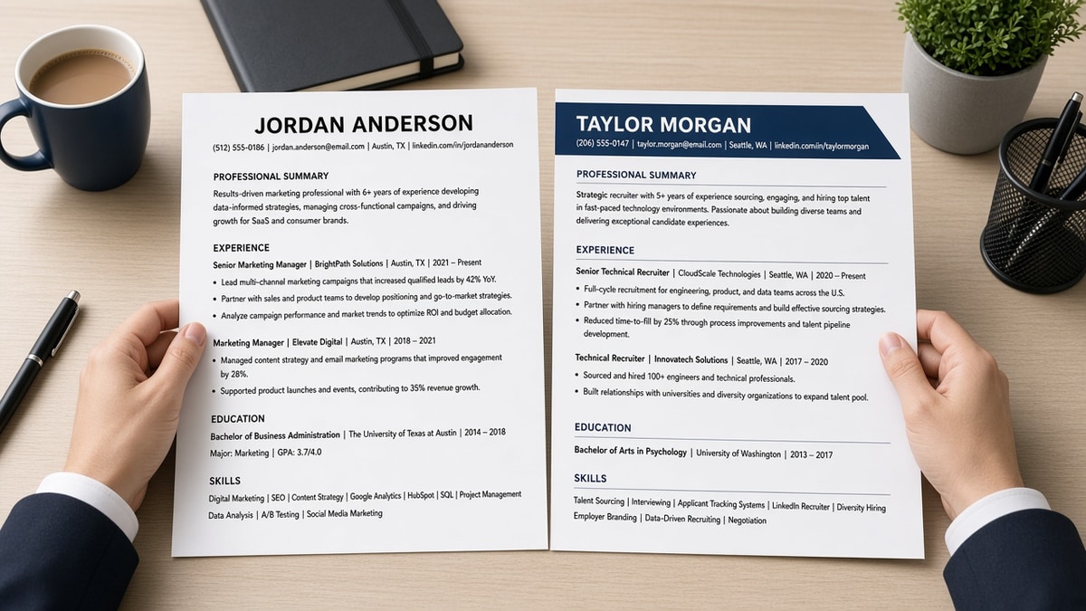
You're not vain for wanting a resume that doesn't look like a tax form. You're trying to look current without building a layout that Workday mangles on upload. US corporate hiring tolerates color when it's seasoning, not the meal.
Can resumes have color in the USA comes up on almost every design thread, and the answer isn't zero color. It's color that survives parsing and still looks professional when a manager prints in black and white.
Test whatever you've got: check your resume for free and paste plain text into Notepad. If order holds, your accent color probably isn't the problem.
Quick Wins
- Limit color to name plus heading lines, not bullet text.
- Print preview in grayscale before you upload.
- Skip full-width color bars behind contact info.
- Keep LinkedIn and email in black text beside your name, not inside colored shapes.
Can resumes have color in the USA without ATS trouble?
Color is a typography choice here, not a branding billboard. US recruiters open PDFs in viewer panes and print for panel interviews. Accent color on headings still reads when grayscale removes hue. Light gray bullets do not.
The risk isn't hex codes. It's templates that use color to hold layout together: sidebars, skill bars, icon rows. Strip the color and the structure still has to parse.
US hiring culture still skews conservative compared with consumer brand decks. That doesn't mean monochrome. It means hiring managers should remember your metrics, not your gradient.
Federal and defense contractors often publish stricter submission rules. When a posting says plain text or specific form fields, treat that as overriding any color advice here and follow the form exactly.
Remote-first companies care about readable PDFs on low-quality home printers during panel reviews. High contrast black body text beats stylish gray every time that packet gets forwarded to a VP on paper.
And if you reuse a template from another country, strip EU-style photo boxes and color ID bands before you apply on US portals. Those layouts fight Workday even when the color looks professional on a social profile preview.
Compare exports with best resume format for ATS in the US before you pick a Canva layout with color bands.
Resume color examples that pass US screens
Example A: Navy name, black body
Before: Full teal header block with white contact text inside a text box.
After: Name in navy 14pt, contact line in black 11pt below, standard Experience heading in navy, bullets in black. Parses clean, prints clean.
Example B: Charcoal rules, no sidebar
Before: Gray sidebar with skills chips in pastel circles.
After: Single column, thin charcoal line under each heading, skills as a comma list in the body. Color is decorative lines only.
Example C: Designer with portfolio link
Before: Magenta gradient background on page one of the resume PDF.
After: Plain resume with one blue link line Portfolio: URL and visual work in a separate PDF or site linked in the application.
Copy-paste block: safe US color settings
Name: #1e3a5f or #333333 (navy or charcoal)
Headings: same accent, 12–13 pt bold
Body, dates, bullets: #000000 on white
Avoid: colored bullet text, light #999 body, icons as bullets
Export: PDF (text-based), then Notepad paste test
Example D: Executive one-page
Name centered in dark blue, section headings left-aligned in caps with letter spacing, no tables. Looks polished in email previews without triggering two-column parsers common in executive templates.
Example E: Healthcare and lab roles
Before: Mint green section backgrounds for Certifications and Clinical Experience.
After: Black text, navy heading lines, certifications listed with issuing body and year. Clinical color belongs in credentials formatting, not page tint.
Example F: Sales and account management
Before: Orange callout boxes for quota wins beside a narrow experience column.
After: Quota and pipeline wins as bullets with numbers in black text; optional thin orange rule under the name only. Numbers need to parse, not glow.
Example G: Recent graduate
School career centers sometimes hand out templates with school colors in footers. Keep the footer plain or drop it. Recruiters know which school you attended from Education; they don't need a maroon banner stealing margin space.
When you test, upload the same PDF to a plain text view and read dates aloud. If start and end months for each role stay paired, color wasn't masking a broken table. If they jump, simplify layout even if you love the palette.
Photo headers and color blocks often travel together in template packs. Drop the photo for US corporate uploads unless the posting asks for a headshot. You'll save margin space and avoid parsers that treat images as empty lines.
Color choices that backfire in US uploads
I've opened thousands of PDFs in Greenhouse viewers where the candidate looked designer-grade but the parsed profile lost half the employment block because color hid a table layout.
Colored text for dates. Gray dates disappear on print and sometimes drop from paste tests. Keep dates black.
Skill bars filled with color. Parsers read bars as shapes or skip them. Use words, not meters.
White text on dark bands. Contact info trapped in a header image or colored band often fails OCR on older ATS imports.
Hyperlinks styled in bright blue only. Plain URLs in black still work; neon link color without underlines confuses people who print. Underline links or spell them out in contact lines.
Matching letterhead color to a consumer brand. If you're applying to a retailer, you don't need their brand red on your resume. Show customer metrics instead. Brand mimicry reads cute on a screen and odd on a printed stack.
Dark mode exports. Some editors preview white text on black backgrounds. Export always returns to white paper, black type, unless you're submitting a creative portfolio packet separately.
For layout fixes after you simplify color, see why your resume looks different after upload .
Verify structure before you debate palette
Run the colored export through the free ATS resume checker . If sections import, your accent color is likely fine. If they don't, flatten layout first.
Save two versions on disk: Resume-Plain.pdf with zero accent for conservative employers, and Resume-Accent.pdf with navy headings for everyone else. Same content, different polish, so you're not rebuilding bullets twice.
When a posting mentions submitting through a portal that strips formatting, upload the plain version even if you prefer color for networking emails.
Use color like a highlight, not a layout crutch
Can resumes have color in the USA? They can, and many strong candidates use one restrained accent. The files that fail aren't navy headings. They're colorful containers hiding structures parsers can't read.
Run the grayscale print test before you attach anything to a dream req. If headings still pop and bullets stay readable, keep the accent. If everything flattens into mush, pull color back to the name line only.
Your competitive edge in US hiring still lives in scoped bullets and clean dates. Color is optional polish on top of a parser-safe spine, not a substitute for either one.
Pair a clean PDF with a letter from the cover letter generator using the same accent so the packet matches without overdesigning either file.
Frequently asked questions
Yes. US recruiters accept subtle color on headings or a thin rule line when the body stays black text on white, single column, and exports as text-based PDF. Neon blocks, photo banners, and colored body text cause more parser issues than they help.
Color alone rarely breaks parsing. Two-column templates, text boxes, and icons tied to color layouts do. If paste-into-Notepad test scrambles dates, fix structure before debating navy vs charcoal.
Dark blue, slate, or charcoal for your name and section headings. Keep bullets and dates black. Avoid light gray body text that looks fine on screen but prints faint.
Portfolio links carry visual work. The resume file still uploads through the same ATS. Many designers use one accent color plus a PDF portfolio link instead of a full-bleed resume background.