11 min read
A minimal resume template converts better because parsers read one column in order and recruiters scan one margin in under ten seconds. Fancy columns, icons, and color blocks steal time from both passes. You don't need a design award. You need a file that opens clean in Workday and still shows your best bullet on line one.
Check your resume for free before you swap templates. If sections already parse out of order, a new theme won't fix silence. Layout first, then words.
You've probably been told to "stand out visually." In corporate hiring, standing out means the hiring manager finds your outcome before they click to the next name. Below you'll see why plain beats clever, the narrow cases where decoration's fine, and a copy-paste section order you can build tonight. Job searching's draining enough without fighting your own file format.
Quick Wins
- Switch to one column with 0.75-inch side margins.
- Delete icons, skill bars, and sidebar contact boxes.
- Re-upload once and confirm job titles parsed correctly.
Why a minimal resume template beats a designed one
Two readers touch your file before anyone calls you. The parser extracts text into fields. The recruiter scans the preview pane. A plain single-column file serves both without asking them to decode your layout choices.
Parsers follow document order. In a two-column template, contact info in a left rail can land after skills or merge into education. Workday and Greenhouse do not "see" your visual hierarchy. They read top to bottom, left to right, as plain text.
Recruiters scan one vertical strip. Eyes move down the employer name, pause on a number in a bullet, and jump to the next role. Sidebars split that path. So do skill clouds that push experience to page two.
Minimal also means predictable. When every candidate uses a different Canva theme, the recruiter spends mental energy parsing design before they parse you. A plain file lets them spend those seconds on your first bullet instead of your font pairing.
Before: a composite marketing coordinator uploads a teal sidebar template with star icons beside skills. Greenhouse shows skills first, then a garbled employer line, then education. The req asked for campaign analytics. The parser never surfaces the Google Analytics bullet on page one.
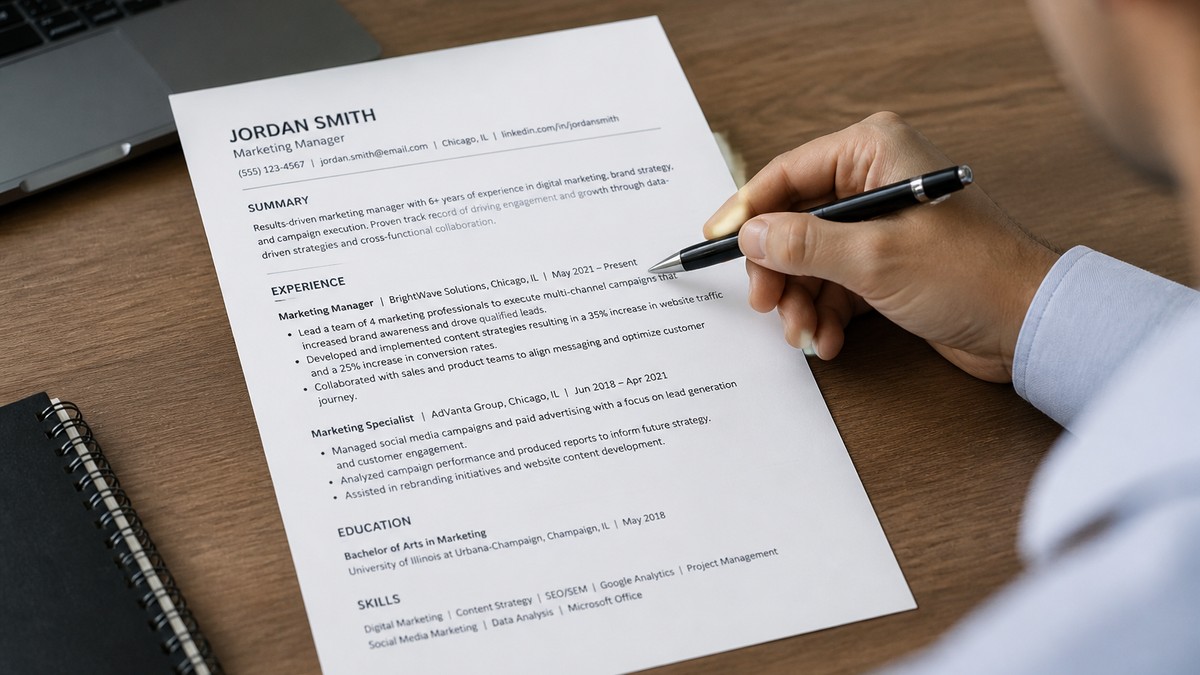
After: same candidate, single column, 11-point Calibri. Contact, three-line summary with "paid social" in line one, skills as a comma list, then bullets with "ROAS" and "Meta Ads" in the first eight words. The profile tab matches the job title on the req. That is conversion at the layout layer.
Before: a composite data analyst keeps a template with a chart thumbnail and a shaded skills table. Lever merges table cells. Dates read as one block. A keyword match on SQL never fires because the skill sat inside a cell the extractor skipped.
After: plain bullets, tools named in line one, Month Year dates on their own line under each title. "Built churn model in Python, cut reactive tickets 11% in Q3" sits where both parser and human expect it. No thumbnail required.
Conversion is not callback rate on this page. It is the file surviving ingestion, surfacing the right keywords, and giving the recruiter a reason to stop scrolling. Minimal templates raise those odds because they remove layout as a variable.
This will not fix applying to roles you are not qualified for. It stops a qualified file from dying because the parser read your header as body text.
When plain layout is not the whole story
Plain is the default. Three exceptions are real. If one applies, follow it. Do not ship a sidebar because you like how it looks.
Exception 1: the employer asks for a portfolio URL. Upload the minimal PDF in the resume field. Put visual work on your site or Behance in the portfolio box. The parser still needs dates, titles, and tools on paper.
Exception 2: academia or CV norms. Long CVs with publications belong in research hiring, not most corporate reqs. If you are applying to a university lab, follow their CV rules. For a product company, send the one- or two-page minimal file even if you also maintain a full CV elsewhere.
Exception 3: executive bios with board lists. Some C-suite candidates carry a second page of boards and speaking topics. Keep page one minimal. Put optional detail on page two in the same single column. No third column of logos.
Edge case: internal referrals where a hiring manager already knows your work. They still forward your PDF inside email threads. A minimal attachment travels cleaner than a link or a heavily designed file that breaks on mobile preview.
Edge case: career fairs that collect resumes into a shared drive. Files get opened on phones. Single-column PDFs scale. Multi-column designs turn into unreadable slivers.
Edge case: government portals with strict upload validators. Some reject PDFs with embedded layers or unusual fonts. Minimal exports from Word with standard fonts pass more often than designer exports with custom type.
When a friend in design insists "you need a visual resume," ask which req they mean. Agency recruiters hiring a motion designer still ingest a PDF in iCIMS. The reel sells the eye. The resume sells titles, dates, and client names the ATS can search.
Build the file tonight
You do not need new software. You need one blank document, one export, and one test upload. Block forty-five minutes.
Step 1: strip the chrome. Open your current file. Delete columns, text boxes, icons, footers with page numbers styled as graphics, and skill meters. Move phone and email to a single line under your name. City and state only unless the posting asks for a full street address.
Step 2: lock typography. Pick Calibri or Arial at 11 points for body, 12 to 14 for your name, bold for section headers. Left align everything. Use standard bullets, not custom arrows. Set margins to 0.75 or 1 inch.
Step 3: reorder sections for the req. Open the posting. Highlight three must-have skills. Put one in the summary, one in the top bullet of your current job, one in the skills line. Minimal layout makes that swap fast because nothing fights you for space.
Step 4: tighten bullets before you add pages. Three to five bullets per recent role. Outcome in the first eight words. If you are wrapping to a third line, split or cut per the bullet length guide .
Step 5: export and test once. Save PDF. Upload to one target portal or run the HireFlow checker. Confirm employer names, titles, and dates appear in separate fields. Fix order before you send ten copies.
Copy-paste section order (rename headers to match your field):
FIRST LAST
City, ST · phone · email · linkedin.com/in/handle

SUMMARY
Two lines: role you want + strongest proof with a tool or metric from the posting.

SKILLS
Comma-separated line: Tool A, Tool B, Method C, Certification D

EXPERIENCE
Company Name | Job Title                    Month Year to Month Year
• Outcome verb + metric + scope in first eight words
• Second bullet with a different skill from the posting
• Third bullet only if it adds a new proof point

EDUCATION
Degree, Major | School Name                 Year
Paste that skeleton into Word or Google Docs. Fill one role completely before you touch the rest. Minimal templates fail when people decorate an empty shell instead of fixing bullet one.
Before: a composite registered nurse lists twelve certifications in a shaded box above experience. The ICU role on the req never surfaces in the preview because the parser choked on the box.
After: certifications on one line under skills, three bullets under the latest hospital role with patient ratios and EHR names in line one. Same credentials, readable order.
Set a timer. Forty-five minutes, one template, one test upload. You can tailor words per job later. You only want one layout problem solved tonight.
Where plain files still fail
Switching to plain paper does not auto-fix weak content. These four patterns still kill conversion after the layout is clean.
Mistake 1: minimal but empty. White space without metrics reads as junior. Cut design, not proof. Every role needs at least one bullet with scope or a number, even if the number is illustrative inside your own work history.
Mistake 2: hiding keywords in graphics. Removing icons but keeping "SQL" only inside a screenshot of a dashboard still fails parsing. Type the skill in a bullet.
Mistake 3: using headers as design elements. Giant all-caps section titles eat vertical space and push your best job to page two. Bold 12-point headers are enough.
Mistake 4: skipping the re-upload test. A minimal export from a design tool can embed invisible layers. Always open the parsed view once. If dates merged, switch to a Word export and try again.
A composite operations lead still ships a "minimal" template with six identical bullets starting with "Responsible for." The layout is fine. The recruiter never sees a result. Fix verbs before you fix fonts.
Another pattern: stuffing every posting keyword into a skills paragraph with no bullets underneath. ATS may match, but the human pass dies on vague lists. Pair each must-have skill with one bullet that shows use.
If your file is two pages, page two should be older roles or optional detail, not a repeat of skills in a new font. Recruiters rarely scroll past bullet three on page one unless line one earned it.
Tools that fit a minimal workflow
You need parsing feedback and a clean starting file, not another theme marketplace.
Run the ATS checker after you strip columns. It flags section order problems before you burn applications. Fix structure, then tailor keywords per req.
Build your resume from a single-column base if you are starting from scratch. Export DOCX when the portal asks for Word, PDF otherwise. Keep one master file and swap summary plus three bullets per posting.
Pair the template work with a quick match pass on your top req: score your job match once the layout parses cleanly. Layout gets you read. Match gets you shortlisted.
If the posting asks for a letter, generate a cover letter after the resume file is clean. A designed PDF plus a messy letter is still half a broken application.
Your default template
Strip columns tonight. Export once. Confirm the parser read your current job title correctly. Then tailor three lines to the next posting on your list.
A minimal resume template converts better because it respects how files move through Workday and how recruiters actually scan. I've screened stacks of these in Greenhouse, and boring plus specific beats clever plus scrambled on every high-volume req.
If you are unsure whether your file is minimal enough, read why your resume never reaches a human . Parser failures look like silence. Fix layout before you rewrite your whole career story.
Save the master PDF. Swap summary and top bullets per req. Decoration is a weekend project. Getting read is tonight's project.
Read more
Frequently asked questions
One column, standard fonts like Calibri or Arial at 10.5 to 11.5 points, plain section headers, and no tables, text boxes, icons, or skill bars. Contact block on top, then summary or headline, skills, experience with bullets, education. White space between sections, not between columns.
Corporate and agency back-office roles still want a clean PDF in the portal. Pure creative portfolios can live on a separate site or in a portfolio field. The minimal resume template carries dates, titles, and tools the parser can match to the req. Save the visual story for work samples, not the file Greenhouse ingests.
Layout gets you parsed in order. Keywords in bullets still have to match the posting. A minimal file that says nothing about the req dies quietly after a clean parse. Think of the template as removing friction, not replacing tailoring.
PDF unless the posting requests DOCX. Export from Word or Google Docs with embedded fonts off. Re-upload once to your target portal and confirm employer names and dates landed in the right fields before you mass apply.
One page for under eight years of relevant experience, two pages when every line supports the target role. Minimal refers to design, not empty content. Cut decorative elements first, then old jobs that do not support this application.